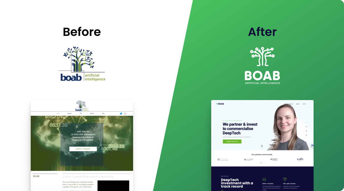
Boab is a scale-up investment program supporting AI ventures in Victoria and beyond. They approached us to help build a strong, consistent brand that reflects their mission and values. At the same time, they wanted to improve their website, which wasn’t engaging visitors or capturing leads.
They needed a brand identity that could work across all platforms and a clear strategy to boost their digital presence.



The primary challenge was crafting a branding strategy that effectively communicated Boab’s unique position in the AI industry while adhering to the stringent guidelines that ensure brand consistency across various platforms and materials.
The task involved balancing creativity with adherence to the guidelines, particularly in terms of logo usage, colour palette, typography, and overall brand voice and tone, ensuring that the brand’s identity was both flexible for various applications and instantly recognisable.
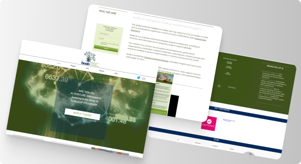
Boab’s website was over 10 years old and needed an urgent UX review to bring it up to scratch. It was slow, and the user experience was very disappointing, as some buttons didn’t work, and there were many 404 error pages. Overall, there was no web strategy for collecting visitor details, and the content on the home page felt disjointed and vague.
With a clear brand strategy in place, Boab now has a strong and consistent identity that reflects who they are and what they stand for. The new logo and colour system draw on the resilience and strength of the Boab tree, while the chosen typography creates a professional and approachable tone across all materials.
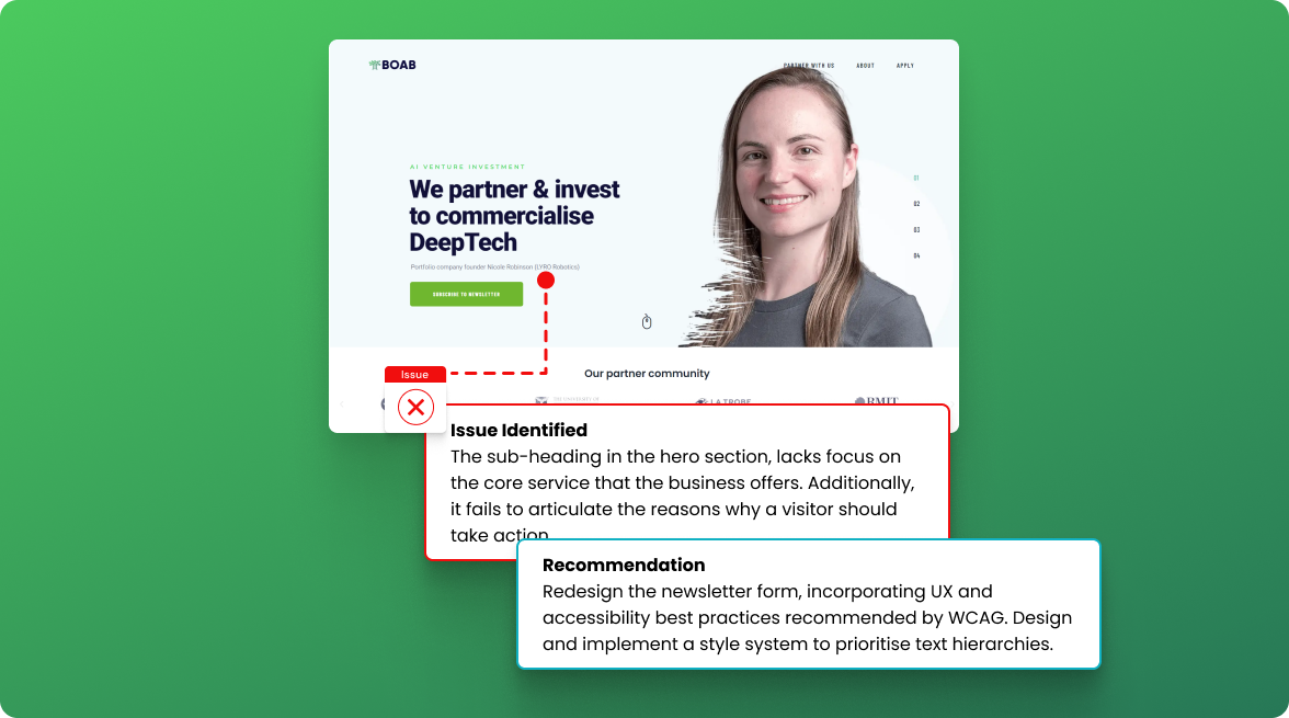
We also delivered a detailed UX audit of their website, highlighting the core issues that were affecting performance and user trust. Our recommendations gave Boab a roadmap to not only improve the look and feel of their site but also implement a strategy to better engage visitors and convert interest into real opportunities for investment and growth.
