Marketers & Business Owners
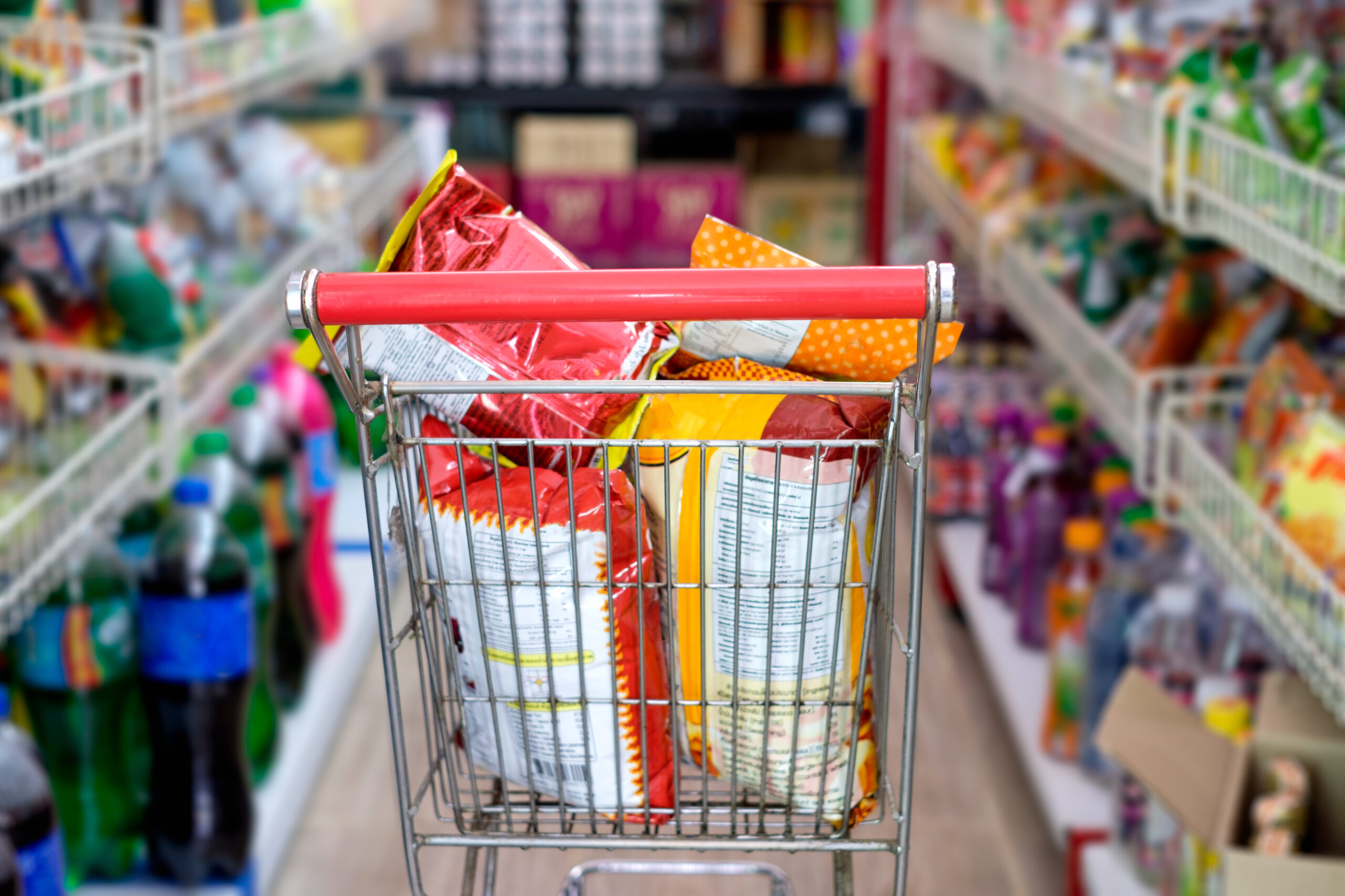
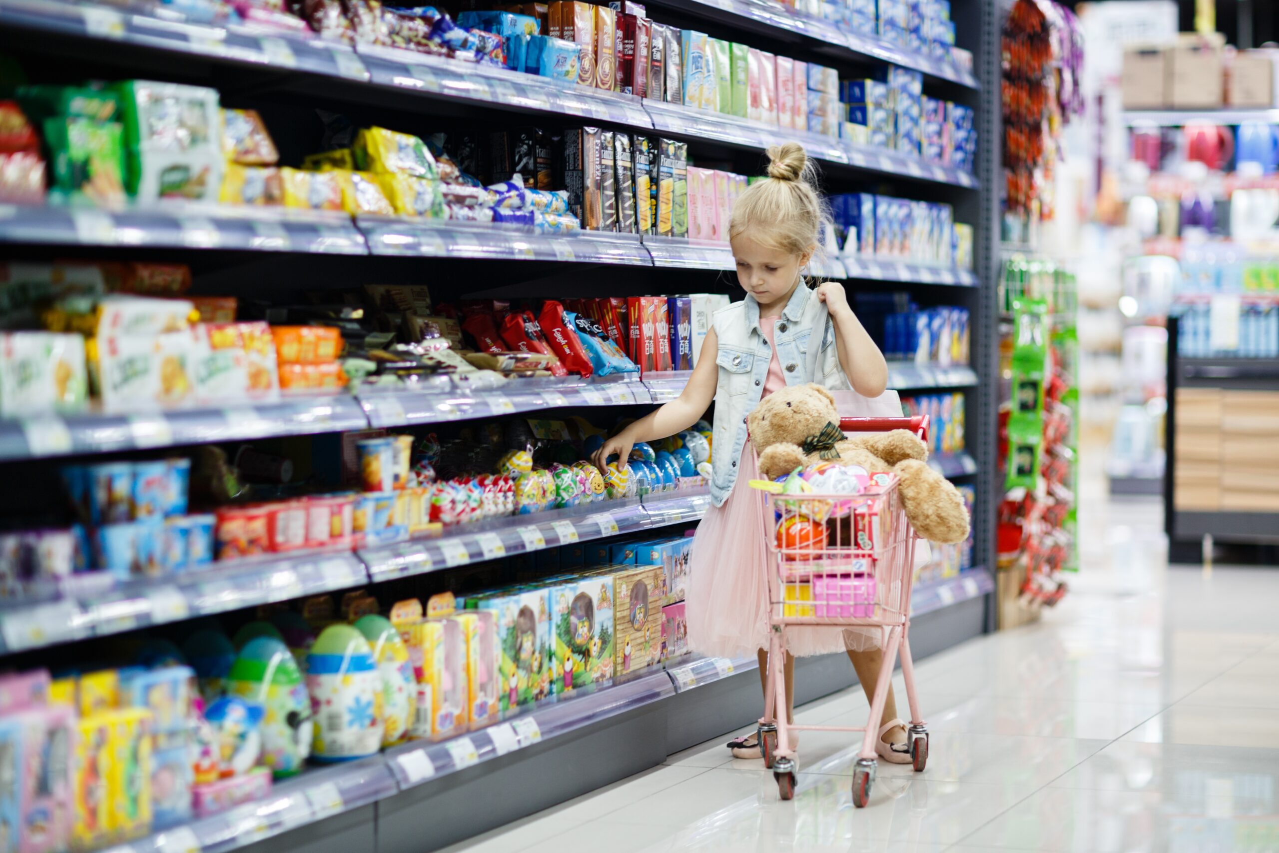
Snacks are one of the most crowded categories in FMCG. In a single supermarket aisle, hundreds of snacks compete for barely two seconds for a shopper’s attention. There is no time for explanation, comparison, or education. Strong snacks branding bridges that gap. Clear, eye-catching packaging gives shoppers confidence that a product will meet expectations, even without prior experience.
There is no time for explanation, comparison, or education. Strong snacks branding bridges that gap. Clear, eye-catching packaging gives shoppers confidence that a product will meet expectations, even without prior experience.
Without a deliberate branding strategy, snacks disappear into the visual noise long before they are truly seen. This applies whether you are launching a new snack, refreshing an existing range, or updating packaging to stay competitive.
In the sections that follow, we break down how consumers actually choose snacks, and the behavioural cues that influence recognition and trust. This goes beyond packaging, outlining how positioning, personality, and structure work together to drive recognition at the shelf.
How Consumers Actually Choose Snacks
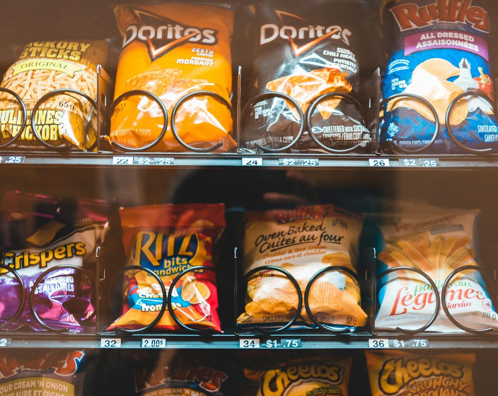
Snack purchases feel casual, but the behaviour behind them is predictable. Shoppers rarely compare options in detail. They scan shelves quickly and reach for what feels familiar, obvious, or immediately appealing.
Impulse
A large share of snack purchases are unplanned, with one in five shoppers leaving a store with an impulse purchase. Of those impulse buyers:
- 40.3% gravitated toward an item that looked appetising
- 21.5% were influenced by seeing a brand they already liked
- 19.2% were influenced by an eye-catching product display
To win the “impulse” snack war, you have to be obvious. This could mean using:
- Bold colour
- Clear flavour cues
- Minimal messaging
Products positioned at eye level or near checkouts benefit most from this behaviour. In these moments, complexity becomes friction. The more a shopper has to think, the less likely they are to buy.
That said, not all snacks rely on impulse alone. Health-focused and functional snacks often invite a more considered decision. Instead of shouting for attention, design should reduce perceived risk. You may have to do the opposite of “impulse” snacks. These helps shoppers quickly validate that the product aligns with their values:
- Clean layouts
- Muted palettes
- Clear ingredient or benefit cues
Even when the purchase is more deliberate, the goal is still to make the decision feel easy, credible, and reassuring.
Visual Recognition and Familiarity
Visual recognition lowers decision effort. Shoppers default to shortcuts, especially when attention is limited. Strong snacks branding prioritises shelf impact, allowing the brand and category to be recognised instantly.
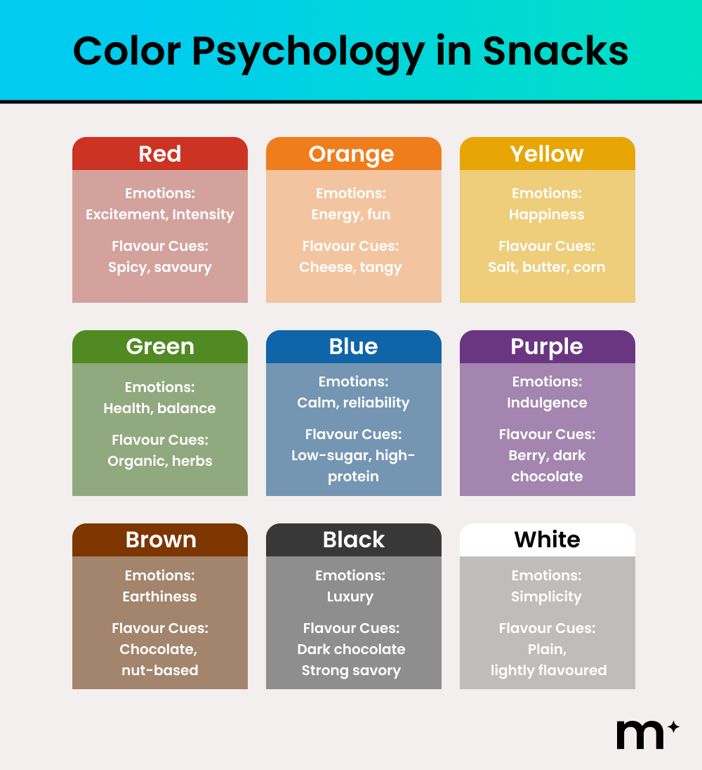
- Colour cues
- Bold reds, yellows, and blues signal indulgence and strong flavour
- Muted greens, browns, and creams suggest health, naturalness, or restraint
- Bright primary colours and high contrast attract kids and signal fun or sweetness
- Motifs and surface cues
- Flames or heat graphics to indicate spice
- Rustic textures or matte finishes to imply premium or artisanal quality
- Clean grids and white space to communicate simplicity and transparency
However, it’s not just about colours and design motifs. You can also use the shape of the packaging to your advantage. A cylindrical can instantly signals Pringles before the logo is read. The triangular prism of a Toblerone bar communicates brand identity through shape alone. These structures act as memory anchors.
Familiarity (and Credibility)
Familiarity and credibility allow shoppers to feel safe making a decision quickly. In a crowded snack aisle, trust is often formed before conscious evaluation. Previous positive experience plays a powerful role here. A snack that has delivered before is easier to choose again, even with minimal thought.
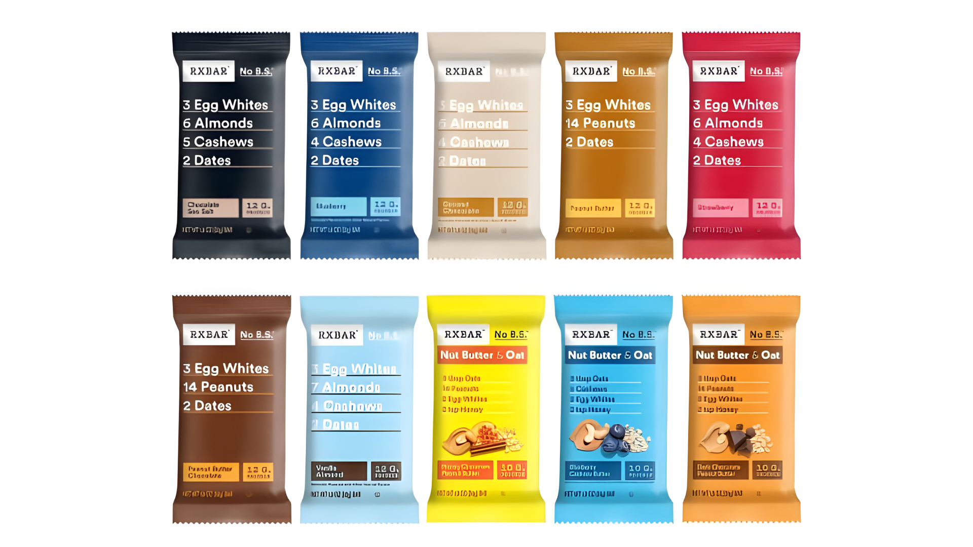
Source: RXBAR
For newer brands, credibility must be borrowed rather than recognised. Clear category signals, ingredient transparency, and restrained design help unfamiliar products feel trustworthy. RXBAR achieved this by using large front-of-pack ingredient lists and stark typography, allowing shoppers to understand the product instantly.
Packaging is the primary carrier of that trust, especially for first-time or low-involvement purchases. Visual cues help shoppers decide whether a product belongs and whether it can be relied on.
The Core Pillars of Strong Snacks Branding
The most effective snack brands are designed as systems, with each element working together to support fast understanding, trust, and repeat purchase. These pillars provide the foundation for branding that performs consistently on the shelf.
Brand Positioning
Every strong snack brand starts with a single, sharp position. It should have one clear role the snack plays in the shopper’s life.
Before any design work begins, three questions need clear answers.
- Who is this snack for? For example, a post-gym protein bar for time-poor professionals requires a very different tone to a lunchbox snack for primary school kids.
- When is it eaten and why? Is it an afternoon energy boost, a late-night indulgence, or a functional meal replacement.
- What problem or desire does it solve? Hunger, convenience, health reassurance, indulgence, nostalgia, or performance.
Positioning also defines who the brand is not for. A performance-driven protein bar should not speak like a treat. A nostalgic chip brand should not borrow the language of clinical nutrition.
Brand Personality
Brand personality is the set of human traits a snack brand consistently expresses through its look, language, and behaviour. Strong snack brands choose a narrow personality and repeat it consistently. Playful. Bold. Calm. Earnest. They do not rotate tone by campaign or flavour.
Personality is not an abstract concept. It shows up in every visible decision a brand makes, from colour and typography to flavour naming and imagery style.
| Brand | Core Personality | How It Shows Up |
| Red Bull | High-energy, confident | High contrast, dynamic graphics, performance-led messaging |
| M&M’s | Playful, irreverent | Bright colours, character-led, humour-driven |
| Smith’s | Familiar, no-nonsense | Bold colour blocking, simple flavour naming |
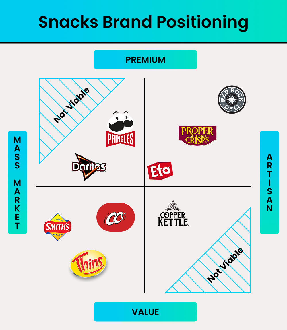
| Red Rock Deli | Premium, restrained | Muted palettes, ingredient-led naming |
| Carman’s | Calm, earnest | Handwritten-style fonts, natural colour palettes |
In each case, personality is not just tone of voice. It is embedded in colour, layout, imagery, and hierarchy.
Consistency across the entire product range is critical. Personality must be applied to every flavour. When layouts, colours, and tone are consistent, shelf recognition strengthens and new flavours feel familiar rather than risky.
Visual Identity and Packaging
Colour and packaging shape how a snack is understood before any claims are processed. They establish category fit, price expectations, and emotional tone in seconds.
Colour acts as a recognition shortcut. Repetition builds memory. Mountain Dew is a clear example of this in practice. The brand’s use of aggressive colour contrast, neon greens, blacks, and high-energy graphics instantly communicates intensity. Even without reading the name, shoppers can identify Mountain Dew from a distance because the visual language is so consistently applied. Over time, those colours have stopped being a design choice and become a recognition trigger.
Packaging structure also carries meaning. Material choice, format, and physical shape communicate value and intent. Distinct structures are remembered even when logos are ignored.
Together, colour and structure form a visual system. When applied consistently across a range, they reduce effort for repeat buyers and make new variants easier to accept.
Common Snacks Branding Mistakes and How to Avoid Them
Many snack brands fail not because of poor products, but because of avoidable branding errors. These mistakes increase decision effort, weaken recognition, and make it harder for shoppers to choose quickly.
Overcomplicating the Brand Story
Many snack brands fall into the trap of trying to explain everything at once. Origin stories, health credentials, sustainability claims, and flavour descriptions are often crammed onto the front of the pack. In a category where decisions are made in seconds, this level of complexity overwhelms rather than informs. When too many messages compete for attention, shoppers struggle to understand what the product actually stands for.
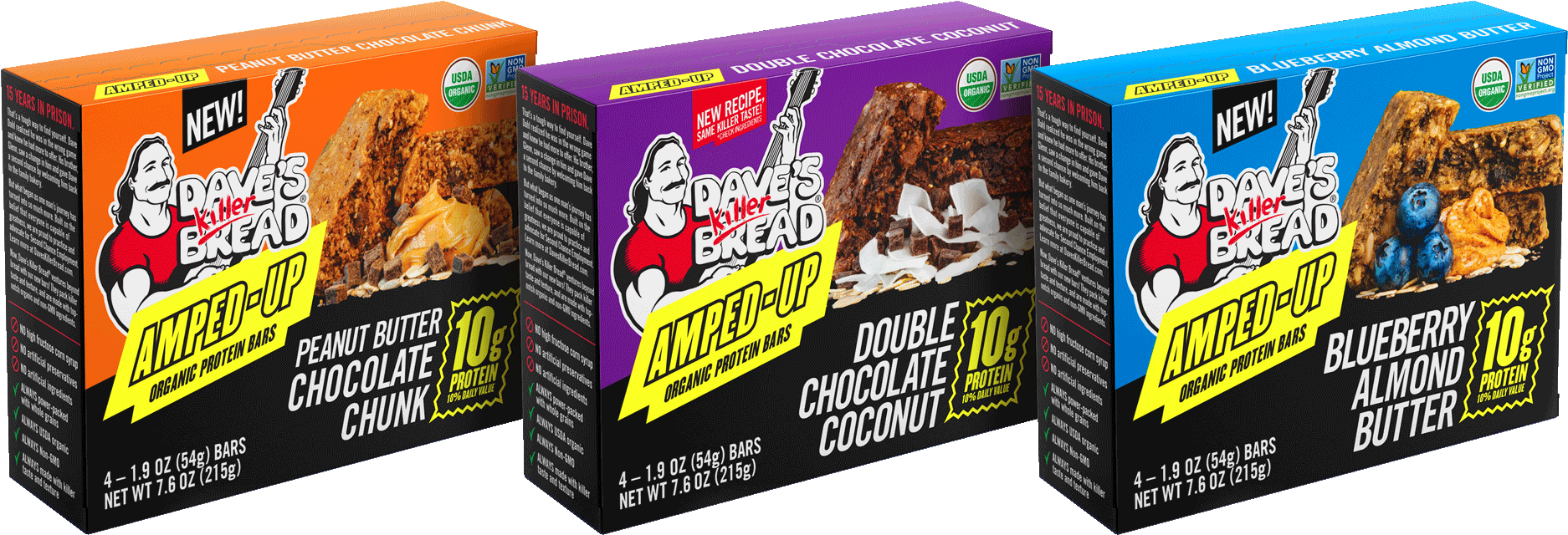
Source: Dave’s Killer Bread
Dave’s Killer Bread provides an interesting example of how a strong brand story can be present without overwhelming functional messaging. While the brand is widely associated with its social mission of second-chance employment, that story does not dominate the moment of choice on its snack bars.
Instead, protein and fibre content are clearly signposted on the front of pack, giving shoppers an immediate functional reason to buy. The broader brand story remains visible but secondary, reinforcing trust rather than leading the decision. This balance allows the product to perform in a fast snack environment, where nutritional clarity and satiety matter more than narrative depth.
Inconsistent Branding Across Product Lines
Another common issue is inconsistency across SKUs. Changes in logo size, layout structure, typography, or hierarchy can make each product feel disconnected from the next. While individual packs may look attractive on their own, the brand loses strength as a system.
When shoppers cannot immediately recognise products as belonging to the same brand, familiarity resets. Each decision feels like a first-time evaluation, increasing effort and reducing impulse. Strong snack brands protect recognition by locking in core layout rules and visual hierarchy across the entire range. Variation is introduced through flavour cues, not structural changes, allowing the brand to scale without losing coherence.
Designing for Trends Instead of Behaviour
Design trends can be tempting, especially when they signal modernity or align with internal values. However, trends that weaken shelf contrast or blur category cues often come at the expense of visibility. What looks refined in isolation can disappear when placed among bolder competitors. 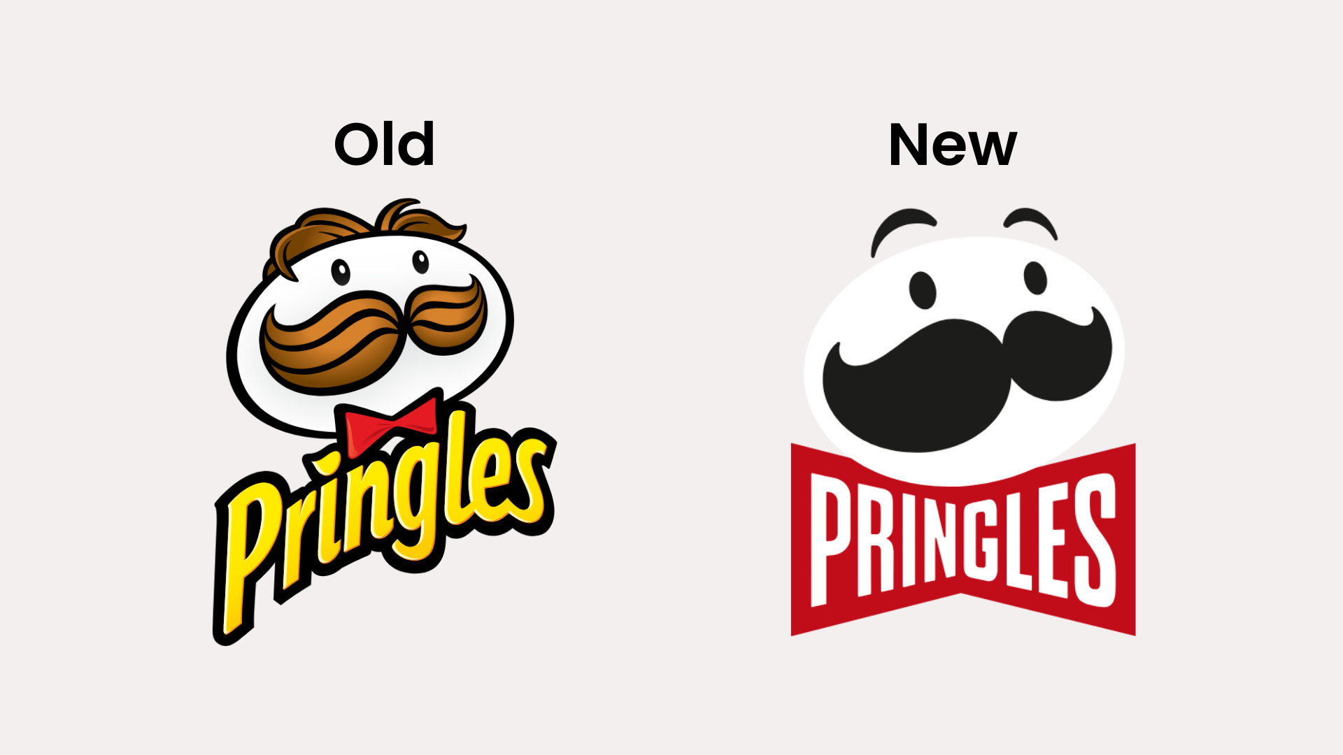
Pringles’ recent logo updates offer a useful example of how even careful modernisation can trigger backlash when familiarity is disrupted. The brand simplified its iconic Mr P character, removing shading, depth, and detail in favour of a flatter, more digital-friendly look. While the change aligned with broader design trends, it was met with noticeable criticism from long-time fans, who described the new logo as generic, emotionless, or stripped of personality.
Build a Snack Brand That Shoppers Remember
In snacks, branding mistakes are expensive. Every moment of hesitation costs visibility, impulse, and repeat purchase. When recognition breaks down, even good products struggle to move.
If you are navigating a launch, refresh, or rebrand, a strategic partner can help reduce that risk. Mindesigns works with snack brands to align positioning, personality, and packaging so recognition compounds instead of resetting.
If you need help building a snack brand designed for real shopper behaviour, not just good-looking packaging, get in touch with Mindesigns to start the conversation.