For Marketing Leaders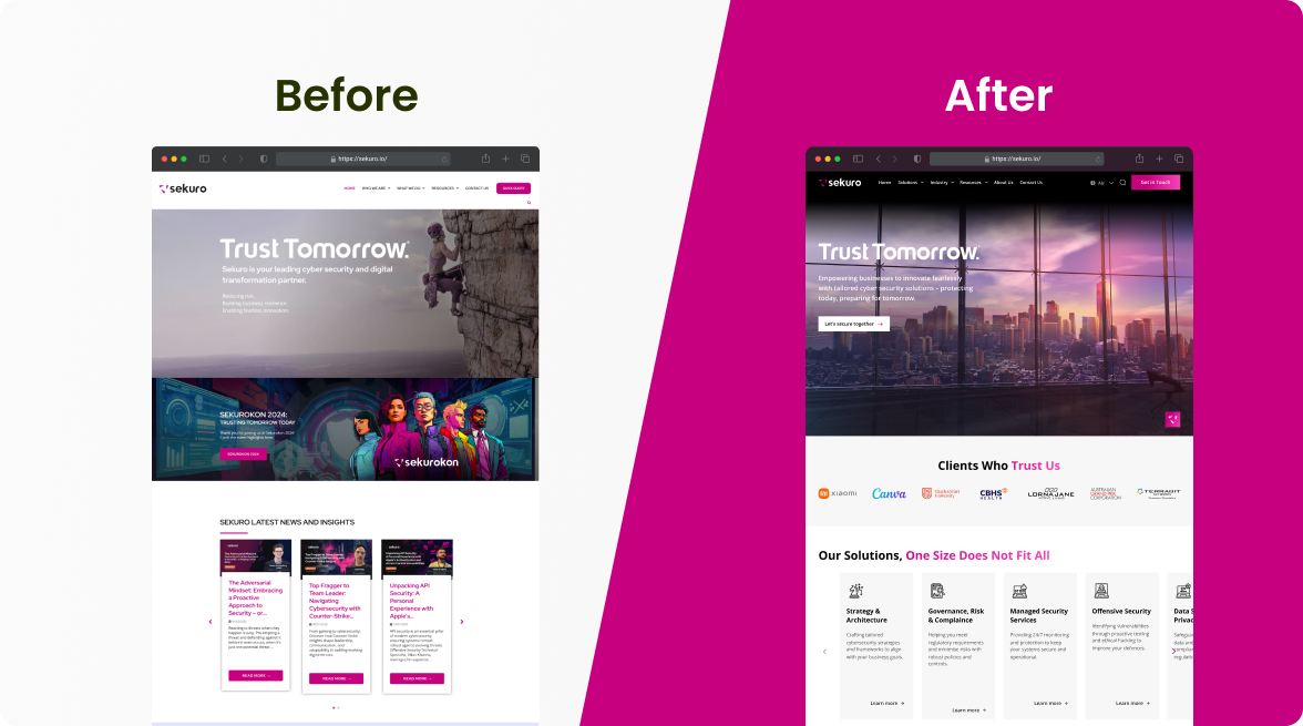
“Hiring a UX/UI Designer”. “Offering UX/UI services”. “Enrol in a UX/UI course”. UX and UI design are often clumped together as if they are interchangeable. While they are closely connected, they aren’t the same discipline. Think of it like architecture and interior design. One shapes the structure and flow, the other shapes the visual experience. Without one, the other struggles to perform.
Both disciplines demand expertise. Effective UX and UI design is not guesswork or surface-level styling. It is driven by research, behavioural insight, testing, and measurable outcomes. At Mindesigns, we take a human-centred, conversion-focused approach so that every design decision contributes to real business growth, not just aesthetics.
Our work with Online Education Services (OES) is a clear example. Their website was not aligned with how universities and TAFEs searched for solutions, and key actions were not surfaced clearly. We restructured the user journey to reduce friction and clarified the visual hierarchy to strengthen trust and authority.
After we restructured the user journey, OES’s organic traffic grew from roughly 15,000 to 40,000 visits per year, and enquiry conversions from the hero lead magnet became their top-performing acquisition channel.
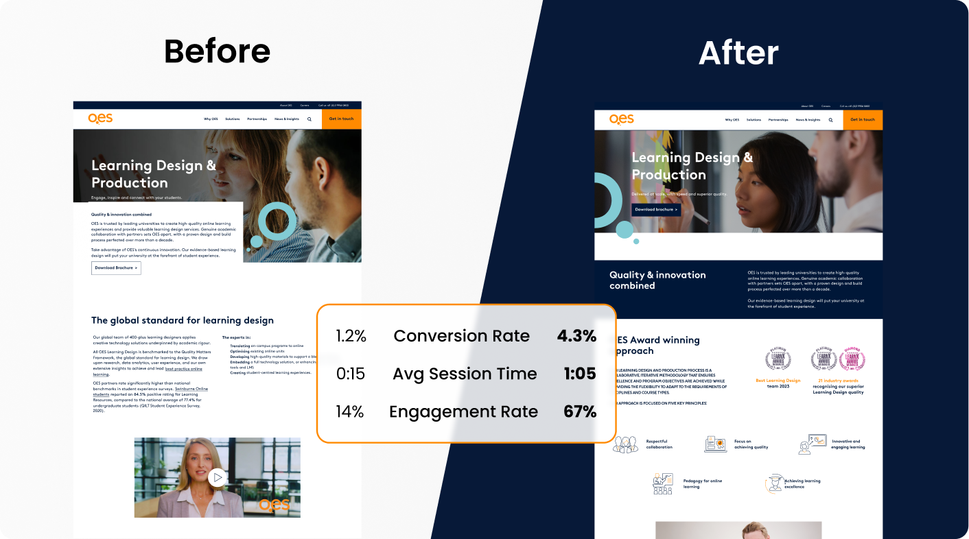
This outcome came from a structured process that aligned user experience, visual design, SEO, and technical integrity with clear commercial goals. So what does that actually look like in practice? The following sections unpack the key differences, core components, and principles that turn design decisions into real commercial results.
The Key Differences Between UX and UI Design
When diagnosing performance issues, identifying whether the problem is structural or visual changes the solution entirely. To see the difference clearly, here is a side-by-side comparison.
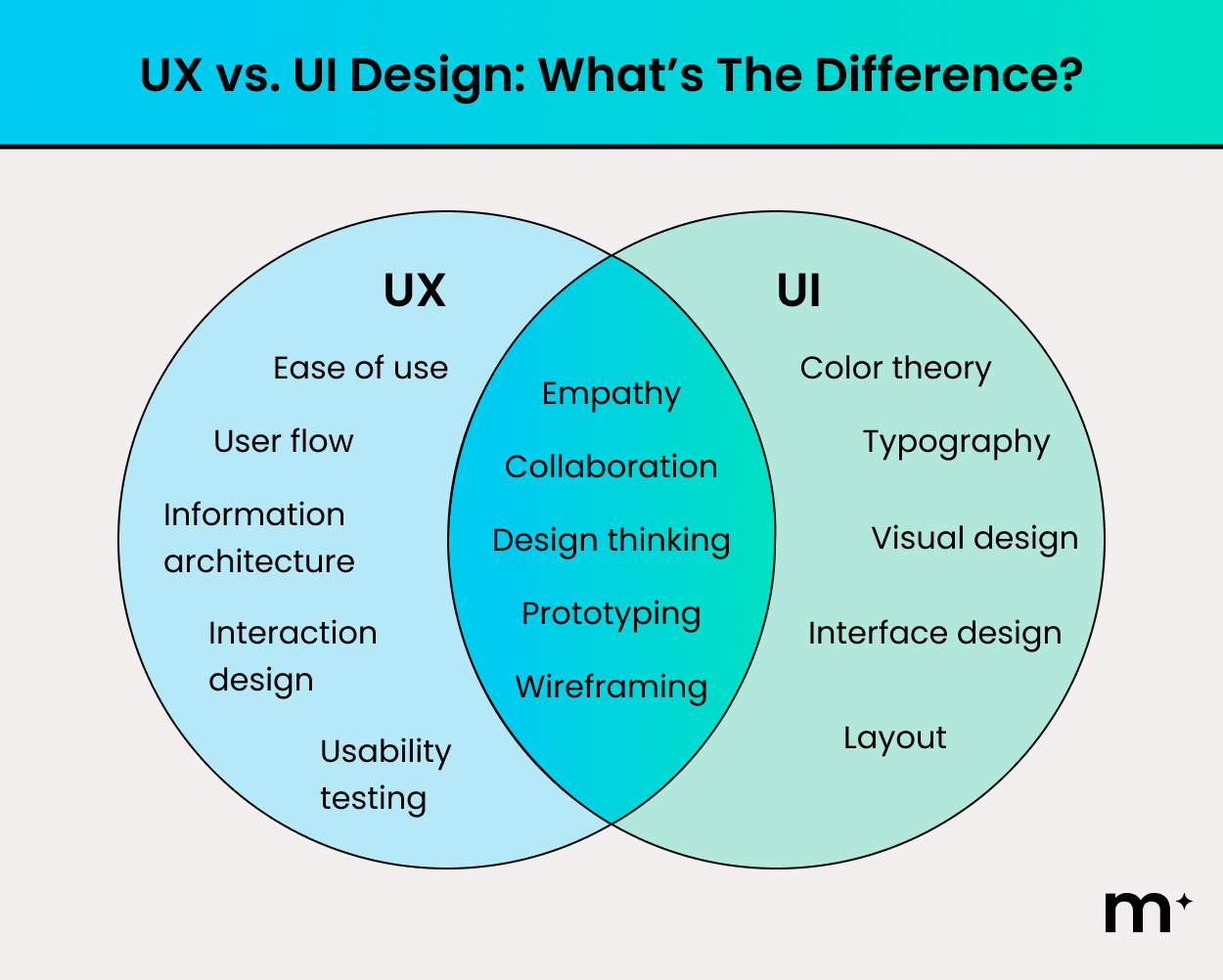
To understand how each operates in practice, we will break them down individually, starting with UX design and then exploring UI design in more detail.
What is UX Design?
UX design focuses on the functional architecture and behavioural performance of a website or software platform. It defines how information is structured, how users move between touchpoints, and how efficiently they can complete key tasks. In practical terms, UX determines whether your digital platform feels intuitive or frustrating.
At a technical level, UX design asks structural and behavioural questions such as:
- Is navigation intuitive enough for first-time users?
- Can we reduce required fields to increase completion rates?
- Is the primary call to action easy to find?
- Can this process be completed in fewer clicks?
- Should this form be single-page or multi-step?
After auditing dozens of Australian business websites over the past 10 years, we most often see the third pattern. The primary call to action buried beneath three scrolls of brand storytelling. It’s the single most common conversion killer we fix.
The goal is to create a streamlined environment where users can act without hesitation or confusion.
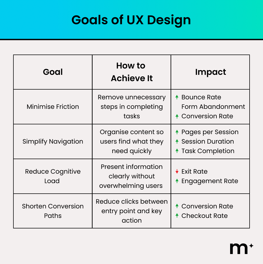
When UX works well, it is almost invisible because everything feels natural. When it fails, frustration becomes immediate and conversions decline.
What is UI Design?
UI design focuses on the visual interface and interactive presentation of a website or software platform. It defines how the digital product looks and how elements are arranged on screen.
At a technical level, UI design includes layout systems, visual hierarchy, typography selection, colour systems, component design, and interactive states such as hover effects and form feedback. These elements work together to guide attention, reinforce brand identity, and create consistency across devices. The goal is to ensure users not only understand what to do next, but feel confident doing it.
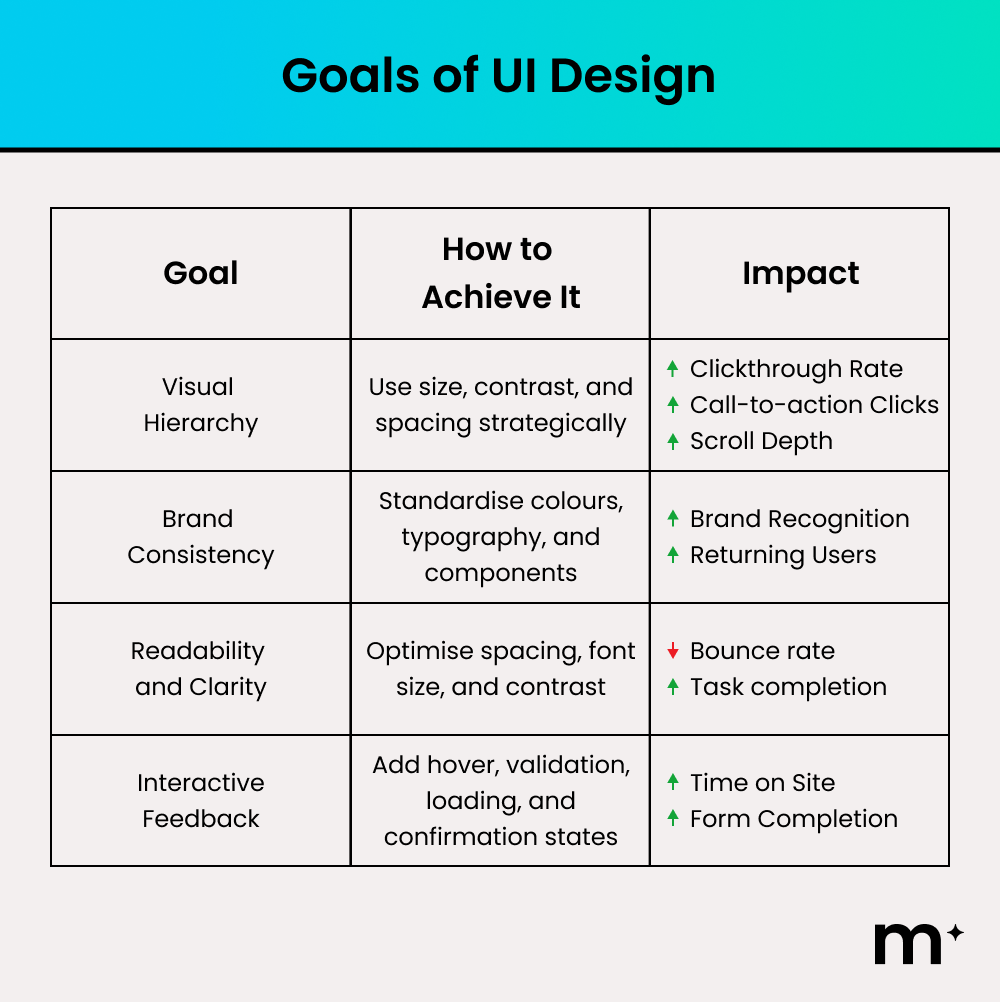
When UI is executed well, users feel trust almost instantly and navigation feels visually effortless. When it fails, the platform can appear unprofessional, inconsistent, or difficult to use, even if the underlying UX structure is sound.
Why You Need Both UX and UI Design For Your Business
Good UX and UI design directly influence revenue, retention, and brand perception. With both aligned strategically, your digital platform becomes a structured growth asset rather than just an online presence.
However, the way UX and UI drive performance depends on the environment. Optimising a marketing website requires a different focus compared to refining a software product used daily. To see how these disciplines adapt in practice, let’s explore how UX and UI function in website environments first, and then in apps and SaaS platforms.
UX and UI Design for Websites
For websites, UX and UI must operate as a unified system. UX defines the structure, navigation pathways, and content hierarchy that guide users toward key actions. UI ensures those pathways are visually clear, credible, and aligned with your brand.
Revisiting our work with OES provides a practical example of this alignment in action. Rather than simply redesigning the interface, we addressed specific performance barriers and resolved them strategically.
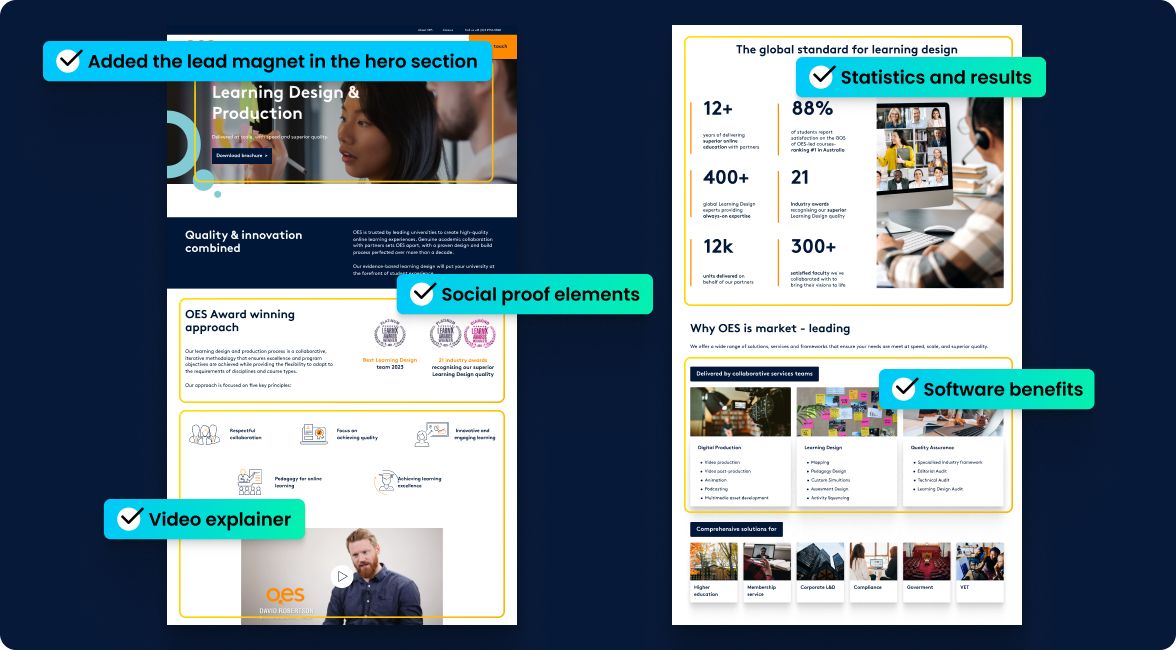
Basically, our thought process is as follows:
| What We Saw | How We Improved It |
| No clear action above the fold | Introduced a prominent lead magnet in the hero section to capture intent immediately. |
| Overloaded navigation and unclear structure | Simplified menu pathways and clarified service categories to reduce cognitive load. |
| Weak visible trust signals | We integrated statistics and social proof to reinforce authority. |
| Low engagement drivers | Added a video explainer and clearer benefit summaries to improve clarity at a glance. |
As a result, OES experienced a stronger engagement rate and a lift in conversion rate as well. More importantly, their website evolved from an online brochure into an asset that produces conversions repeatedly.
UX and UI for Apps and Software
In apps and software, UX and UI carry even greater weight because users interact with the product repeatedly, not just once. Every login, workflow, and dashboard interaction compounds the experience. If routine tasks require excessive clicks, frustration builds quickly, increasing churn and may turn off the user from using your app for good.
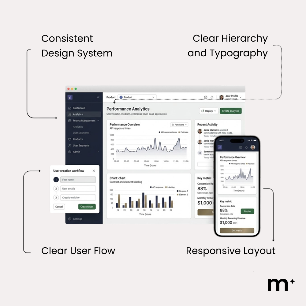
UX Best Practices in Software
- Prioritise the top 5 core user actions
- Reduce unnecessary steps in common workflows
- Surface critical actions immediately on login
- Break complex processes into logical stages
- Design mobile workflows intentionally
Once workflows are streamlined and friction is reduced, UI takes over to ensure those workflows are instantly understandable and easy to act on.
UI Best Practices in Software
- Make primary actions visually dominant through contrast and placement
- Use clear status indicators and feedback states
- Highlight priority data using hierarchy and spacing
- Ensure touch targets and buttons are easy to interact with
- Provide specific, helpful error and confirmation messages
When both follow best practice, users complete tasks faster, make fewer mistakes, and are far more likely to stay engaged long term.
How a UX and UI Design Process Works
A structured UX and UI process ensures design decisions are strategic, measurable, and aligned with commercial goals. Each stage builds on the last to reduce risk and improve performance.
Discovery and Research
Discovery and research establish the strategic foundation of the UX and UI process. This stage matters because design without evidence becomes guesswork.
While there are basic UX and UI heuristics that you can abide by to improve your website, nothing beats actual data. Data is gathered from multiple sources to ground decisions in reality.
In our own audits, we always start with GA4 exit reports to identify the three highest-drop-off pages, then overlay Microsoft Clarity recordings on them. We typically watch 30–50 sessions per page before touching a wireframe. For OES, this is exactly how we spotted that visitors were scrolling past the hero without engaging.
| Tool | Primary Use | Key Insight |
| Google Analytics / GA4 | Behaviour analysis | Drop-offs and user paths |
| Hotjar / Microsoft Clarity | Heatmaps and recordings | Attention and friction |
| Optimizely / CrazyEgg | A/B testing | Winning design variants |
Apart from tools that measure quantitative data, you should also use qualitative data from user interviews. Speaking to people who already use competitor platforms reveals friction points, unmet needs, and opportunities for differentiation
These inputs are synthesised into clear findings that guide design decisions. By the end of this stage, conversion goals are explicit, user risks are understood, and the team moves forward with shared clarity rather than speculation.
Information Architecture and User Flows
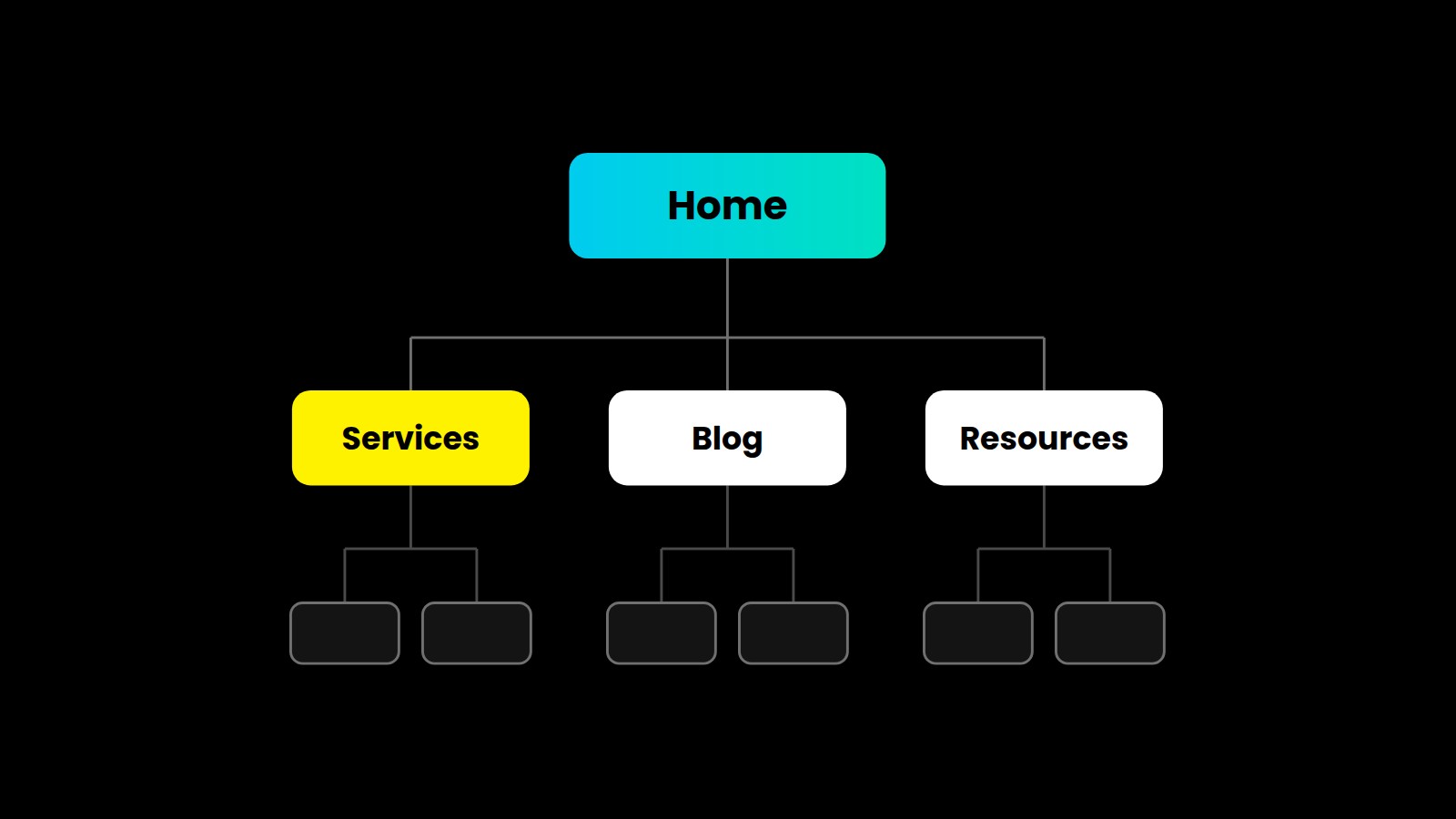
Once research insights are clearly defined, the focus shifts from understanding users to structuring the experience for them. Information architecture defines how content is organised across the site, establishing structure, hierarchy, and labels so users can quickly understand what exists and where to find it. At this stage, teams audit existing content, remove duplication, and group pages by user intent using clear, familiar language to reduce cognitive load.
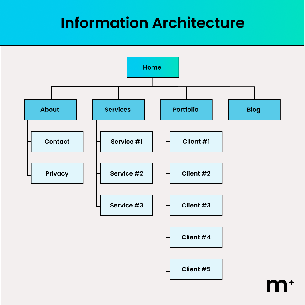
Meanwhile, user flows then bring that structure to life by defining the exact steps a user takes to complete a task. In the example below, the flow starts with a homepage visit, moves through product selection and add-to-cart, and guides the user through checkout, account decisions, and payment.
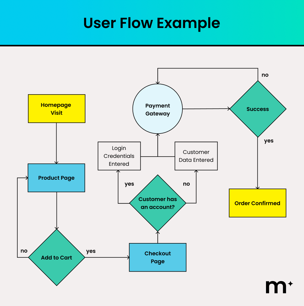
Each decision point highlights where users may hesitate or drop off. By mapping these moments visually, teams can surface key actions earlier, simplify decision paths, and remove unnecessary steps, making it easier for users to progress smoothly from intent to conversion.
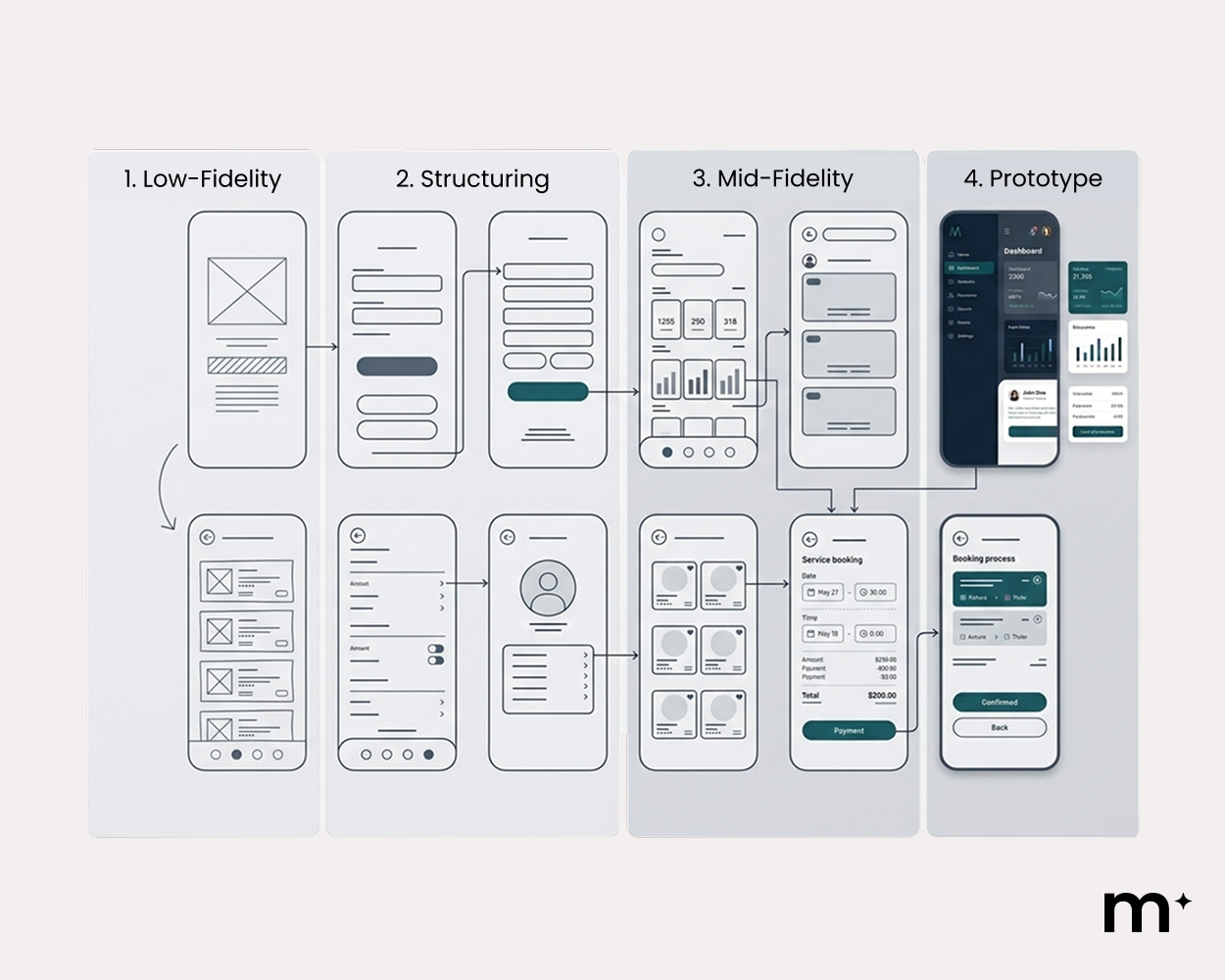
Wireframing and Prototyping
Once structure and pathways are clearly defined, the next step is to test how that structure works in practice. Wireframing and prototyping convert structure into usable layouts.
This stage is critical because visual design can mask structural problems. For example, we saw this recently with a Queensland retail client: on paper their checkout looked fine, but our prototype testing showed users forced to create an account before paying. 4 of the 6 testers abandoned at that exact screen. Removing forced registration was a one-day fix that recovered those sales. There are many reasons users abandon their carts, and I think you want to be well aware of them.
Visual Design and Interface Development
Once layouts and user flows have been validated, the focus shifts from structural logic to visual communication. Up to this point, the work has been predominantly UX driven. Now UI takes over to ensure that the structure is communicated instantly and intuitively through visual cues.
First, visual hierarchy is established by:
- Giving the most important message the largest size
- Using stronger contrast to signal priority
- Adding more space around high-value elements
- Positioning primary calls to action prominently
- De-emphasising supporting content through smaller scale and tighter spacing
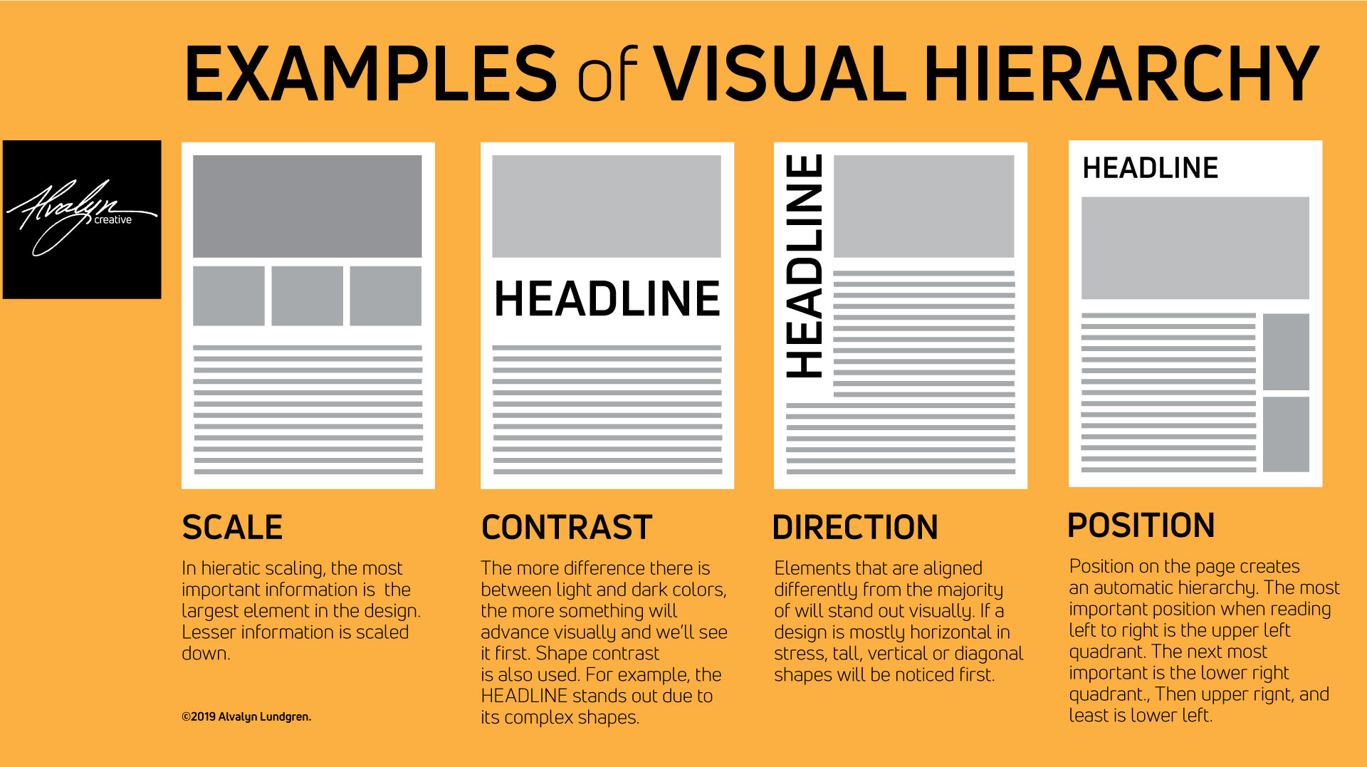
Source: Alvalyn.com
Without this step, even well-structured workflows can feel confusing, inconsistent, or unpolished.
Colour psychology also acts as a shortcut in interface design. Because certain colours are widely associated with specific emotions or actions, designers can communicate meaning instantly without relying on extra words.
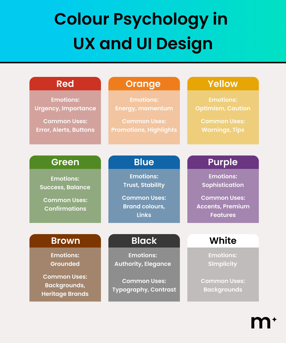
A red “Delete Project” button immediately signals caution. A green “Order Complete” message communicates closure. A bold primary-coloured “Submit Application” button tells users this is the next important step. Designers use these visual cues so the interface explains itself without paragraphs of instruction.
Continuous Improvement After UX and UI Design
Once UX and UI design are in place, the work does not stop. The next phase involves testing, analytics, and optimisation. Focus on measuring actual user behaviour and refining the interface based on evidence, not assumptions.
For our retainer clients, we run a structured optimisation cycle: monthly heatmap reviews, quarterly A/B tests, and an annual full UX audit. On our own site, changing a single button label from ‘Submit’ to ‘Get My Free Session’ lifted click-through by 35%. Small changes, measured properly, compound.
If your website or software is underperforming, improving UX and UI design is often the most impactful place to start. Small, well-informed changes can unlock meaningful performance gains. Contact us to discuss your next digital evolution and turn your online presence into a high-performing growth asset.