Why sign and stall design are important?
In the dynamic and competitive world of local markets and conventions, the visual appeal of your stall is much more than mere aesthetics; it’s a critical component of your business strategy and one that will significantly impact your sales.

Market signs and display stands are powerful tools for attracting customers and boosting sales. An effectively designed sign can capture the essence of your brand and catch the eye of potential customers, while a well-organised display stand can significantly enhance the overall shopping experience.
This guide delves into the nuances of creating impactful market signs and stands that will make your stall the most successful in your marketplace.
Research your audience and marketplace
The foundation of effective stall design lies in understanding your audience and the environment in which you operate. Who are your customers? What are their preferences, and what attracts them? These questions are pivotal in shaping your design and copywriting approach.
Additionally, the location and setting of your stall, whether indoor or outdoor, in a quaint local market or a bustling urban bazaar, significantly influence your design choices. Each environment presents unique challenges and opportunities to maximise visibility and appeal.
Tips for conducting market research
- Discover what your audience likes: Think about what visuals stimulate your audience and what sort of colours and products would attract them to your stall.
- Research your market location: Consider signs and displays that will be suitable to the location and vibe of the market. Essentially, what will set you apart from the other stalls?

How to design an effective market sign
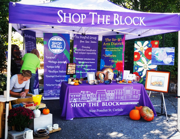
At the heart of your stall’s visual appeal is the market sign. An effective sign is a blend of visibility, readability, and branding. A minimalistic approach can be remarkably effective, focusing on one or two key elements, such as your logo accompanied by a compelling offer or a significant discount.
This approach not only makes your sign stand out but also communicates your message clearly and directly. For instance, a sign that boldly announces “50% OFF” immediately draws attention and differentiates your stall from others.
Remember, readability is crucial. Ensure high contrast between colours and use sufficiently large text. Many often overlook this step, which is vital for effective communication.
Tips for eye-catching sign design
- Use contrasting colours: Employ contrasting colours for the background and text to enhance readability from a distance.
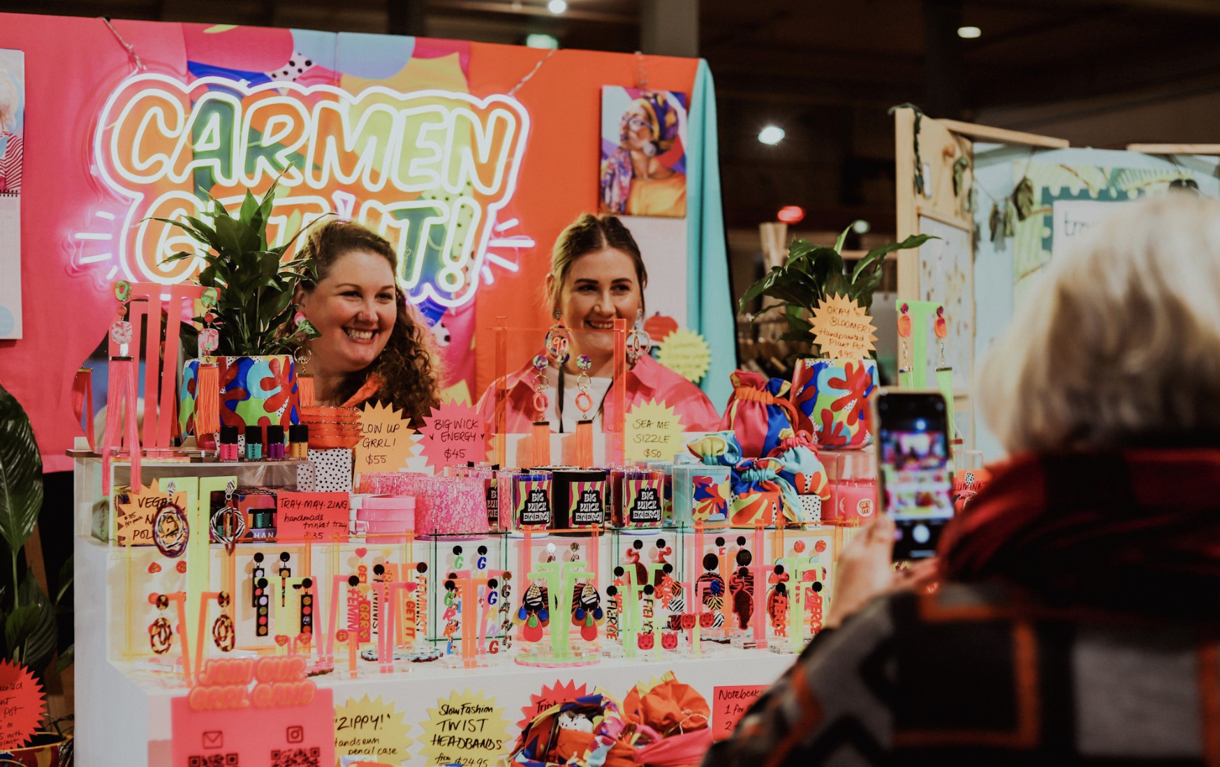
- Have brand consistency: Incorporate your logo and brand colours to create a consistent and recognisable identity.
- Simplicity of the message: Keep your message concise and to the point. If relevant, include a key benefit or a compelling offer in your market sign.


How to select the right display stands
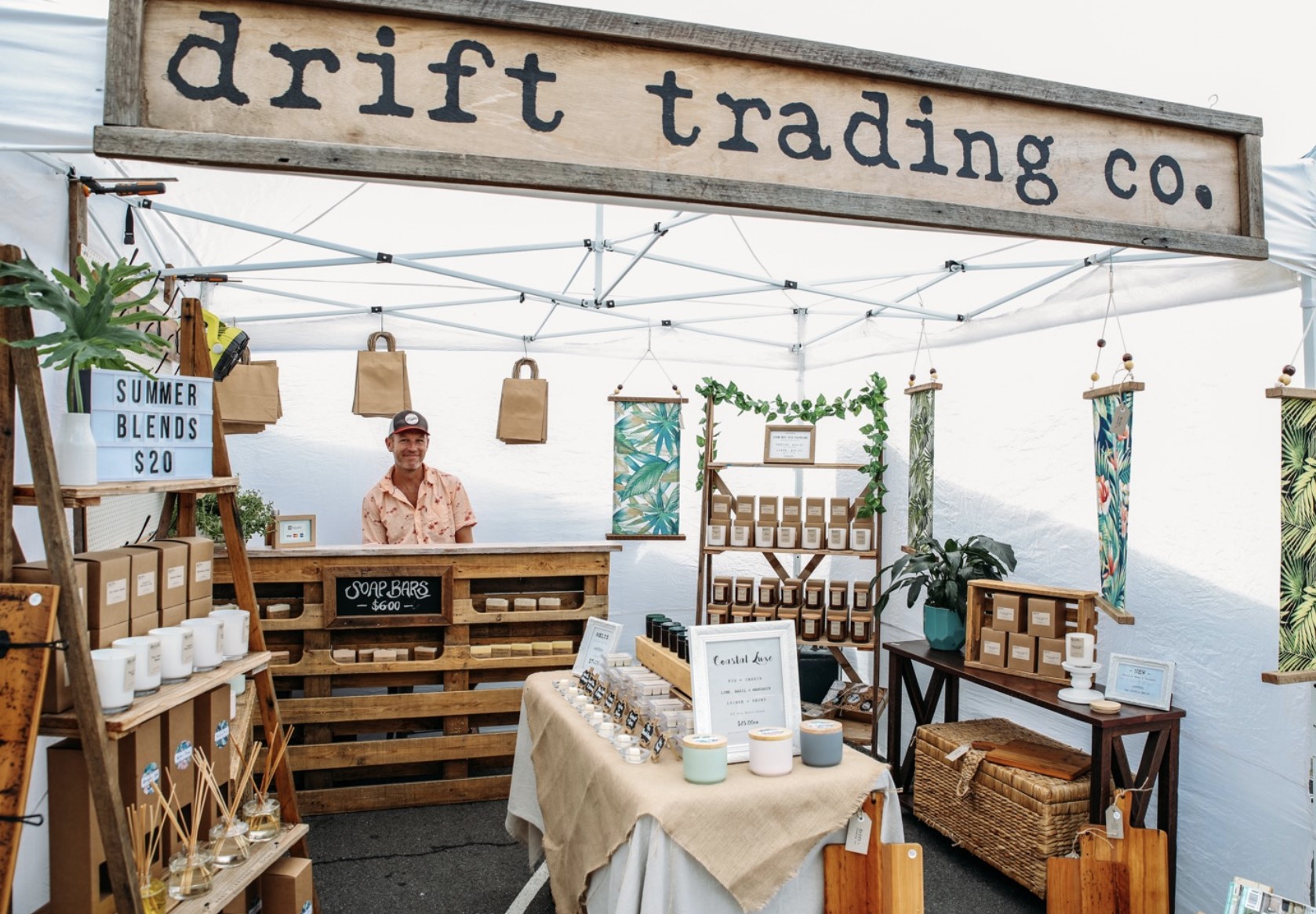
Choosing the right display stands is as crucial as designing your market signs. Your options range from classic wooden stands, ideal for artisanal or organic products, to contemporary metal or adaptable collapsible models, which suit a modern, sleek product line. It’s essential to select materials that complement your products. For instance, if you’re selling handmade jewellery, a rustic wooden stand can enhance the natural beauty of your items.
If there’s a mismatch, tasteful decorative additions like colourful fabric or themed ornaments can improve their display. A stand that’s easy to pack and adorned with creative decorations boosts not only aesthetic appeal but also lends a unique character to your stall.
Tips for making your stand unique
- Customisation: Personalise your stand with unique decorations or themes that reflect your brand’s personality.
- Product visibility: Arrange your products strategically to maximise visibility and accessibility.


How to brand your stall design
Your stall is a physical representation of your brand. Consistent use of brand colours, logos, and themes across your stall creates a cohesive and memorable customer experience. This brand consistency is key to building recognition and customer loyalty.
Going to the markets as a seller is about creating an environment that resonates with your brand’s ethos and leaves a lasting impression on your customers.
Essential tips for stall setup
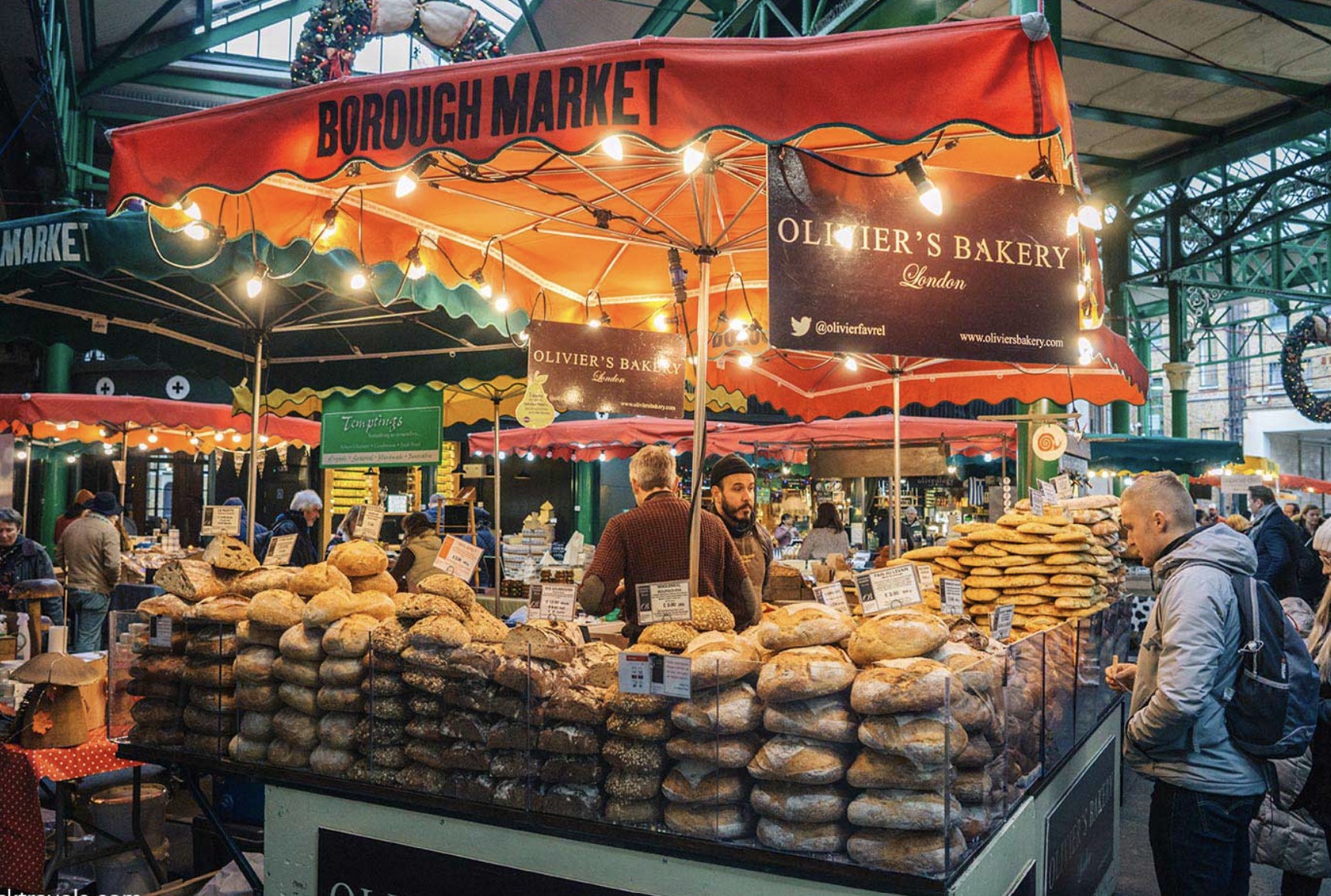
An effective stall setup requires careful consideration of product organisation, lighting, and spacing. Arrange your products in a way that allows for easy navigation and access. Adequate lighting enhances product appeal, while thoughtful spacing ensures a comfortable and safe shopping experience.
Stall setup tips and tricks
- Customer flow: Design your stall layout to guide customers smoothly through your products, avoiding congestion.
- Safety first: Ensure a secure shopping environment with clear walkways and stable structures for the safety of customers and staff.
- Product display: Arrange your products at different heights for visibility. Highlight key items to catch customer attention.
- Make products shine: Enhance the appeal of your products by ensuring they are clean and shiny.
- Pleasant scents: Use subtle, pleasing scents to create a memorable shopping experience.

Conclusion
This guide highlights the essential role of well-crafted market signs and display stands in drawing customers and enhancing their shopping journey. Every detail, from the style of your sign to your stall’s arrangement, must be carefully chosen to reflect your brand’s identity. Be willing to try new ideas and adjust your strategy according to the market’s trends and customer feedback.
The marketplace is always evolving, and your stall should too. Staying flexible and responsive to what your customers want and need is crucial for keeping your stall relevant and attractive in the lively, ever-changing market scene.


