For Marketing Leaders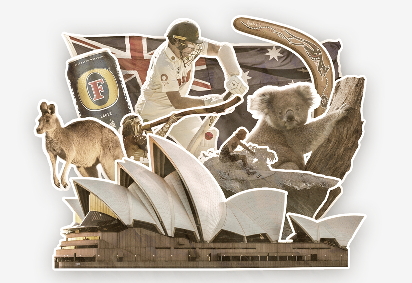
Most articles about Australian icons are written for tourists and quiz writers. This one is written for the person deciding whether a kangaroo, a wattle or a stretch of coastline belongs anywhere near their brand.
One of our offices is based in Cairns, which means we work at the doorstep of the icons most of these lists celebrate, the Reef, the Daintree, and the Far North. We also build brands for real clients across Australia and overseas. That combination has taught us one uncomfortable thing. “Australian” branding mostly fails when it’s bolted on for flavour, and works only when it’s tied to a genuine strategic reason for being there. So instead of cataloguing every koala and surfboard, this guide answers the question a Head of Marketing actually has. Should our brand use an Australian element at all, and if so, which one and why?
Why brands reach for Australian icons in the first place
National iconography is a shortcut to meaning. A kangaroo signals pride and energy before anyone reads a word. A surfboard says freedom and lifestyle. The Southern Cross says “home” to a domestic audience and “exotic” to an export one. In a crowded market, that instant recognition is genuinely valuable, because it compresses a brand story into a single recognisable cue.
But a shortcut is not a strategy. The same instant recognition that makes these cues powerful also makes them generic. If a symbol means “Australia” to everyone, it rarely means you to anyone. The job isn’t to decide whether Australian icons are good or bad. It’s about knowing when the national association is your actual proposition and when it’s just decoration.
The test, should an Australian element be in your brand at all?
Before reaching for an icon, we put four questions to a client.
- Is “Australian-ness” part of the proposition, or just the postcode? A business that happens to be in Australia is different from a business whose Australian-ness is the reason customers choose it.
- Who’s the audience, domestic or export? Australian cues often read very differently at home than abroad, more on that below.
- Does the cue differentiate, or does it converge? If three competitors already use a kangaroo, a fourth roo makes you part of the wallpaper, not distinct from it.
- Is there legal or cultural risk attached? Some symbols are protected. Some belong to living cultures. Both carry real downside.
If the icon survives all four questions, it earns its place. If it doesn’t, it’s flavour, and flavour is the first thing that makes a brand look derivative.
A few icons, and what they actually signal
Here’s how we read some of the most reached for cues, not as definitions, but as branding decisions.
The kangaroo, the most over reached for cue in the country. It signals national pride instantly, which is exactly why it rarely differentiates. Qantas already owns the most famous roo in the market, and a generic kangaroo logo tends to read as a derivative of it rather than a brand in its own right. We use it only when the national association is the proposition.
For our client Kangaroo Gifts, an Australian souvenir business, the kangaroo isn’t decoration, it’s the entire point, so leaning in is authentic and earns recognition immediately. For most other businesses it’s a cliché to avoid. One thing worth knowing is that a plain kangaroo isn’t legally protected. What is off limits is the full Commonwealth Coat of Arms and the Australian flags, which can’t be registered as trade marks at all, and goods bearing the Coat of Arms can’t even be imported. So the risk with a roo is dilution, not illegality, while the risk with the Coat of Arms is both.
The koala and native wildlife, softness and conservation. Where the kangaroo reads as strength and energy, the koala reads as gentleness, care and environmental responsibility. That makes it a fit for eco tourism, conservation linked brands and family facing products, and a poor fit for anything that needs to look fast, premium or serious.
The personal brand, what a well built one teaches. Australia’s most durable personal brands are a masterclass in consistency. The reason a figure like the late Steve Irwin became shorthand for Australian wildlife wasn’t fame alone. It was an unmistakable, repeated identity, the same energy, the same look, the same message, every single appearance. That’s the transferable lesson for brand building, and it’s a more useful one than “borrow a celebrity’s reputation.” The strongest personal brands win through relentless consistency, not novelty, and so do the strongest company brands.
Place and landmark, the Southern Cross, Uluru, the coastline. Locational cues anchor a brand to a region and work hardest for tourism, hospitality and “made here” products. They come with a caveat. Some places aren’t neutral scenery. Uluru is a sacred site, not a backdrop, and using it casually signals exactly the kind of cultural tin ear that costs trust. Anchor to place when place is part of your story, and know which places carry obligations.
Surf and beach culture, lifestyle, not geography. Billabong built a global brand by turning Australian surf culture into a complete identity system, where product, photography, tone and visual style all reinforced one idea. The lesson isn’t “use a surfboard.” It’s that a single cultural cue can carry an entire brand if every touchpoint commits to it. Strong fit for lifestyle, apparel and youth brands, weak fit for anyone whose audience doesn’t aspire to that world.
The export cue, selling “Australia” abroad. This is where Foster’s is instructive. It’s marketed as a quintessential Australian beer overseas, yet Australians themselves barely drink it. That’s not a failure, it’s a strategy. Foster’s sells a packaged idea of Australia to people who aren’t here. The lesson for exporters is that the version of “Australian” that resonates in London or New York is often not the one that resonates in Brisbane. Pick your audience first, then pick the cue.
Brands that build their identity around Australia
A handful of brands go beyond referencing Australia and make it the spine of their identity. Qantas ties itself to pride, distance and the emotional idea of home, so it reads as part of the national story, not just an airline. Vegemite leans into familiarity and nostalgia, proving cultural relevance can come from being unmistakably embedded in daily life rather than from being polished or aspirational. Kangaroo Gifts, at a far smaller scale, works for the same underlying reason, because the icon and the proposition are the same thing. In every case the icon amplifies a clear strategy. It never substitutes for one.
Using cultural and Indigenous icons responsibly
Working with organisations including James Cook University and the Queensland Government has taught us that cultural symbols carry weight, and that using them carelessly can cause real reputational damage.
Several icons that get casually dropped into “Aussie” branding, the boomerang, the didgeridoo, Uluru, Aboriginal art motifs, belong to living cultures and communities. They are not free to use design assets. Before any client reaches for Indigenous imagery, we ask the harder questions. Is there a genuine connection? Has the right community been consulted? Does this celebrate, or does it appropriate? There’s a commercial layer too. Beyond the cultural risk, protected national symbols like the Coat of Arms and the flags carry direct legal exposure. Done well, cultural relevance builds trust. Done lazily, it erodes it, and a sceptical audience notices the difference instantly.
So, should your brand use an Australian icon?
A kangaroo or a wattle is shorthand, not a strategy. Cultural cues amplify a clear brand. They cannot rescue an unclear one. The brands that get real value from Australian iconography start with positioning, then decide whether a national element genuinely belongs in the story, and they’re willing to walk away from the obvious cue when it doesn’t differentiate. That discipline is the difference between a brand that earns its place in the Australian story and one that borrows a costume it can’t carry.
Sources
- IP Australia, What can’t be a trade mark
- IP Australia Manuals, Examining trade marks containing national symbols (reg 4.15 and s39)
- Department of the Prime Minister and Cabinet, Guidelines on the use of the Commonwealth Coat of Arms