For Marketing Leaders
Did you know that web visitors form an opinion about your website in just 0.05 seconds? Before they read a headline, click a button, or even scroll, they have already decided whether your site is worth their time. That first impression shapes everything that follows, which is why using best-practice web design is critical.
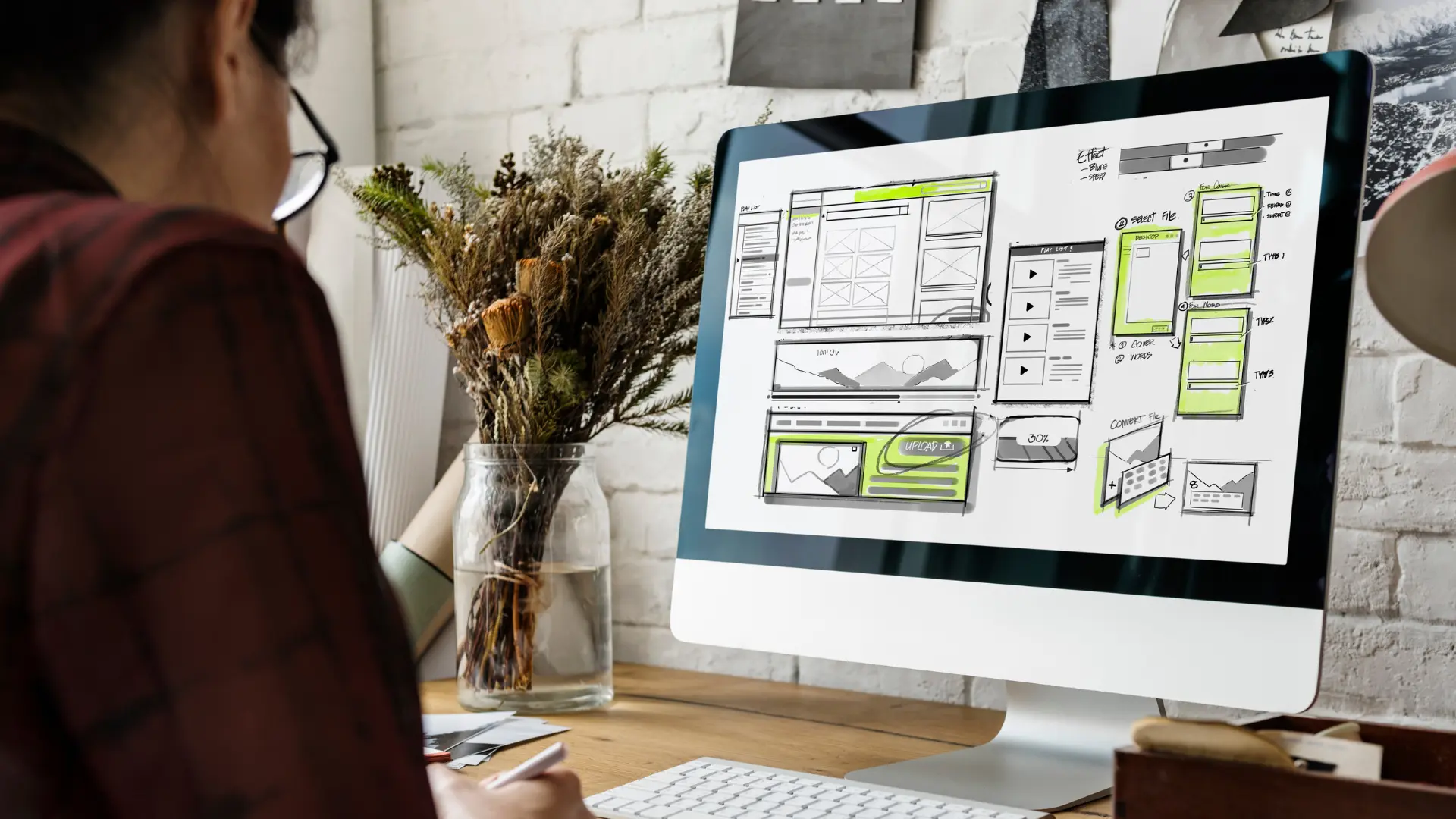
But the best practices are not one-size-fits-all. Every visitor arrives with a specific goal in mind, whether they are researching, comparing options, or ready to act, and what defines “good design” is how well your website aligns with that goal. At our agency Mindesigns, our goal is to create websites that are not only visually appealing but strategically built around user intent. If you were looking for expertise on this specific topic, you found it.
In the next section, we’ll break down the different types of user behavior and how they relate to the buying journey, giving you a clearer framework for designing your website with intent in mind.
What is User Behaviour in Web Design?
User behaviour in web design refers to how visitors interact with your website based on their intent, while keeping in mind what stage of the buying journey they are in.
Every interaction, from clicking a button to leaving a page, is driven by what the user is trying to achieve in that moment. Some users are looking for answers, others are comparing options, and some are ready to act. Understanding this behaviour is what allows you to design experiences that feel intuitive, relevant, and easy to navigate.
Broadly, user behaviour can be categorised into four key types:
- Transactional (Decision stage) – Ready to take action
- Commercial / Comparative (Consideration stage) – Evaluating and comparing options before deciding
- Informational (Awareness stage) – Researching and learning about solutions
- Navigational / Local (Varies) – Finding a brand, a specific page, or a known service in a location
Each of these behaviours requires a different design approach in most cases. Not all intents can be catered by the same landing page layout. However, a website should still strategically be built to serve all users.
To better understand what we should be designing, or improving, we can use heatmaps and session recordings, where interaction directly shape how people navigate your site:
| Intent Type | Typical Behaviour (Heatmaps & Recordings) |
| Informational | Users scroll, scan headings, and click internal links to explore topics |
| Commercial / Comparative | Users review pricing and features, compare options, and revisit key pages like testimonials and FAQs |
| Transactional | Users focus on CTAs, with minimal scrolling and direct interaction toward taking action |
| Navigational | Users go directly to menus, search, or contact details to quickly find specific pages or confirm relevance |
These patterns highlight a key insight. Users do not behave the same way, and your design should not treat them as if they do. High-performing websites are built to adapt to these behaviours, guiding users naturally based on their intent.
The Evolution of User Behaviour
To understand how users behave today, it helps to look at how that behaviour has evolved. As the internet has matured, users have shifted from curiosity to efficiency, becoming faster, more selective, and more outcome-driven.
In the 1990s and early 2000s, users were more patient and exploratory. They spent time navigating websites and learning how they worked. As familiarity increased, expectations began to rise. Research shows that users perceive responses under 0.1 seconds as instant, while delays beyond 1 second start to interrupt their flow and reduce engagement.
By the 2010s and into the 2020s, smartphones, apps, and social media reshaped user behaviour entirely. Today, 79% of users skim web pages, while only 16% percent read content word for word. This means decisions are made within seconds, as users quickly judge whether a website is relevant, trustworthy, and easy to use, and leave immediately if it is not.
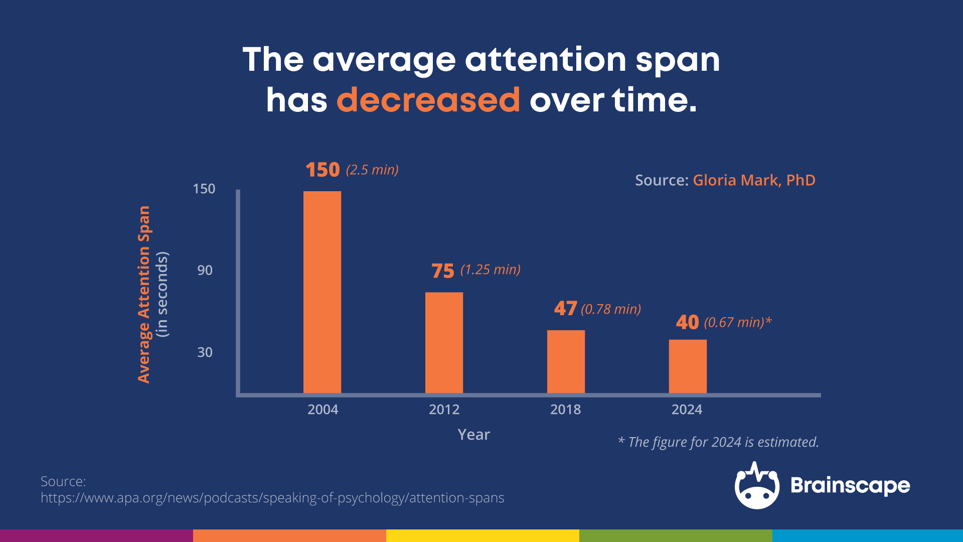
Attention spans have also declined significantly over time. Research indicates that average focused attention has dropped from around 150 seconds in the early 2000s to under 50 seconds today. This reflects a broader shift in how users process information, with constant exposure to fast, bite-sized content training users to filter quickly and move on just as fast.
A good way to think about this is that you are not competing for attention, but against distraction. If your website does not communicate value clearly and immediately, users will not stay long enough to figure it out. Design should prioritise clarity, speed, and relevance from the first interaction.
Best Practices by Target User Behaviour
Best-practice web design is not one-size-fits-all. Different users have different goals, and your design needs to respond accordingly. The following principles break down how to design effectively based on specific types of user behaviour.
1. Informational Intent
At this stage, users are learning. For example, someone searching “how to create a website” is trying to understand the fundamentals before taking any action.
Users in this stage are not ready to act yet. They are building understanding and forming early impressions. The goal is to guide them toward pages that help them learn and move closer to a decision.

Most popular pages and elements designed for education and discovery, include:
- Homepage
- Blog articles
- Resource hubs
- Guides and tutorials
- FAQs
Strong design makes content easy to find and consume. It breaks down information, supports fast scanning, and guides users naturally to the next step.
2. Commercial/Comparative Intent
At this stage, users are evaluating and comparing their options. For example, someone searching “best web hosting services” or “WordPress vs Shopify” is trying to understand which option is right for them and justify their decision. What they need is clarity. If they cannot quickly understand what you offer, and how it compares, they hesitate and bounce.
If users are comparing options, make those comparisons obvious. Use clear layouts that highlight differences, value, and outcomes without requiring users to piece things together themselves or overthink about their options, less info in many cases is better.
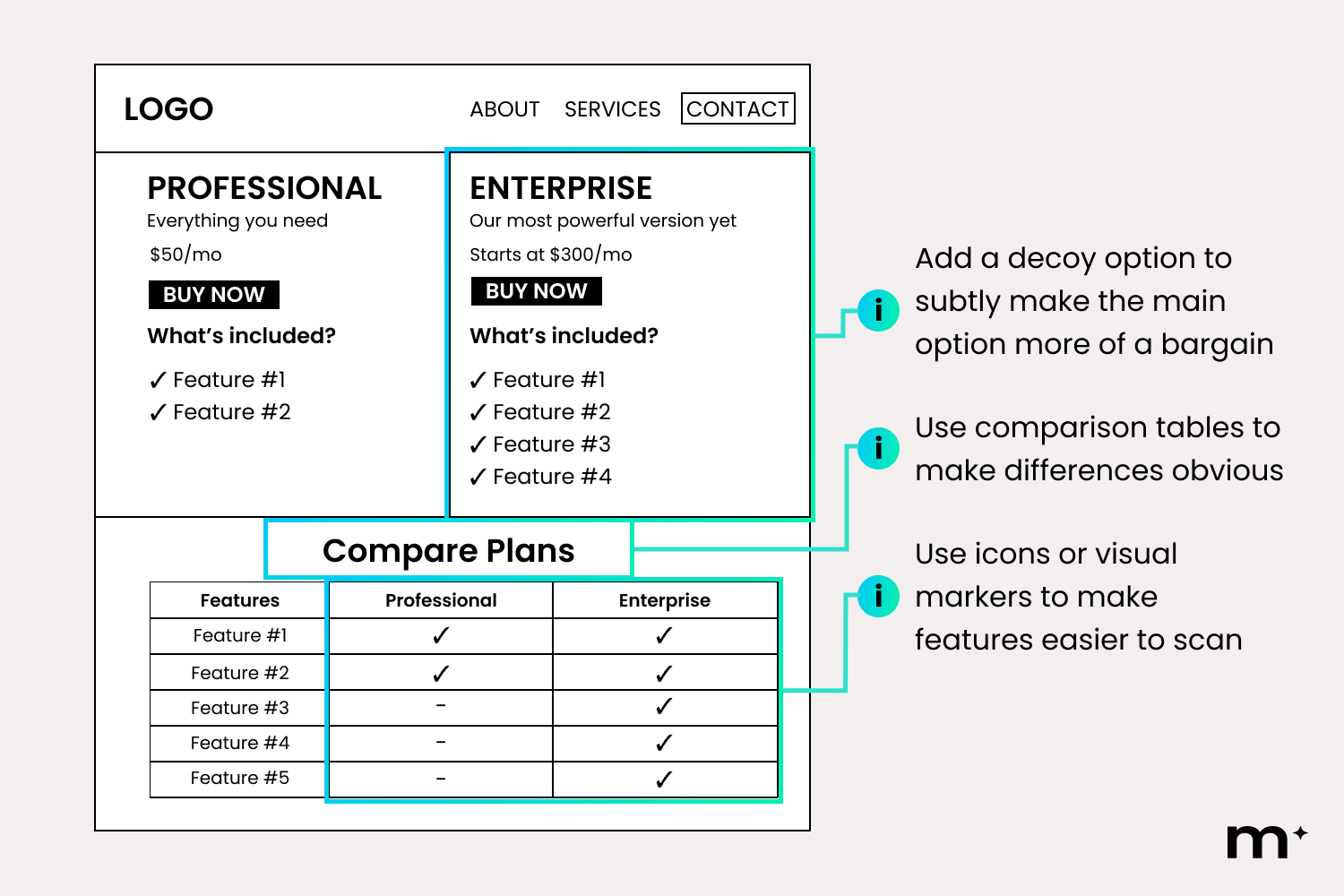
Commercial intent is most common on pages designed for exploration and decision-making, such as:
- Services pages
- Features pages
- Product overview pages
- Pricing pages
- Comparison blogs pages
As a rule, if users are unsure, simplify. Break down information into clear sections, highlight what matters most, and make differences easy to understand. If users need to compare, guide that process. Reduce effort, reduce doubt, and make the best choice feel obvious.
3. Transactional Intent
At this stage, users are ready to take action. For example, someone searching “website builder free trial” is looking for immediate access, not more information. What they need is a clear, direct path forward. Any distraction, whether it is competing links, excessive content, or unclear messaging, creates hesitation.
This is especially critical in how you design your primary action. If the CTA is a button, it needs to stand out visually and feel immediate.
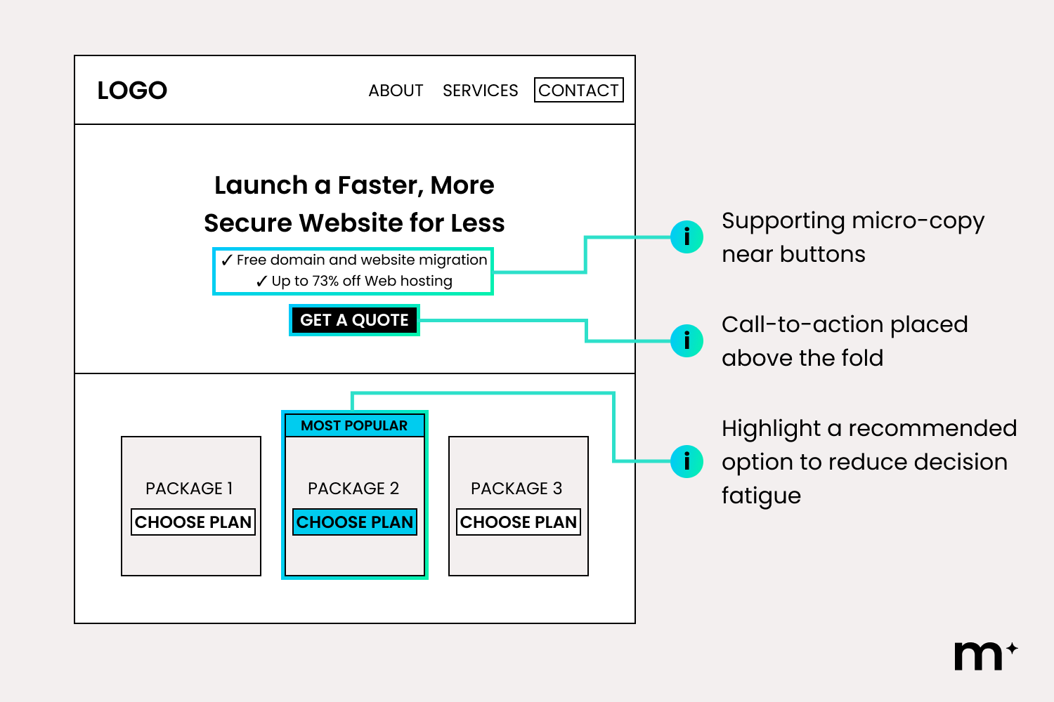
Reassure users by reinforcing credibility and reducing hesitation. This can be done through subtle social proof, as well as messaging that highlights how easy, low-risk, and reversible the action is, such as “no credit card required” or “cancel anytime.”
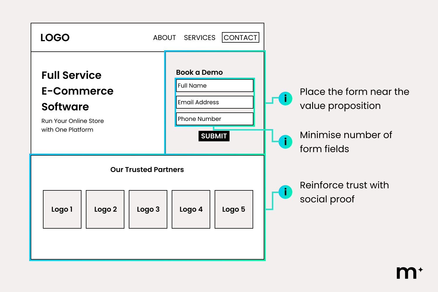
Transactional intent users are most interested with pages designed for immediate action, such as:
- Homepage
- Landing pages
- Sign-up or onboarding pages
- Free trial pages
- Contact us pages
As a rule, if users hesitate, simplify. Reduce the number of elements competing for attention, make the primary action visually dominant, and ensure the next step is always clear. If action requires effort, shorten the path.
4. Navigational Intent
At this stage, users are trying to find something specific. For example, someone searching for your brand or contact page already knows where they want to go, and who to contact.
The risk here is frustration. If users cannot find what they need quickly, they leave. The goal is to make navigation feel effortless.
Users at this stage are moving with purpose. They are not browsing, they are trying to get somewhere quickly. They already know what they want.
This is especially important for local businesses, where users are often trying to confirm location, service areas, or how to get in touch. If it is not immediately clear where you are based or who you serve, trust drops and users move on.
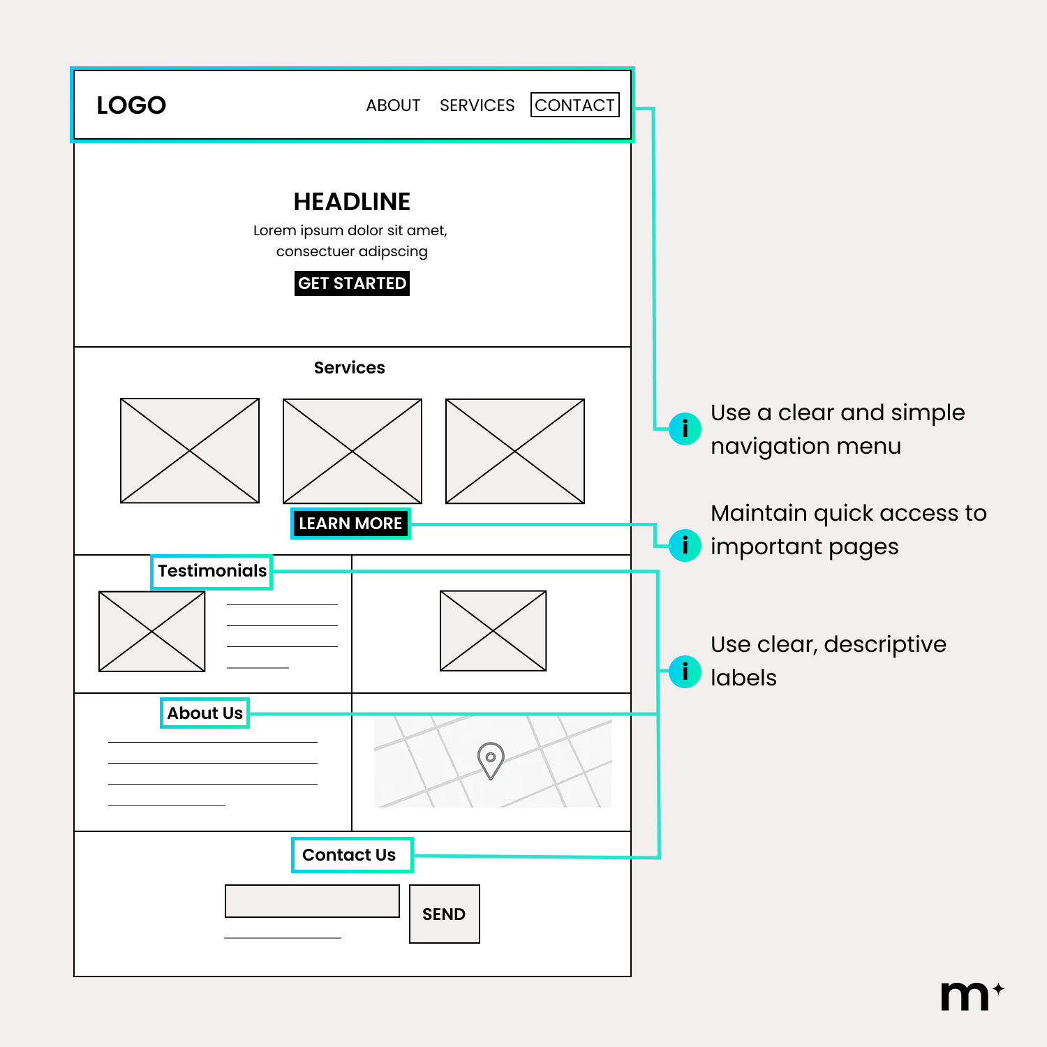
Your location and service area should be obvious at a glance. This can be reinforced through clear headings, visible contact details, and elements like maps or suburb references. Users should not have to work hard to confirm you are relevant to them.
These behaviours are most critical across key access points, such as:
- Main navigation menus
- Product pages
- Contact pages
Strong design removes friction by making structure predictable and paths obvious. It ensures users can find what they need instantly, while clearly reinforcing who you are, where you are based, and how to take the next step.
Design Paths, Not Pages
As you start to understand how users move through your website, patterns become clearer. You begin to see where they hesitate, where they drop off, and where they move forward. These insights are not isolated. What you learn from one page often applies across your entire site.
Every element on your website should serve a purpose. Navigation, content, and design are not just there to fill space. They should exist to guide users toward a specific outcome. If something does not support that journey, it adds friction.
This intersection is what makes web design so powerful and, honestly, so enjoyable to get right. At Mindesigns, we bring creativity and data together to design websites that not only look engaging, but are strategically built to guide decisions. The result is a website that does not just look good, but performs with purpose.
If you are looking to improve how your website performs, get in touch with Mindesigns to see how we can help turn your site into a high-performing asset.
Reviewed by Santiago Parra Suarez