Marketers & Business Owners
Unlock the most powerful ways to improve website UX and boost both SEO and CRO performance.
This expert-backed article is packed with proven strategies, crafted with care by our dedicated team, to help you drive more traffic and convert leads like never before. Get ready for game-changing insights!
Why Improving Website UX Matters for Both SEO and CRO
Improving your website’s UX isn’t just a nice-to-have—it’s a game-changer for both SEO and CRO. Think of it like this: a website that’s easy to use keeps people sticking around longer, which sends all the right signals to search engines.
It’s not just about looking good; it’s about being smart with mobile-friendliness and accessibility too. These are the things that make Google smile, helping you climb those search rankings faster than your competition.
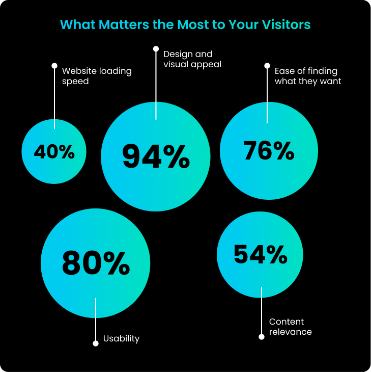
Now, when it comes to conversions, a slick UX is like rolling out the red carpet for your visitors. Smooth navigation, quick load times, and a trustworthy design make all the difference. Add a touch of personalisation, and suddenly, you’re not just getting clicks—you’re turning them into loyal customers.
By zeroing in on these elements, you’re not just building a better website; you’re building a better business.
Simple Actionable Strategies and Tips to Improve Website UX
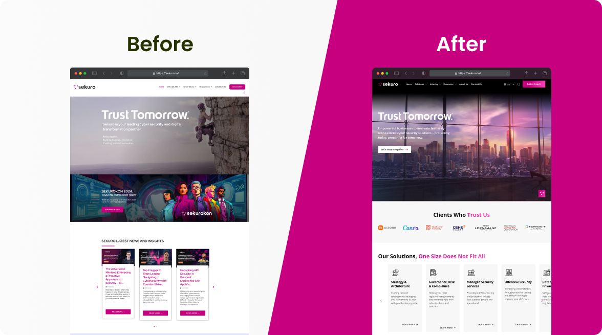
1. The Hero Section: First Impressions Matter
Your hero section is the opening act, the first thing visitors see when they land on your website. It sets the stage for everything that follows. If people are left scratching their heads about where they are or what you offer, they’ll be out the door before you can say “conversion.” The key? Clarity. Your hero section needs to nail three things: what you do, why it matters to them, and what action they should take next.

Make sure you’re hitting the right notes—grab their attention with a strong headline that speaks directly to their needs, follow it up with a value proposition that highlights the benefits of your service, and finish with a prominent CTA that guides them to the next step, whether it’s learning more, signing up, or making a purchase.
2. Social Proof: Credibility is King
Social proof is your best friend when it comes to building trust on your homepage. It’s all about leveraging the experiences of others to show new visitors that you’re the real deal. Whether it’s reviews, testimonials, or logos of big-name clients, make sure they’re front and centre. This kind of endorsement reassures potential customers that they’re making the right choice by sticking around.
To really pack a punch, think about adding video testimonials, real-world case studies, or even displaying the number of happy customers you’ve served. If you want to keep things fresh, live social media feeds or review widgets can add dynamic, up-to-date proof that you’re still delivering the goods.
3. UX Copy: Benefits Over Features
When it comes to writing copy for your homepage, it’s easy to get bogged down in features and the story of your brand. But here’s the thing—your visitors don’t care about features; they care about what’s in it for them. That’s why your focus should always be on the benefits and value your product or service provides.
So, instead of droning on about your software’s “advanced analytics features,” flip the script. Tell them how they can “gain actionable insights that drive smarter decisions and boost productivity.” It’s all about showing them the value, not just the bells and whistles.
4. Optimising for Mobile: Action-Oriented UX
Mobile isn’t just a second thought anymore; it’s often the first stop for many users. And here’s the kicker—mobile users are usually on the hunt for quick, actionable info. They’re ready to call, book, or buy. So, your mobile site needs to cut to the chase with concise text and CTAs that are easy to tap.

Shorten up the copy, streamline your CTAs like ‘Call Now’ or contact forms, and make sure they’re easily accessible on smaller screens. Don’t forget to put key info like your phone number or directions within easy reach—mobile users are often looking for just that.
5. Website Speed: Fast and Furious
Nobody’s got time for a slow website. If your pages take too long to load, users are going to bounce faster than you can blink, and that’s a big no-no for both UX and SEO. Start by trimming the fat—reduce image sizes (150KB max is a good rule of thumb) and stick to efficient formats like JPEG or WebP.
Your hosting service plays a crucial role here too. For those Down Under, servers like SiteGround, A2 Hosting, and WP Engine are known for their speed and reliability in Australia. If you’re serious about speed, consider a CDN to ensure your content gets delivered lightning-fast, no matter where your users are.
6. Clean and Coherent Design: Keep It Simple
A cluttered website is like a messy desk—it’s hard to find anything, and it’s downright stressful. Your goal is to guide users effortlessly through your content, and that means keeping things clean and coherent. Use plenty of white space, stick to a consistent colour scheme, and choose typography that’s easy on the eyes. Every element should have a purpose, whether it’s leading users to a CTA or making content easier to digest.
A minimalist approach doesn’t just look good—it helps users focus on what really matters, reducing cognitive load and making their journey through your site a breeze.
7. Authentic Imagery: Keep It Real
Your website’s images are more than just decoration—they’re a big part of how your brand is perceived. While stock photos might seem like an easy option, they often fall flat, making your site feel generic. Instead, invest in authentic, high-quality photos that show off your business, your team, and your products. Real images help create a connection with your audience, making your brand feel more relatable and trustworthy.
Authentic imagery can also tell your story or highlight your commitment to quality and company culture, adding depth to the user experience.
8. Targeted Messaging: Speak to Your Audience
One of the most effective ways to grab attention is by speaking directly to your target audience. Whether it’s in your hero section or key areas of your homepage, make sure you’re calling out the specific customers you want to reach. If your business caters to small business owners, your headline could be something like, “Empowering Small Businesses to Succeed Online.” This immediately signals to visitors that they’re in the right place and that your services are tailored just for them.
Targeted messaging doesn’t just capture attention—it makes visitors feel understood, increasing engagement and boosting the likelihood of conversion.
9. Simplified Navigation: Keep It Clear
Good navigation is the backbone of a great website experience. If users can’t find what they’re looking for, they’ll quickly move on. Keep your menu simple and intuitive, with clear labels that make it easy to navigate. A sticky menu that follows users as they scroll can also help them move around your site with ease.
Enhance navigation further with breadcrumbs, a search bar, and well-organised categories. The easier it is for users to find information, the better their experience will be.
10. Clear CTAs: Show the Way
Your CTAs should be more than just an afterthought—they’re the guideposts that lead users to take action. Make them clear, compelling, and easy to spot. Use action-oriented language like “Get Started,” “Download Now,” or “Contact Us Today” to tell users exactly what to do next. The design of your CTAs should stand out, with contrasting colours and ample whitespace to draw attention.
For mobile users, ensure CTAs are big enough to tap easily and positioned where they’re most likely to engage, such as at the bottom of the screen or within easy thumb reach.
11. Regular Testing and Feedback: Keep Improving
UX is never a one-and-done deal—it’s a journey of continuous improvement. Regularly test your website’s performance and gather user feedback to identify areas where you can do better. Tools like Google Analytics, Hotjar, and A/B testing are your allies here, offering insights into how users interact with your site and where tweaks are needed.
By staying on top of this, you’ll ensure your website remains user-friendly and effective, keeping pace with evolving user expectations and technology.
Common Mistakes to Avoid When Trying to Improve Website UX
1. Overloading the Hero Section
Cramming too much information into the hero section can overwhelm visitors and dilute your message. Keep it focused with a clear value proposition and a single, strong call to action.
2. Ignoring Mobile Optimisation
Failing to optimise for mobile can alienate a large portion of your audience. Ensure your site is responsive, with easy navigation and mobile-friendly CTAs that match mobile users’ needs.
3. Using Stock Photos Instead of Authentic Images
Relying on generic stock photos can make your brand feel impersonal. Invest in authentic, high-quality images that build trust and connect with your audience.
4. Cluttering the Design
A cluttered design can confuse and frustrate visitors, leading them to leave. Aim for a clean, minimalistic layout that highlights key content and makes navigation intuitive.
5. Focusing Too Much on Features, Not Enough on Benefits
Overemphasising features can miss the mark with users who care more about benefits. Shift the focus to how your product or service solves problems and adds value.
6. Neglecting Website Speed
A slow-loading site can drive users away before they even engage with your content. Optimise images, choose a fast server, and consider a CDN to ensure quick load times.
7. Not Testing and Gathering Feedback
Assuming your UX is perfect without testing can lead to missed opportunities for improvement. Regularly test and gather user feedback to keep your site effective and user-friendly.
8. Overcomplicating Navigation
Complex or unclear navigation can frustrate users and lead to higher bounce rates. Keep navigation simple, with clear labels and easy access to important pages.
9. Forgetting to Speak Directly to Your Audience
Generic messaging can fail to resonate with your target audience. Tailor your content to speak directly to the needs and desires of your ideal customers, making them feel understood and valued.
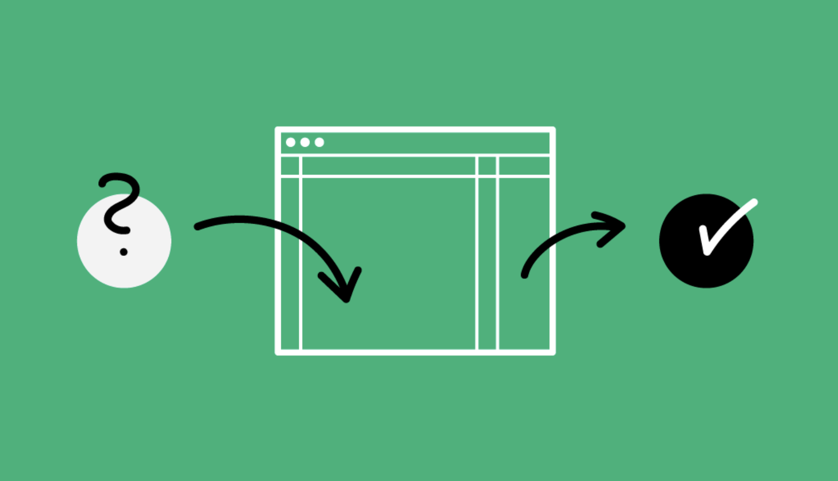
How User Feedback Can Help Improve UX Effectively
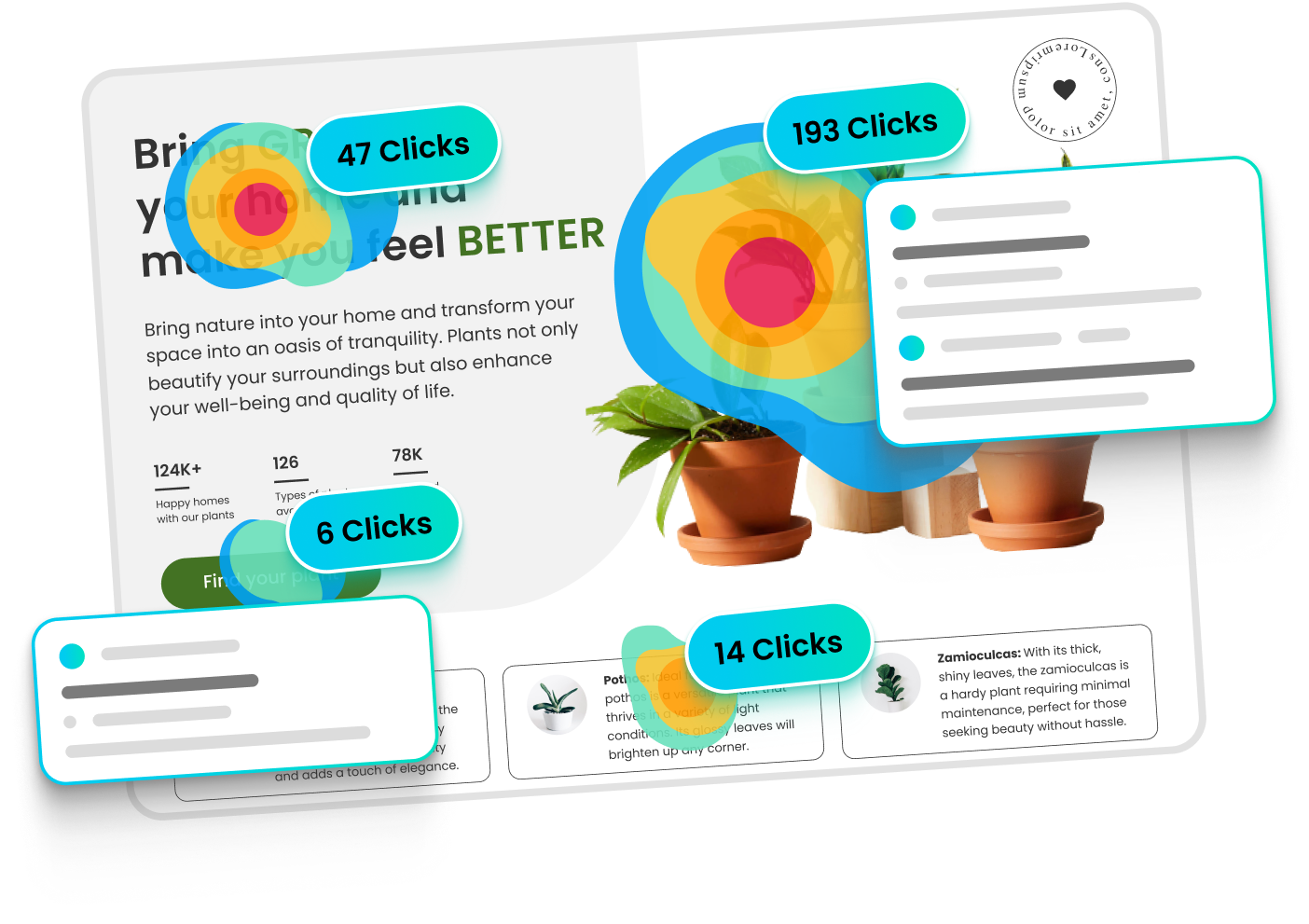
User feedback is one of the most valuable resources for enhancing your website’s UX. By directly engaging with your audience, you can gain insights into what works well and where improvements are needed.
Tools like Clarity and Hotjar are particularly useful for gathering this feedback. Clarity, a free tool from Microsoft, provides heatmaps and session recordings, allowing you to see where users are clicking, scrolling, and leaving your site.
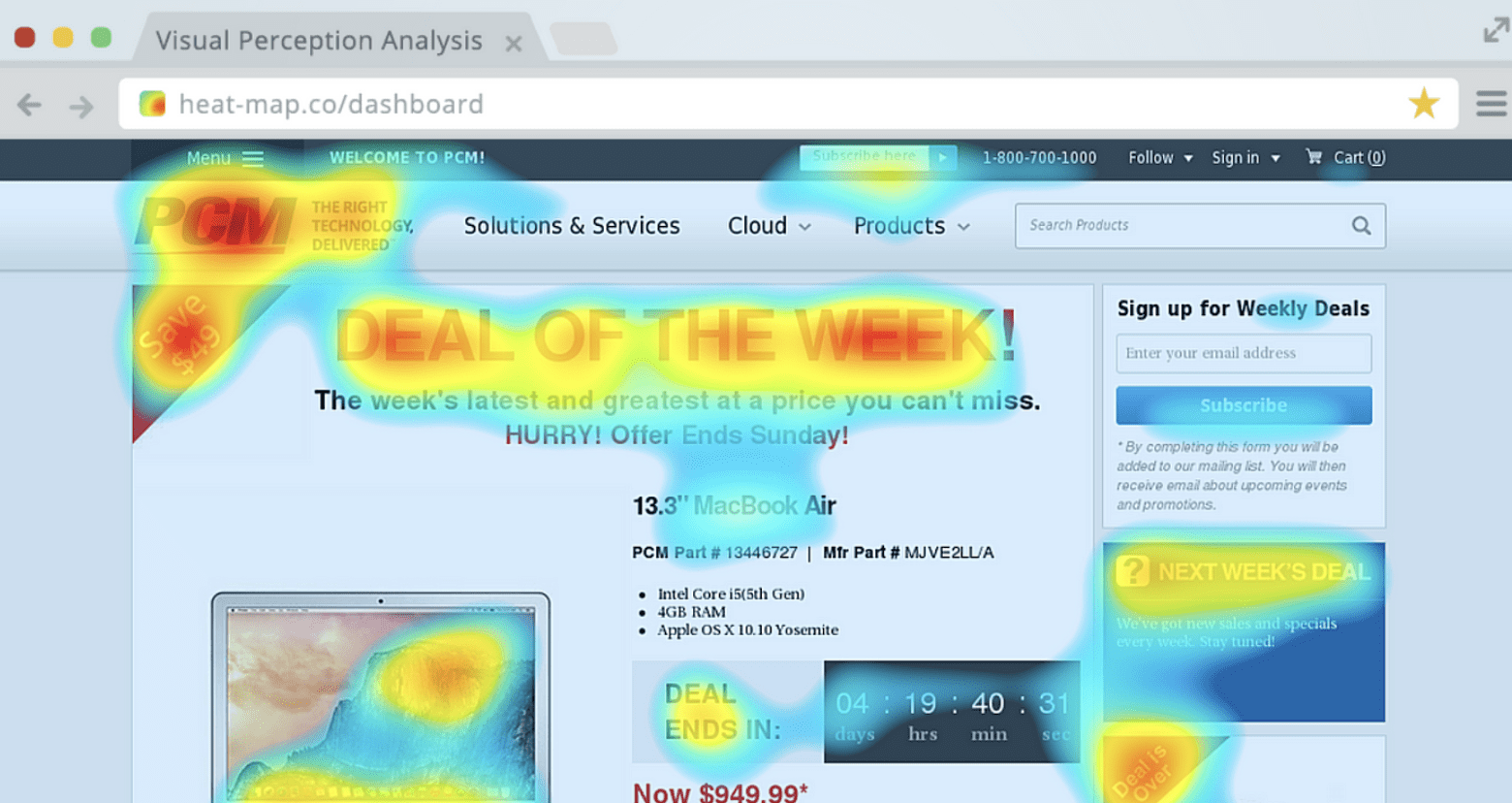
Hotjar offers similar features, along with on-site surveys and feedback polls that capture users’ thoughts in real-time.
When analysing user feedback, it’s important to identify both positive and negative signals. Positive signals include high engagement with key CTAs, smooth navigation paths, and feedback that mentions a seamless user experience.
Conversely, negative signals might include frequent drop-offs on crucial pages, confusion about navigation or content, and low interaction with important site elements.
By focusing on these signals, you can prioritise UX improvements that have the most significant impact, ensuring your site not only meets but exceeds user expectations. Regularly updating your site based on this feedback keeps it relevant and user-friendly, ultimately driving higher engagement and conversions.
Essential Website UX Tools
Here’s a list of essential tools that can help you enhance your website’s UX, along with a brief description of what they do:
Clarity – Provides heatmaps and session recordings to track user interactions and identify areas of improvement.
Visit Clarity
Hotjar – Offers heatmaps, session recordings, on-site surveys, and feedback polls to understand user behaviour and gather real-time feedback.
Visit Hotjar
Google Analytics – Tracks user behaviour, traffic sources, and other key metrics to provide insights into how users interact with your website.
Visit Google Analytics
Crazy Egg – Provides heatmaps, scroll maps, and A/B testing tools to help you optimise website design and improve user engagement.
Visit Crazy Egg
Optimizely – A powerful A/B testing and experimentation platform to test different versions of your site and improve conversion rates.
Visit Optimizely
UserTesting – Allows you to collect video feedback from real users as they navigate your site, offering direct insights into the user experience.
Visit UserTesting
Maze – A rapid testing platform that provides insights into your designs through usability testing, surveys, and user flows.
Visit Maze
Figma – A collaborative design tool that allows you to create, prototype, and share website designs with your team in real-time.
Visit Figma
Sketch – A vector-based design tool primarily used for UI/UX design, enabling you to create and prototype website designs.
Visit Sketch
InVision – A digital product design platform that helps you prototype, collaborate, and manage your design workflow effectively.
Visit InVision