If you’re experimenting with static images and video in your Facebook ads, get ready to take your efforts to the next level. Keep reading to learn why Facebook carousel ads are the secret weapon your PPC campaign is missing.
But first, let’s start with some basics.
What are Facebook carousel ads?
Facebook carousel ads are an advertising format on Facebook that allows advertisers to showcase multiple images or videos in a single, interactive ad unit. These ads appear in users’ Facebook News Feeds and Instagram feeds, and they are designed to engage viewers with a series of scrollable cards, each containing a different image or video.
The key features of Facebook carousel ads are:
Multiple Cards: Facebook carousel ads typically consist of two or more scrollable cards, with each card featuring a unique image or video. These cards can be presented in a horizontal or vertical format.
Headline and Call to Action (CTA): Each card can include a headline and a call-to-action button, allowing advertisers to provide context and guide users on what action they want them to take.
Linking Options: Advertisers can link each card to a specific landing page, product page, or website, depending on their campaign goals. This isn’t an option with single-image ads.
More Creative Flexibility: Facebook carousel ads offer creative flexibility, enabling advertisers to tell a better story, display a product catalogue, showcase different features, highlight customer testimonials, or deliver a longer sequence of messages.
Engagement Metrics: Same as with other digital ads, advertisers can track metrics such as clicks, impressions, click-through rates, and more to measure the performance of each card within the Facebook carousel ad.
Dynamic Ads: Facebook offers dynamic carousel ads, which allow advertisers to automatically show the most relevant products or content to each individual user based on their browsing behaviour and interests.
Placement Options: These ads can be shown not only on Facebook but also on Instagram, Audience Network, and even on Facebook Messenger, depending on the campaign’s settings.
What are the benefits of Facebook carousel ads?
Simply put, Facebook Carousel Ads could be the secret sauce your campaign is missing because they can deliver a more comprehensive and immersive experience. This translates into ads that are both more effective and cheaper.
While it’s true that Facebook carousel ads can have a lower CTR, they also have an average Conversion Rate that is 20% higher than single image ads and 25% higher than video ads.
In lay terms, this means that while they may get fewer clicks, the clicks they do get are higher-quality leads that are more likely to convert, which is what matters most at the end of the day.
But it doesn’t end there, Meta confirmed that “advertisers have seen carousel link ads drive 30 to 50 percent lower cost per conversion and 20 to 30 percent lower cost per click than single-image link ads.”
Basically, if you’re not using Facebook carousel ads, your business could be missing out on a great opportunity!
Now that we’ve covered the basics, let’s study some of the best Facebook Carousel Ads Examples.
Facebook carousel ads examples with good graphics
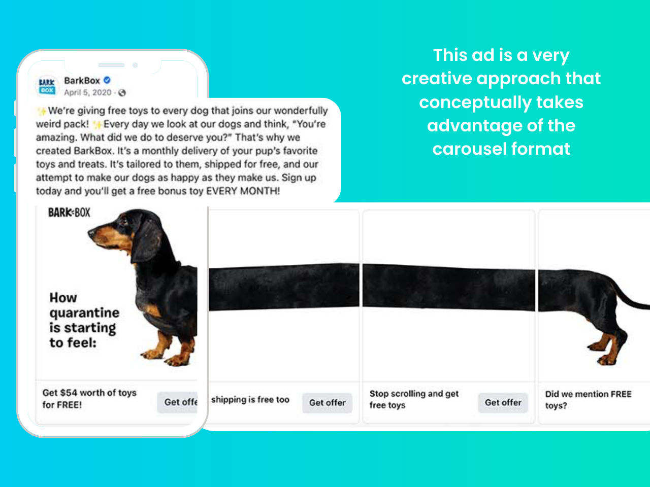
This ad from BarkBox is a great example of a creative and attention-grabbing use of images. While it may not give any extra information, the ad is fun and sure to grab their animal-lover audience’s attention because it’s not something you see every day. They are also very smart in the way they use the copy on the headline to joke and engage the audience so they’ll keep reading through the end.
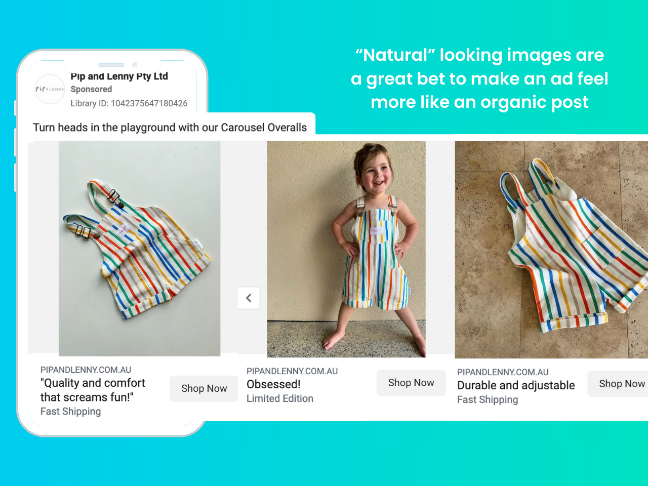
This ad uses lovely pictures that feel organic and showcase not only the product but the actual use of it. These are well-lit photos, with a great model, and they also let you see the details. At the same time, it feels like a photo a mom could take, and that’s the key to this ad’s success. “Natural” photos are more attention-grabbing than professional images that feel and look like ads. Not including copy in the images is another good way to make your ad feel more organic, as it reinforces the feeling of this ad being a regular post filled with just regular family pictures.
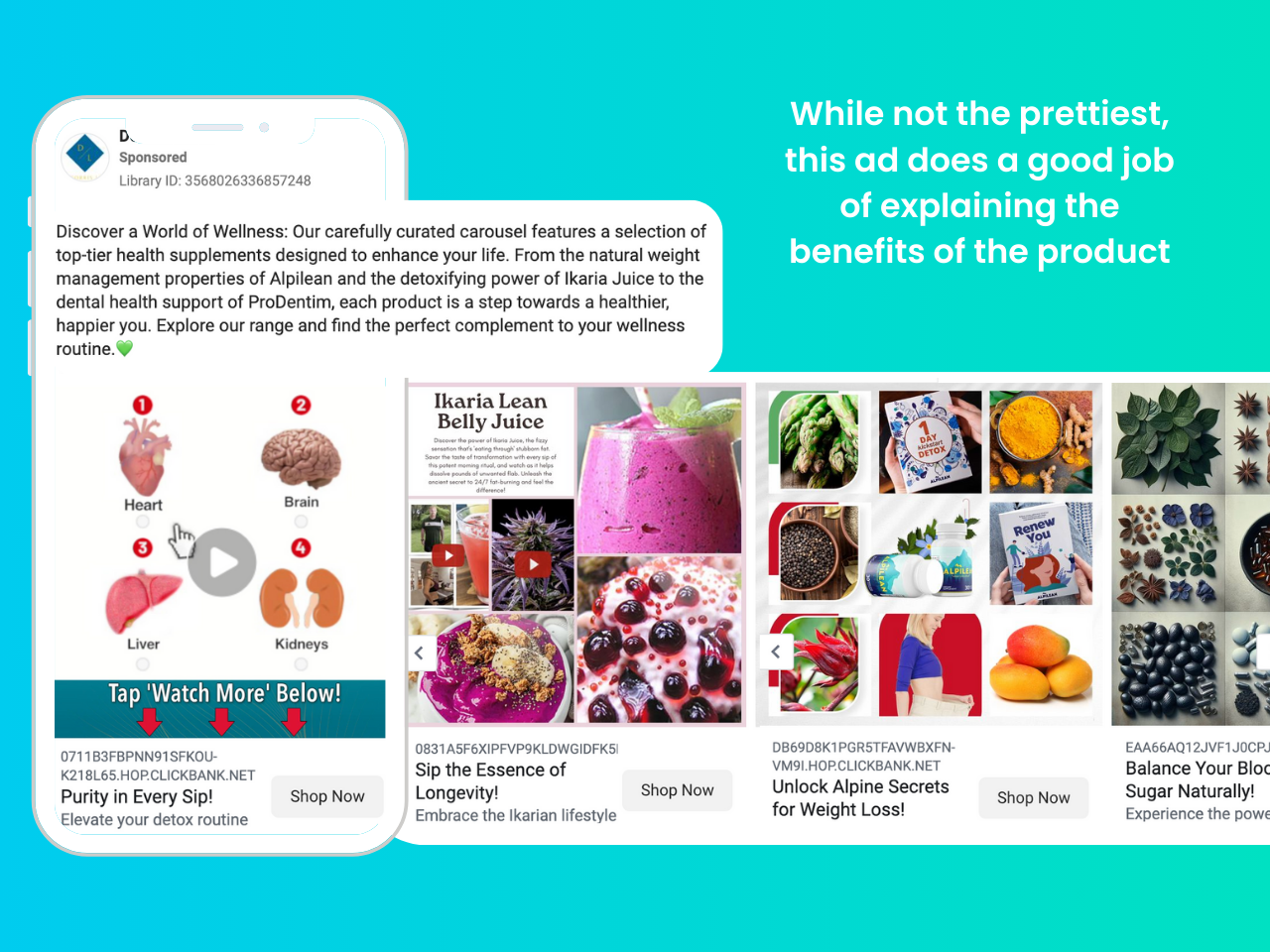
This ad uses a video on the first card of the carousel to get the reader’s attention, which is generally a great choice. Another good choice is that the explainer video showcases the benefits of the products being offered. Next, all the following cards support this same idea, making this an effective ad, despite not using the prettiest graphics.
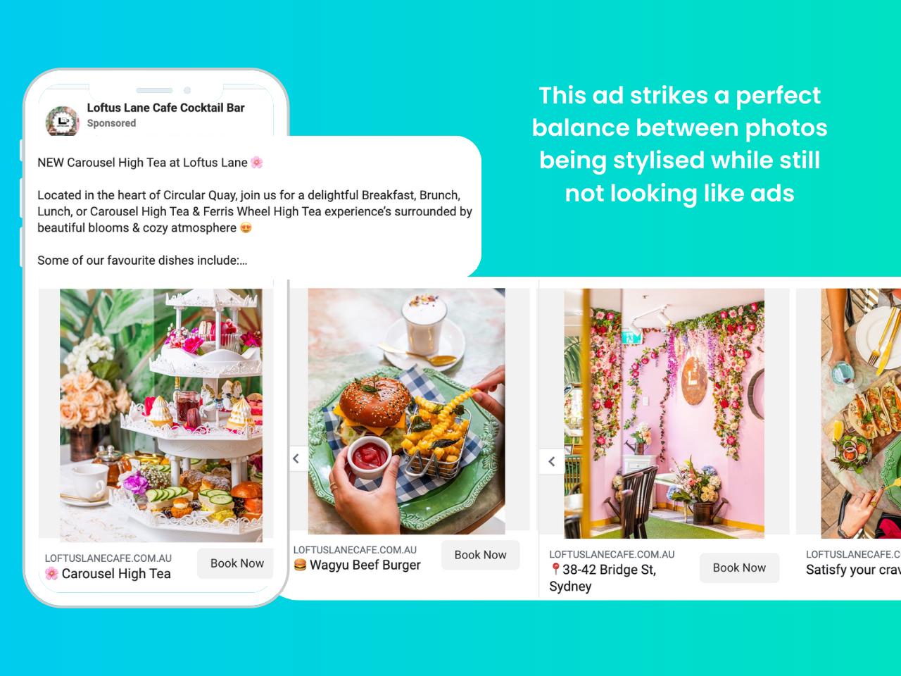
This ad strikes a perfect balance between photos being stylised and beautiful, while still not looking like an ad from a billboard or a magazine. The images chosen here are extremely effective because they are inviting and make the audience want to participate in the High Tea they’re offering. The image gives the vibe of the place and the carousel also doubles as a brochure that shares the address of the venue and some of the products they want to highlight. This is a strategy that works great for restaurants, hotels, bars, and similar businesses.
Facebook carousel ads examples with good copywriting hooks
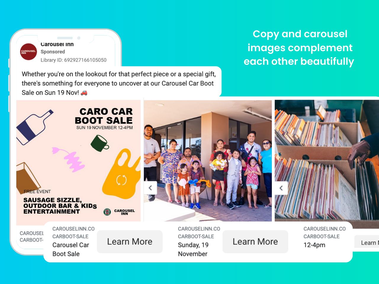
This ad is a good example of how copy doesn’t have to always do the heavy lifting to be effective. Here the copy gives you an intro to what is being offered to pique your interest to attend the sale and that’s it. Then, the carousel shows a proper poster and some pictures of people who’ll be attending, plus some of the items that will be available to buy. In addition to that, the copy in the headlines is used to share even more details about the event, such as the date, location, hours, etc. In general, this shows how simple copy can work great when married to complementary images.
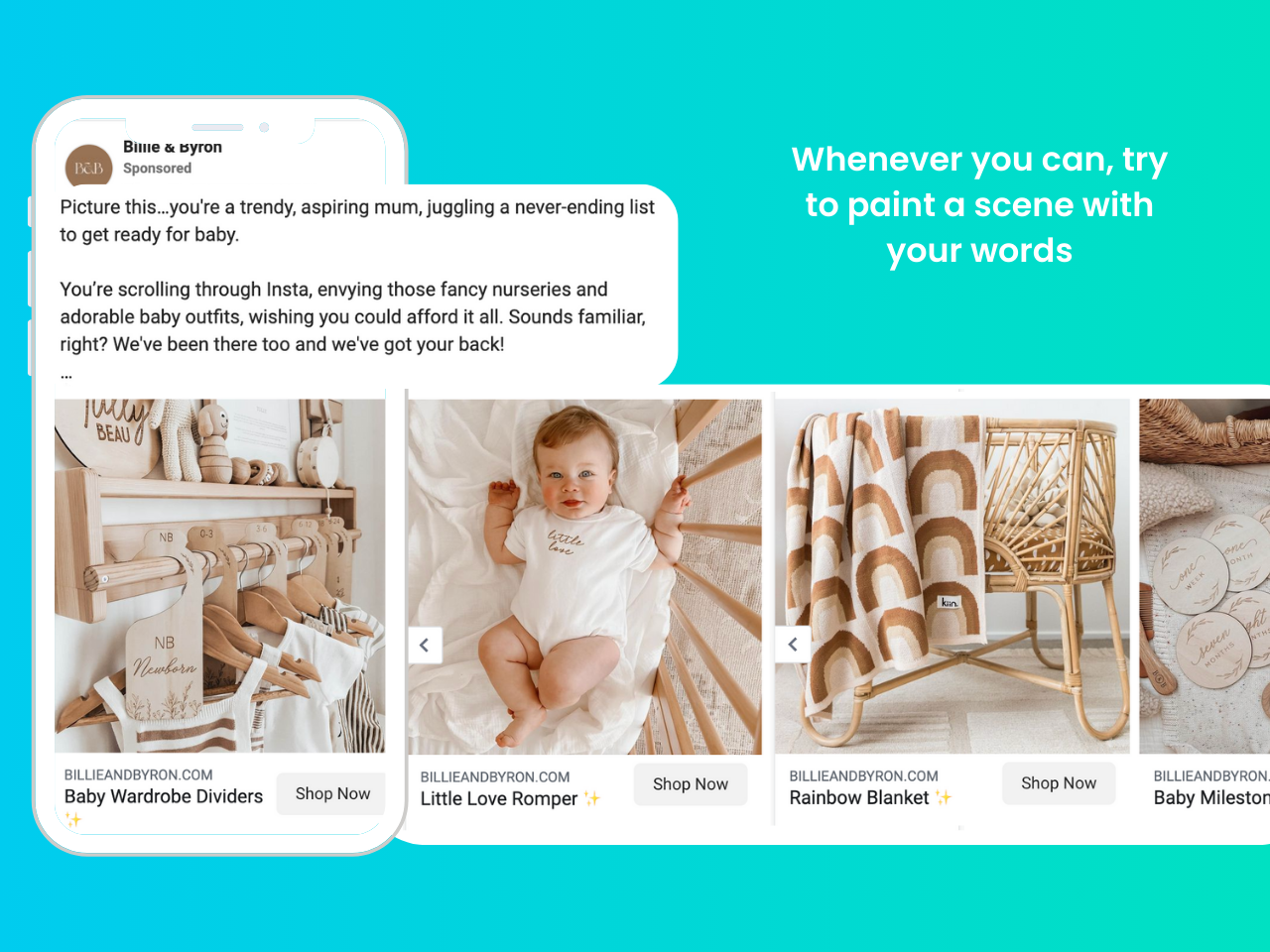
The copy in this ad uses words to paint a mental picture that connects with the reader and is directly tied to the product images in the carousel. It articulates how the product solves a problem and gets the reader to imagine what it’s like to have the desired result using your product. This is a great example of what good copy should do.
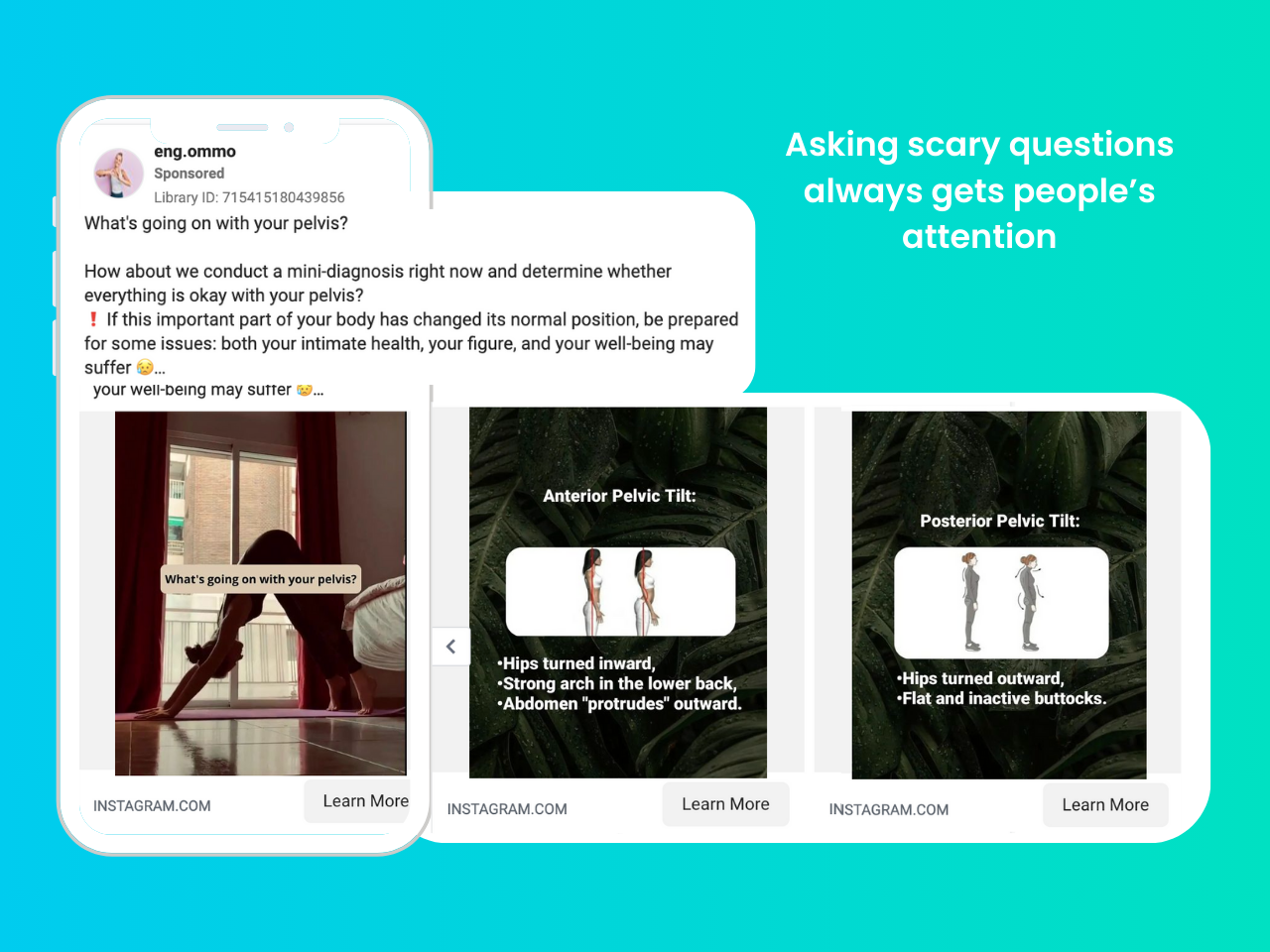
Opening with a question that instils a little bit of fear in your audience is a very effective hook, as long as you: 1) keep it realistic, and 2) give a solution or answer. This is exactly what this ad is doing.
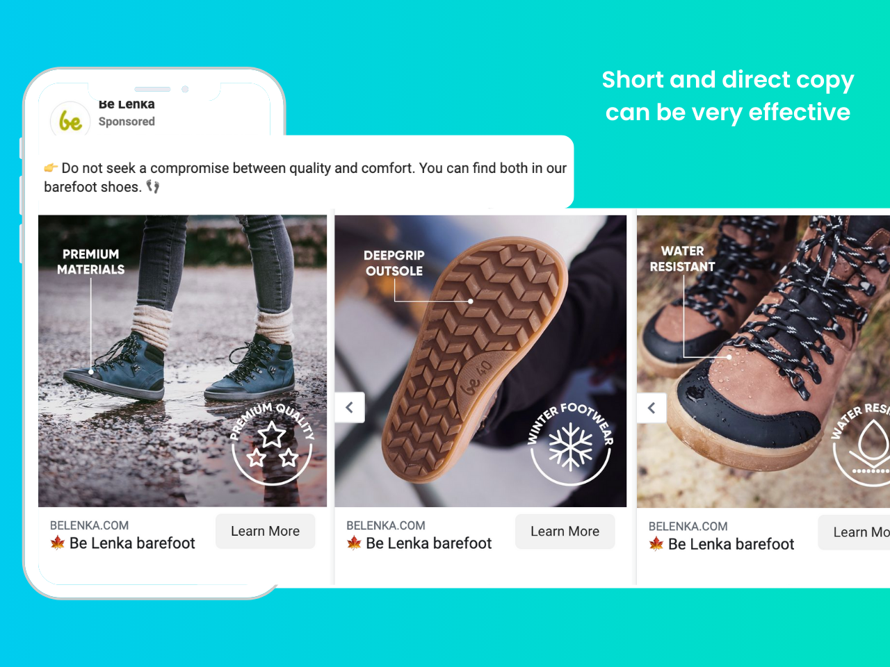
This ad is a perfect example of a simple copy that opens with a strong premise to catch your attention and then supports the claims with the images that accompany it, showing you the exact benefits and features of the product.
Facebook carousel ads examples with good offers

This ad shows the gigantic potential of carousel ads for industries like real estate. We know that the fewer clicks someone needs to make to decide to buy, the better, so this ad shows the entire listing without having to leave Facebook. This is attention-grabbing for someone shopping for a new home as it shows the full offer, plus it almost guarantees that whoever clicks on this ad is actually interested in at least visiting the property. Quality leads are always a priority when you’re paying per click and this ad gets top marks in this aspect.
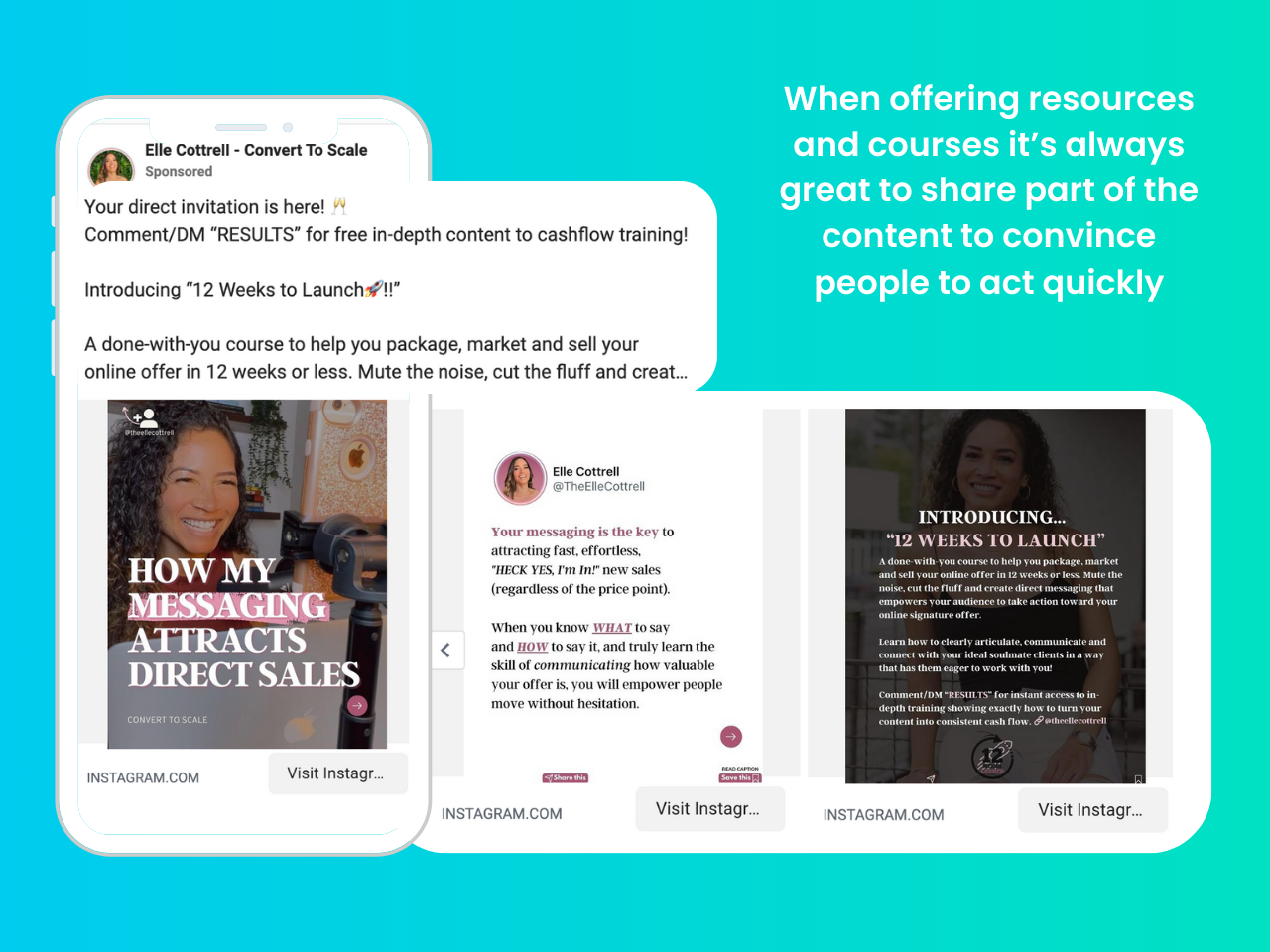
This ad offers a free course and uses the carousel in the ads to give you a glimpse into the contents of it. This is a great way to convince the doubters to sign up for your offer because they don’t have to guess what they’ll get after signing up. The offer is also on the first line of text, which also introduces a CTA to incite you to act right away.
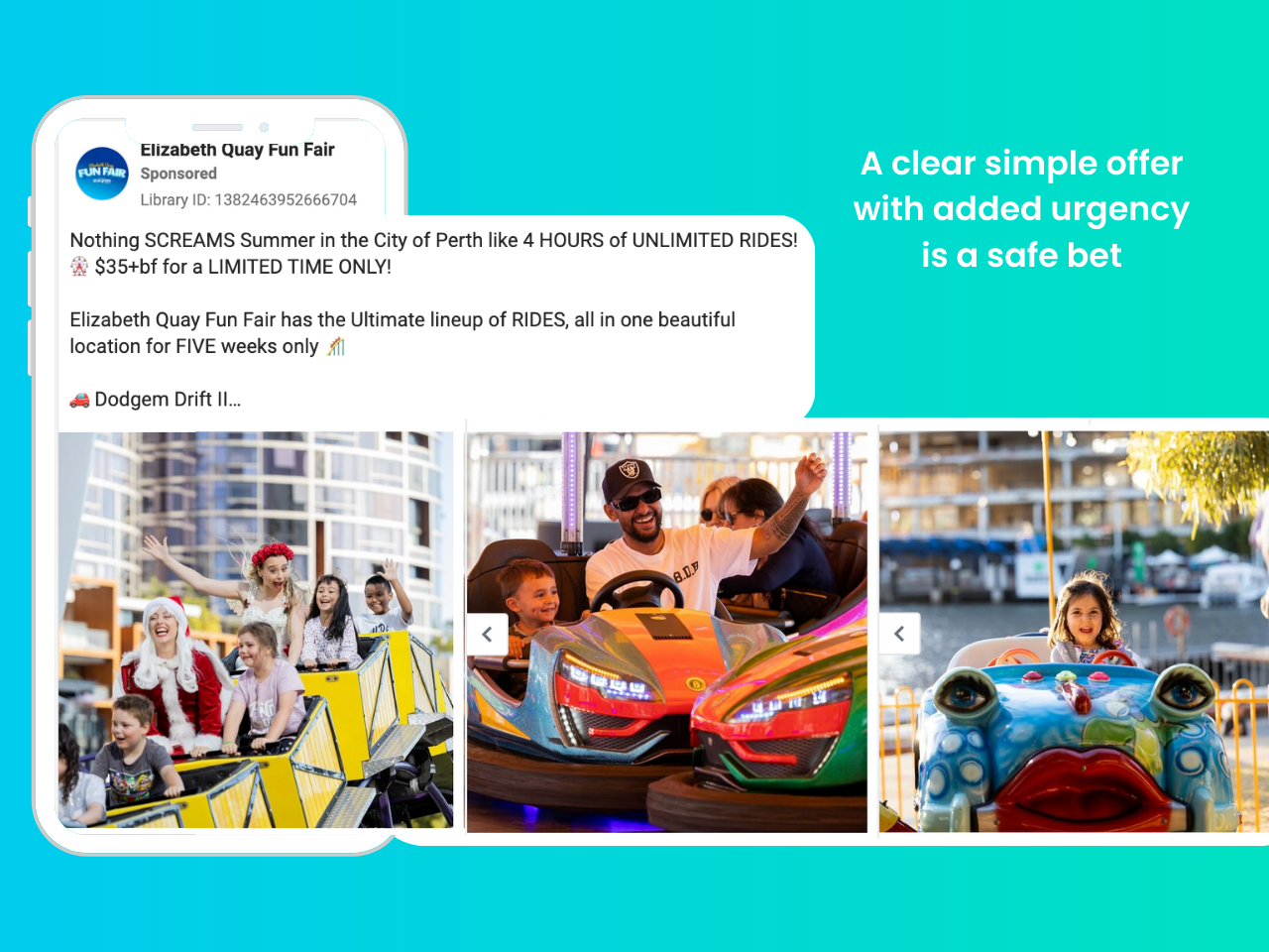
This ad perfectly matches the copy explaining the offer they have with images showing how much fun you could have if you took advantage of it. A perfect marriage in a very simple ad, that shows you don’t need to overcomplicate things to make them work. The offer appears right at the beginning, so it’s immediately clear what the reader can get, plus it’s a limited-time offer, adding urgency to incentivise them to take action quickly.
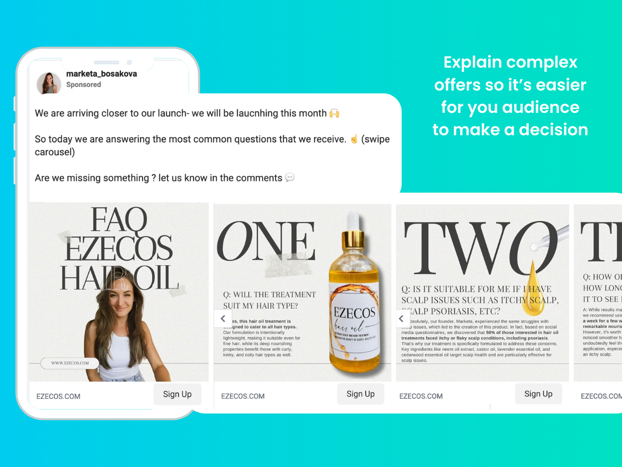
If you know your product is a bit harder to understand, a great way to increase the odds of your audience taking your offer is by answering their questions. For anything that may confuse buyers, use a carousel to explain, and give extra details to bring your potential buyers closer to making a purchase decision.
Facebook carousel ads examples with good storytelling
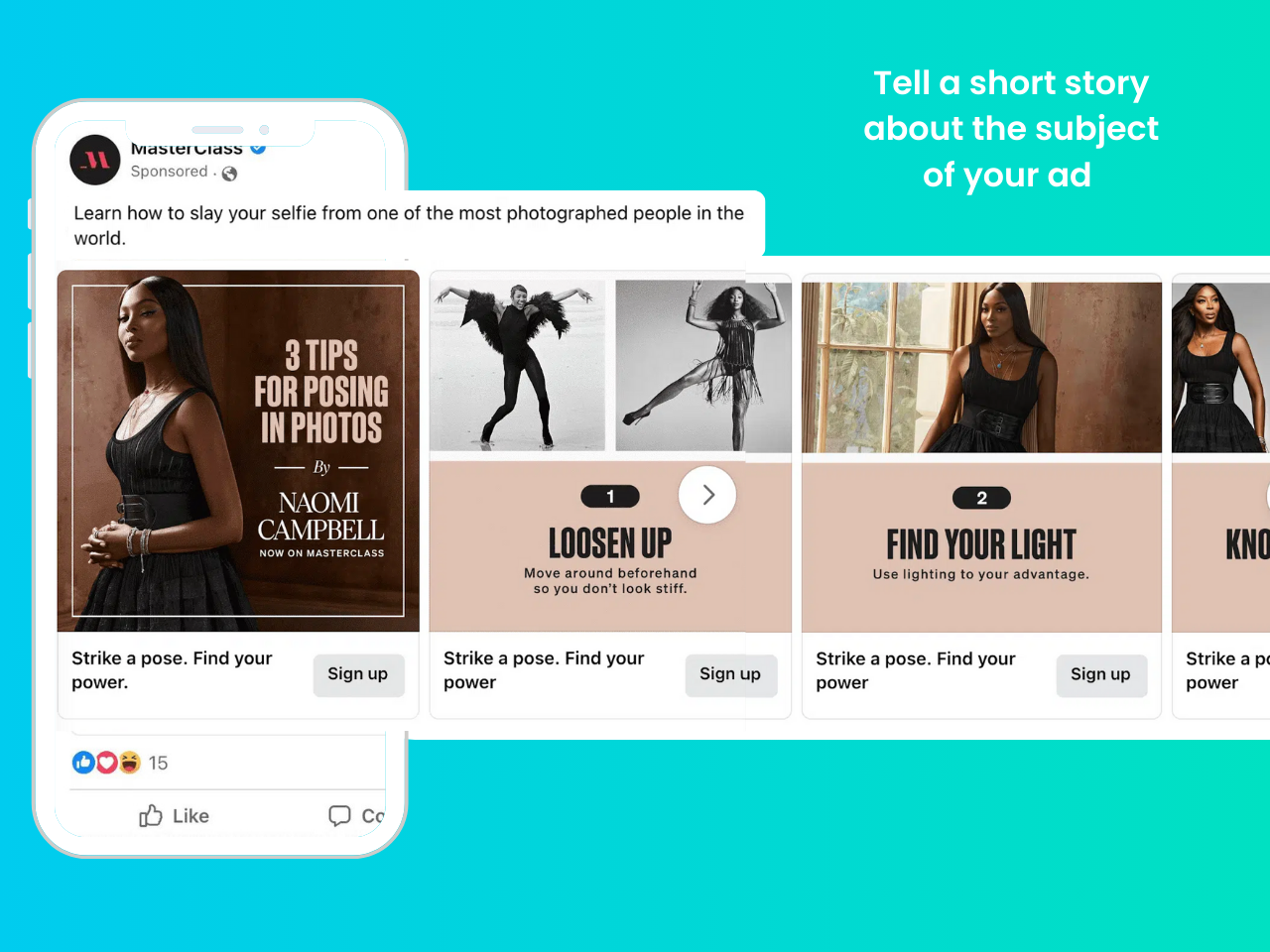
Masterclass ads give, unsurprisingly, a masterclass in storytelling. They showcase the knowledge of their teachers and give the audience enough information to hook them and get them inspired to sign up for the service. In this example, they showcase Naomi Campbell’s expertise in some short tips that tease the things someone could learn in the class.
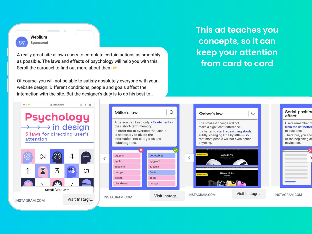
This carousel teaches concepts directly related to what the company offers. While it can get a little wordy on some parts, it showcases a great way to use storytelling to demonstrate your expertise to potential customers. After they literally teach in the ad, a potential buyer will have no doubt that they can deliver on their effective design offer.
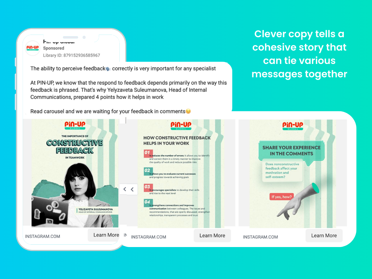
This ad quickly tells you what they’re offering and why you should care. They tie the topic they’re discussing to their company culture, highlight an expert in their team, and even make a joke at the end. All connected to giving and receiving feedback! The ad is clear and to the point, so you’re instantly hooked and ready to learn from their expertise (and possibly engage their services).
Facebook carousel ads tips
Use video as your first card
Videos are more likely to capture attention and stop people in their tracks, so once the video has made them stop, they will be more likely to go through your whole carousel.
Don’t be gimmicky, though. Only use this tip when it makes sense as modern audiences can smell fakeness and clickbait from a mile away. An impactful image can work great as well if you pick the right one.
Use high-quality, relevant images
It goes without saying that your images should be well-composed, well-lit, in focus, and have elements that make them visually interesting!
They should also ALWAYS be relevant to your product or service and tailored to your target audience. When possible, you should also try to avoid making them look like an ad you’d see in a glossy magazine as content that feels organic tends to perform better on Facebook.
Write clear, concise, and persuasive copy
Your headlines and body copy should be clear, concise, and persuasive. They should also be relevant to the images in your Facebook carousel ads so they work well together and complement each other.
Make sure to avoid rookie mistakes such as incorrect grammar, spelling mistakes, and typos that can make you look unprofessional and will erode the audience’s trust.
Also, keep a consistent voice so your audience knows who you’re speaking to at all times!
Use a call to action on each card
Tell people what action you want them to take in your copywritting, and take advantage of testing different call to actions that a Facebook carousel ad allows.
That said, make sure to keep your CTAs in line with the ad image or video, so it doesn’t cause confusion. If you ask the ad reader to take actions that don’t align with the carousal card it could deter the reader.
Test different variations of your ads
You probably already know you should do this, but it bears repeating. Once you have a few different variations of your ads, test them against each other to see which ones perform best.
Ensure you test one ad variant at a time so you can be more conclusive with your observation. Also, measure your ad results against your industry’s average to know if there is room to improve.
No matter how much experience you have with Facebook carousel ads, tests are always your biggest asset to fine-tune a campaign.
We can help with your Facebook ads
If all this sounds overwhelming, take advantage of our free consultation to strategise your new carousel ad campaign. Get in touch today!

