When you look at a Facebook ad being served to you as you scroll on your timeline, you may not think twice about it. It looks pretty simple and straightforward, right?
Wrong.
While it’s true that anyone can publish a Facebook ad, creating an effective one is an entirely different animal. Some ads can perform up to 10 times better than others and in this article we will explore why.
In order to avoid wasting your time and money, you must achieve a delicate balance between compelling content, precise targeting, and effective design. You need to invest some time in each one of these elements and avoid rushing the process as your success depends on it.
Keep reading to learn the tips and tricks that separate the pros from the amateurs, so you can start increasing your conversion and decreasing your cost!
Why is it important to learn from the best Facebook ad examples?
Analysing Facebook ad examples proves to be an incredibly cost-effective and potent approach for gaining valuable insights into honing your ad creation skills, all while sparing your wallet from unnecessary expenditures on gurus or courses you can do without.
These days, with organic reach on a permanent decline as internet giants look to increase their gains and dividends, mastering the art of impactful Facebook ads is more crucial than it has ever been. Without ads, you just won’t be seen on Facebook today.
Gone are the days when you could share on a Facebook business page and have guaranteed visibility to your followers. In fact, unless they go looking for your page specifically, nowadays, they may never see any of your posts or offers organically. Facebook obviously prefers to push content it gets paid to share.
As you accept the need to budget for ads and boosted content, you’ll want to ensure a return on your investment. This is where understanding the nuts and bolts of it all becomes essential to succeed.
Key elements that all the best Facebook ad examples have
While creating Facebook ads is a creative exercise, there are some general strategies that you can follow to get better Click Through Rate (CTR).
Note the goal with our Facebook ads is to get as many people to click on it as possible while avoiding creating a clickbait that doesn’t articulate what the ad is about. Essentially, we want more people to see our ad, stop, read it and click on the link.
Here are the elements you must include in your ad structure:
Hook
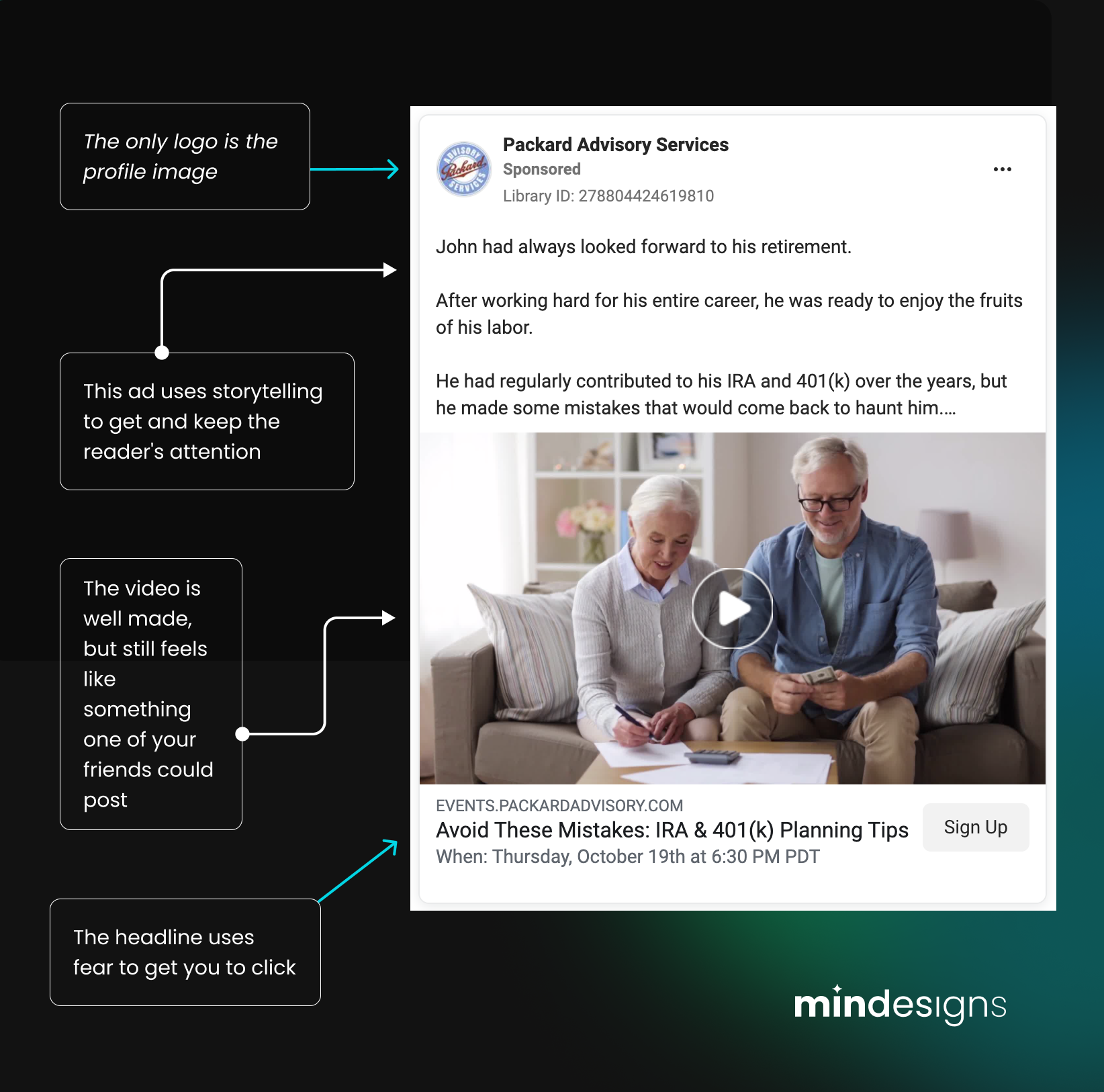
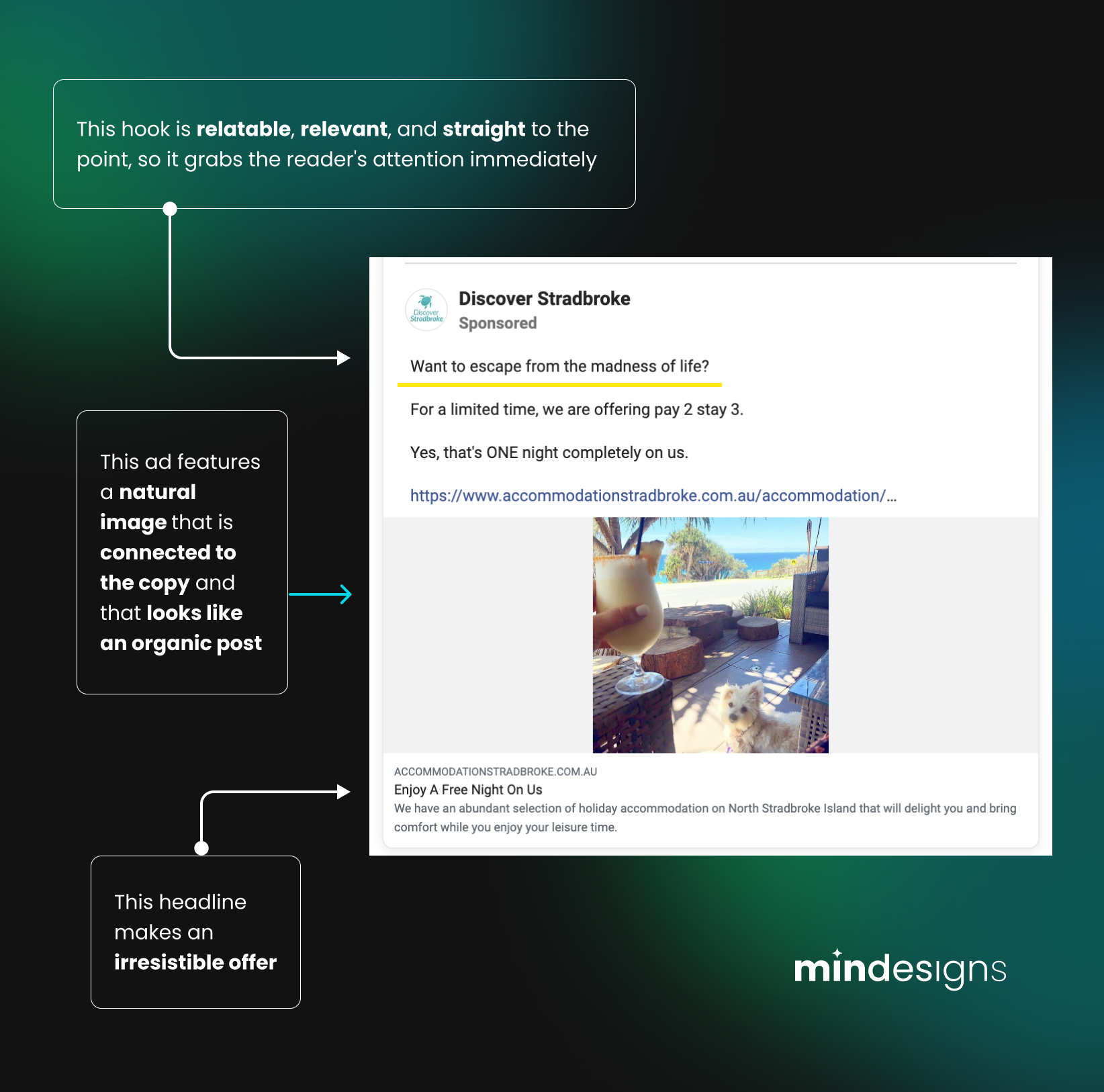
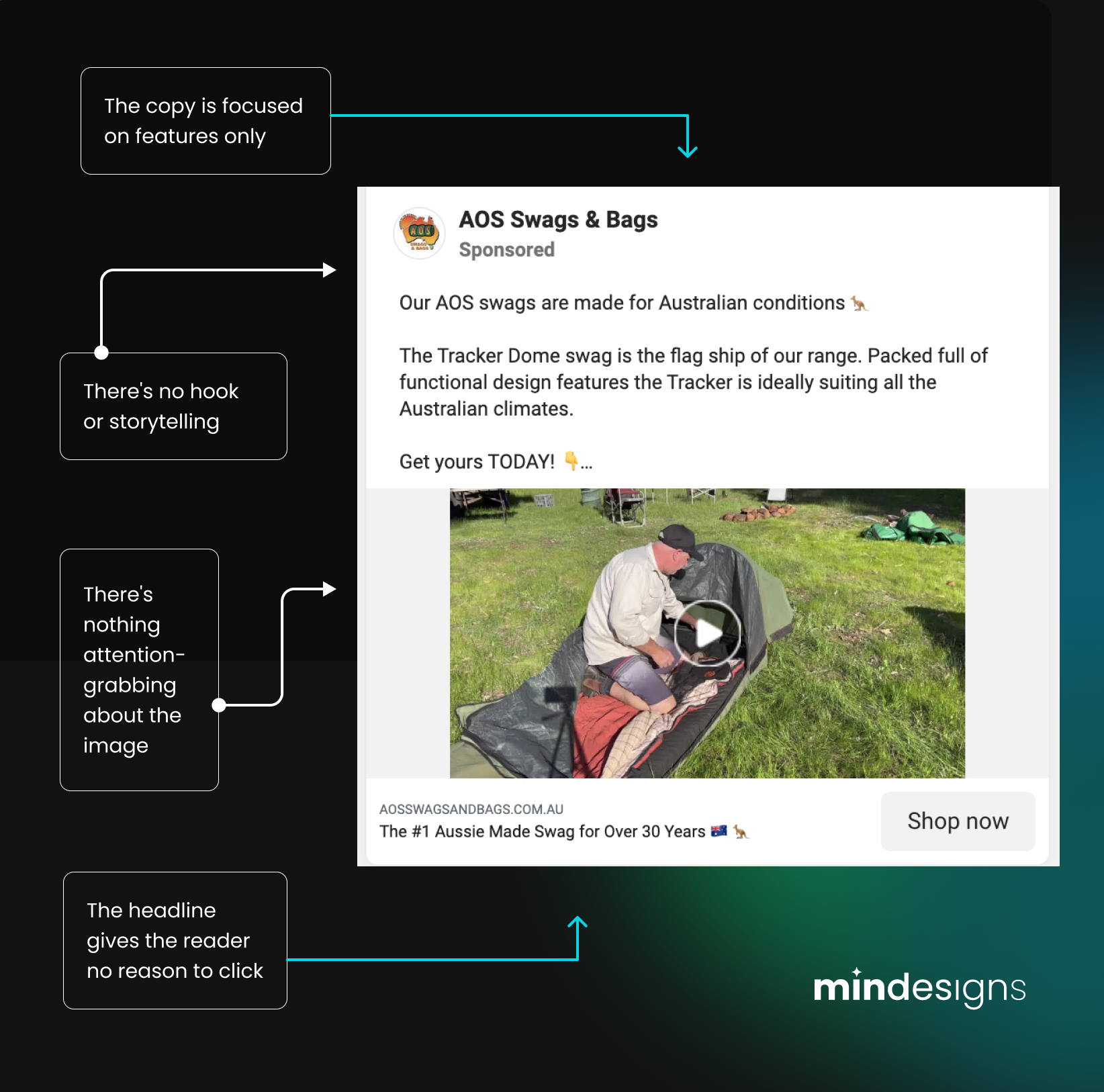
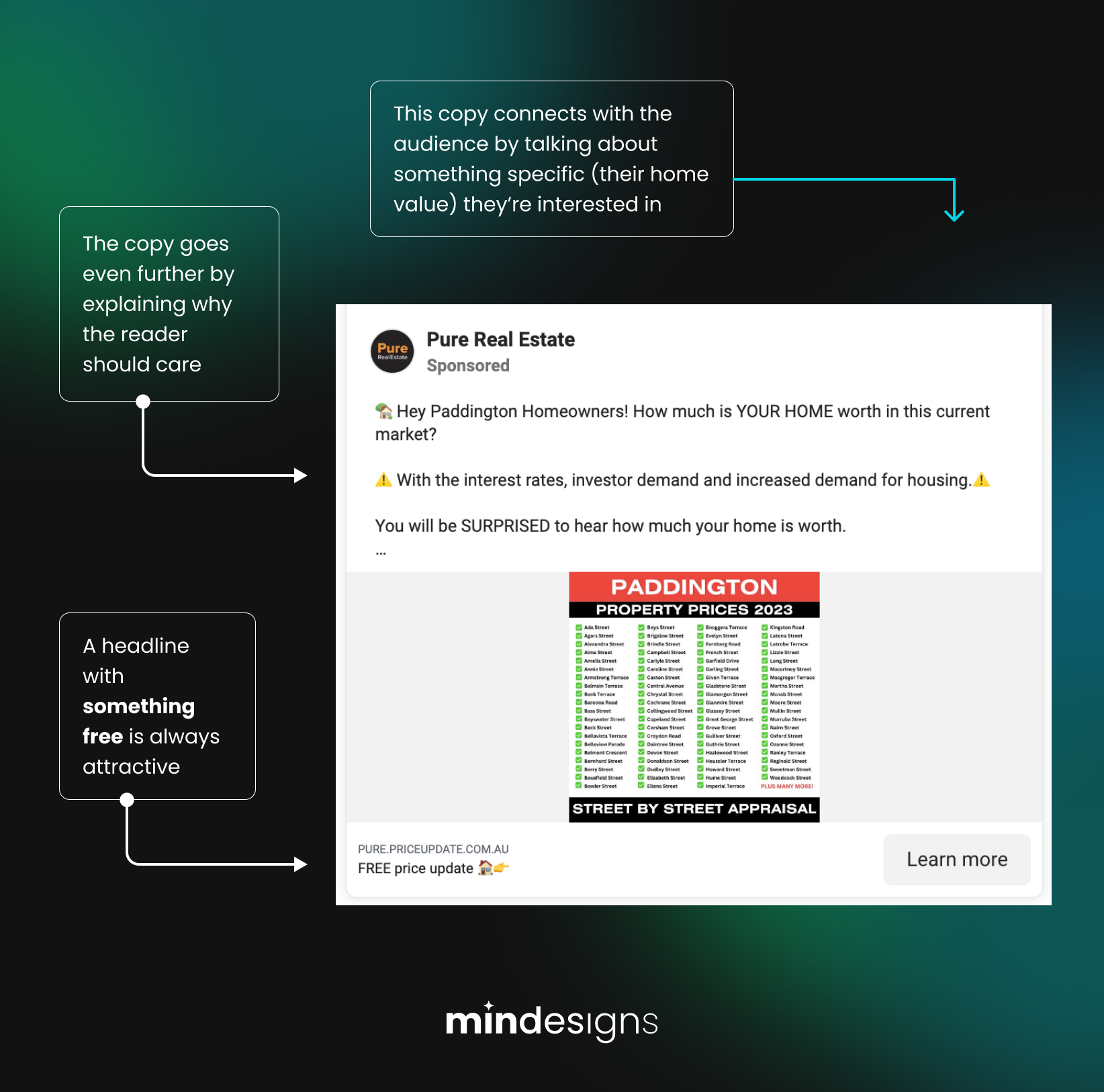
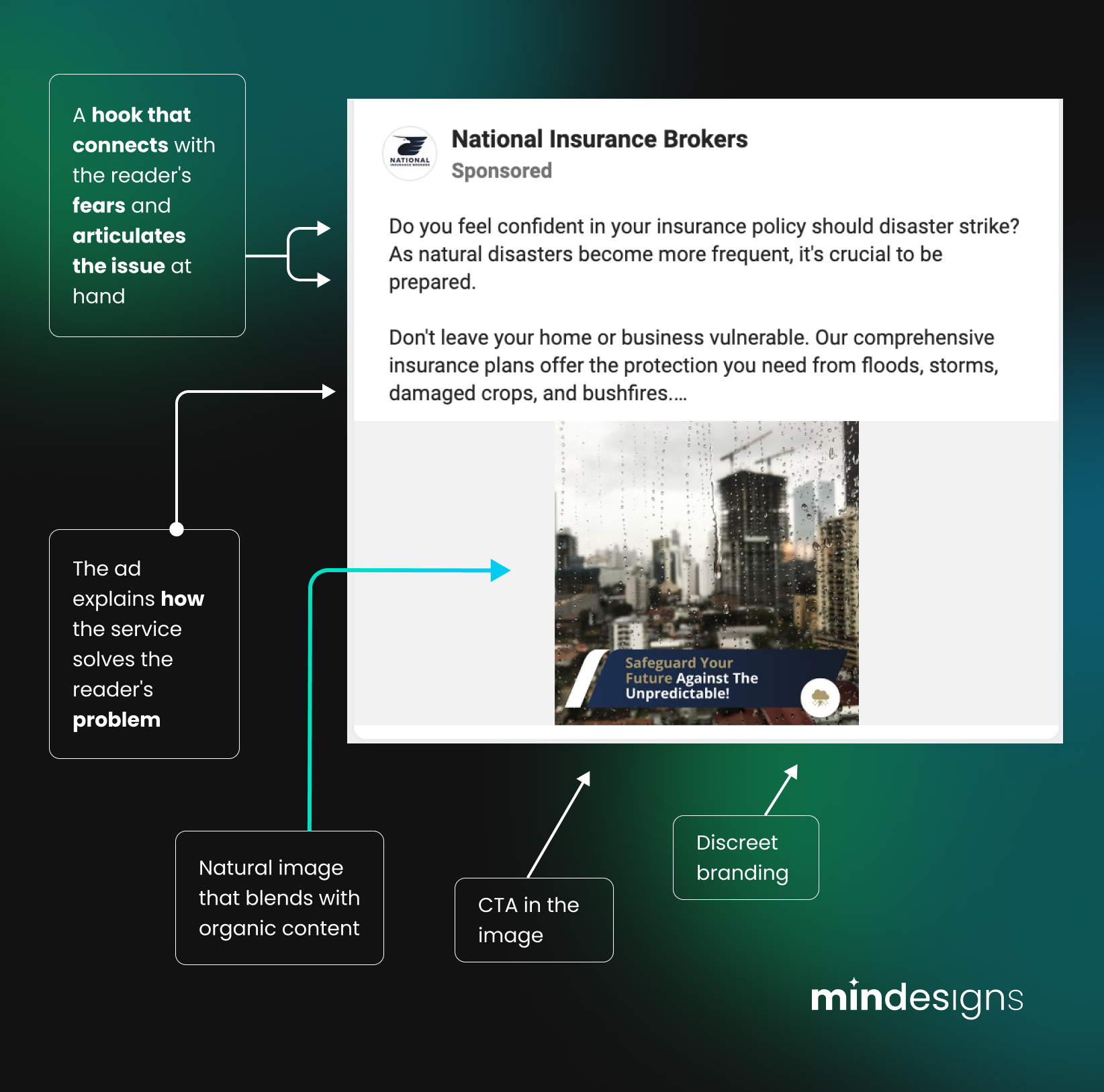
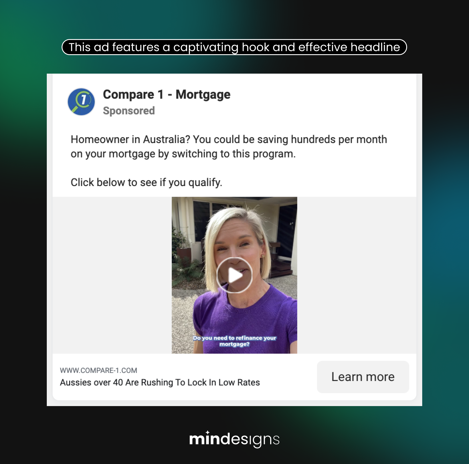
A hook is a combination of an intriguing image, the headline and the first part of the ad description that could make the reader stop in their tracks and read your ad instead of continuing scrolling. This is the first thing the audience will see and read and must make them want to click to read more.
Relatability
The ad description must connect deeply with the audience, their fears, challenges, and pain points. You must use a paragraph or two to explore these issues in a way that makes your audience identify with the story you’re telling them and, at the same time, make them feel that you have the solution. You are on the right track if you can articulate your target audience’s problems and challenges better than they can.
Connection between copy and visuals
The relationship between what you say in your ad and what you choose to show (on static images or video) should be evident at first glance and without much thought. You don’t want to confuse your readers or make them wonder what you’re trying to communicate about your service or offer. Confusion makes it harder for people to make decisions so make sure your image and copy makes sense.
Natural language and images
Make your Facebook Ad feel like a post from a friend or colleague. Ads that can be immediately identified as ads are less effective because people just skip them. This phenomenon is called banner blindness, and we want to avoid this from happening when people see our ads. Think about it this way: are you more likely to stop and check a post from a friend or stop and check a post that is clearly an ad?
Things to avoid in your Facebook ads
As mentioned before, the single worst thing you can do with your Facebook ads is to make them look and feel like ads.
Sure, you are selling something, but it shouldn’t feel like that from the get-go, even if this can feel contradictory. When your reader realises your post is an ad, they should already be hooked on your ad description content and offer, so they won’t skip it.
Unlike traditional ads, social media advertisement is designed to blend in with the user’s organic experience. This means that the ideal Facebook ad includes the elements previously discussed while still feeling like something your contacts would naturally share on the platform.
Blending in with organic platform content while getting your intended audience’s attention is the ultimate goal.
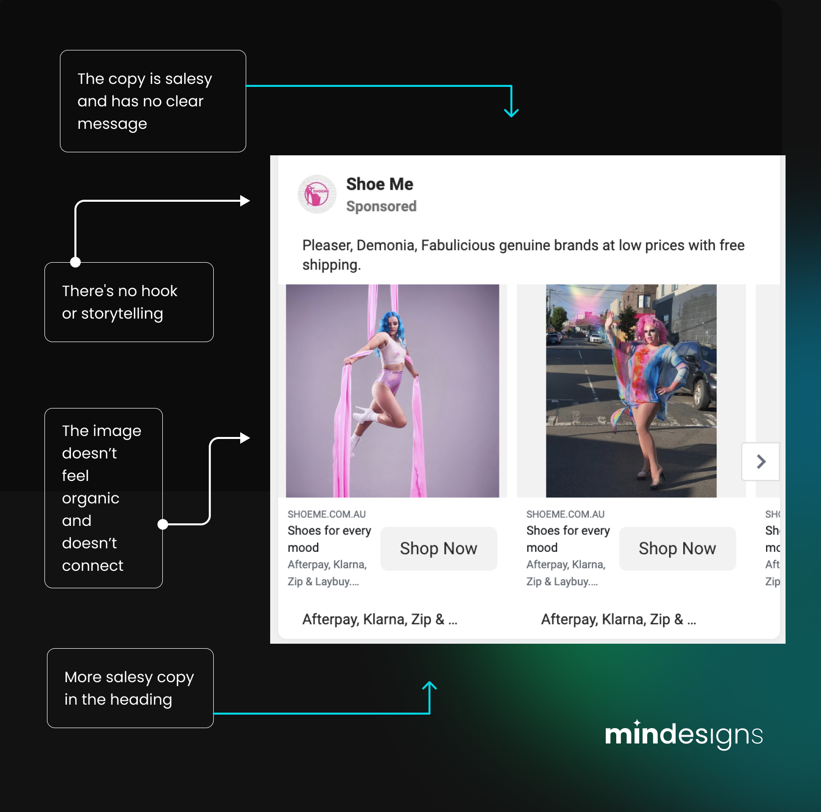
This means that you should usually avoid any copy that feels too corporate, as well as elaborate and highly retouched images that look like they belong in a magazine or a billboard.
You should also avoid the following in your Facebook ad description:
- Writing copy that sounds salesy
- Writing copy that focuses on the features as opposed to benefits
- Including too many emojis in your text
- Spelling and grammar mistakes
Tips and tricks to improve your copy
We already explained the elements all the best Facebook ads have. Now we’ll share a cheat guide to the sequence your copy should follow.
Remember that it is all in the details and that minor improvements to your copy and visual assets can make a big difference in the overall performance of your ads.
In general, this is how your copy should be structured:
- Hook your reader – write a great opening sentence that evokes curiosity.
- Explain the problem – articulate the issue/challenge you product or service solves.
- Connect with the audience – relate to the audience and their problems and challenges.
- Articulate the solution – explain how you can solve their problem.
- Insane offer – give them an offer they can’t resist.
Remember that you should REALLY tailor your copy to your audience and offer, and the more you manage to connect with them in a very specific way, the more likely your audience is to take action. Trying to talk to everyone is the kiss of death in the online world. Be specific, and niche down.
Get right to the point and don’t waste your audience’s time. While it’s true that a long copy can sometimes be very effective, this is only the case if it’s GOOD copy that contains a great hook. Make sure your copy is exactly as long as it needs to be, and follows a similar or exact structure as we previously covered.
Make sure to create copy variations and A/B tests so you can explore which of them gives you better Click Through Rate (CTR).
What makes a great headline and CTA?
Your headline and your Call To Action (CTA) work hand in hand to get your potential customers to click and take action on your ad.
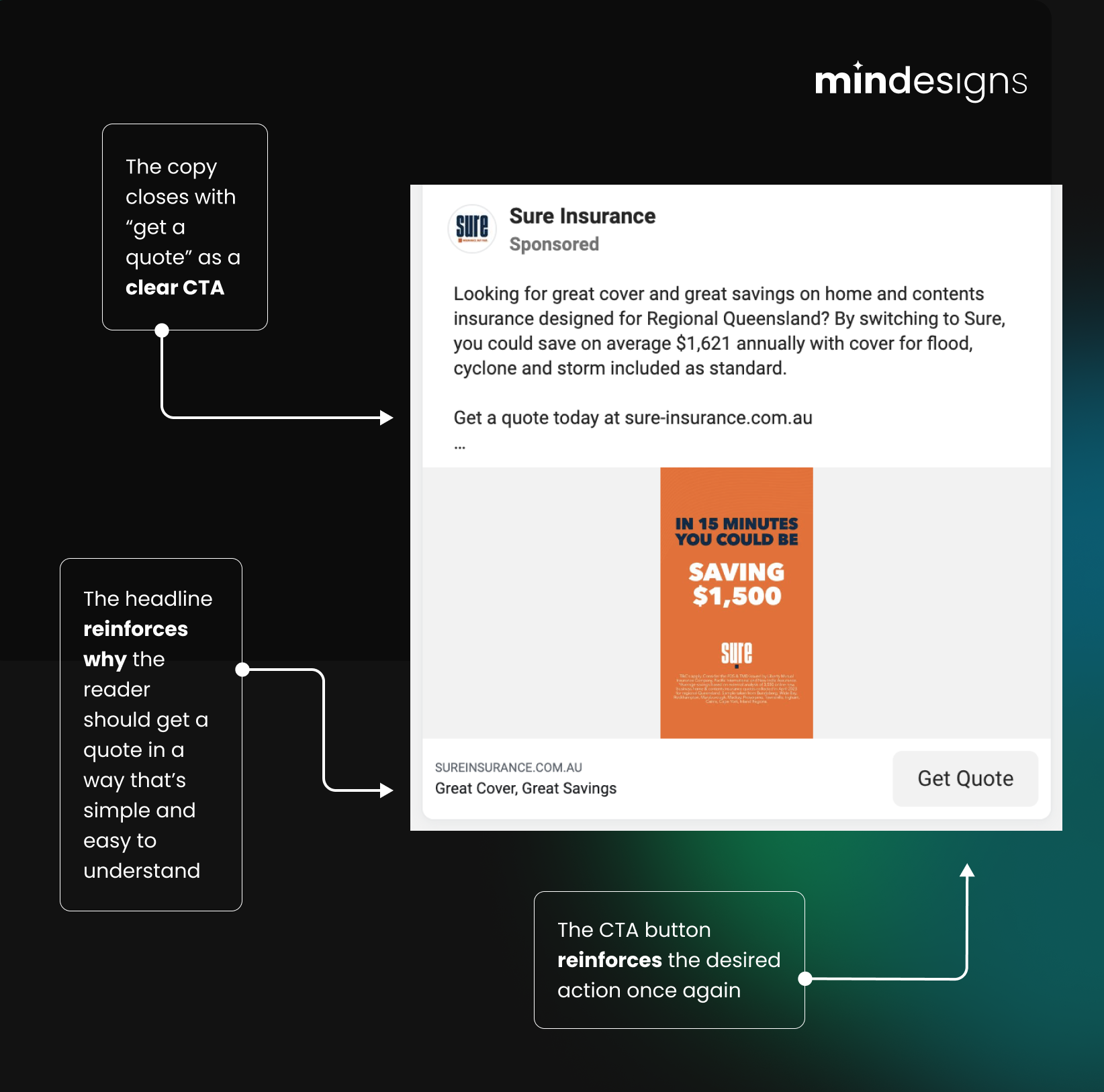
The headline in a Facebook ad is what appears next to the CTA button you select (under your image or video), so it’s more important than ever to make sure they make sense together. While Facebook Ad headlines might not take center stage in your campaign, they play a crucial role in enhancing it to boost conversion rates.
The main use of your ad’s headline should be to clarify what you’re offering. You’re using it to reinforce what you already said in the main copy, but even someone who only skims (as many do online) the main text should be able to understand what will happen after hitting that CTA button.
When it comes to the CTA itself, select the option (out of Facebook’s selection) that is more suitable for the action you want your audience to take. Even with the generic ad CTA being the button, you should also include a CTA in your ad description to remind the readers to click on that button.
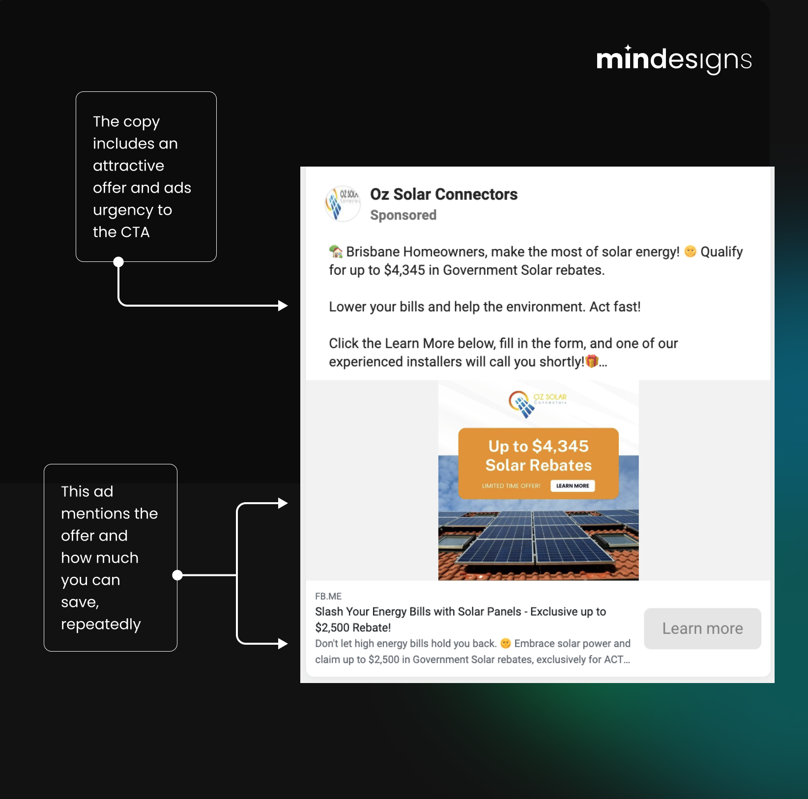
Oh, and if you’re running a limited-time sale or offer, you should DEFINITELY mention it here. Scarcity is a very powerful tool in paid ads that is almost guaranteed to increase your CTR.
How to make a great Facebook ad image or video
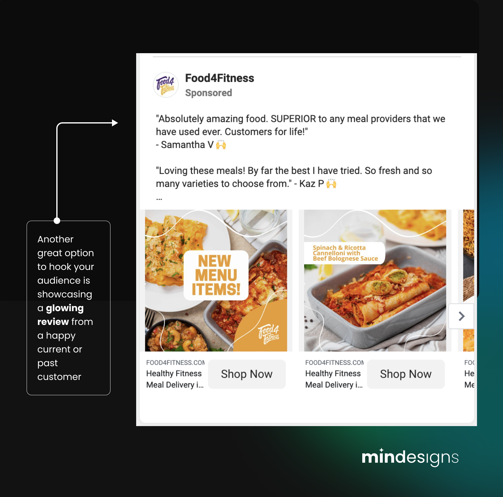
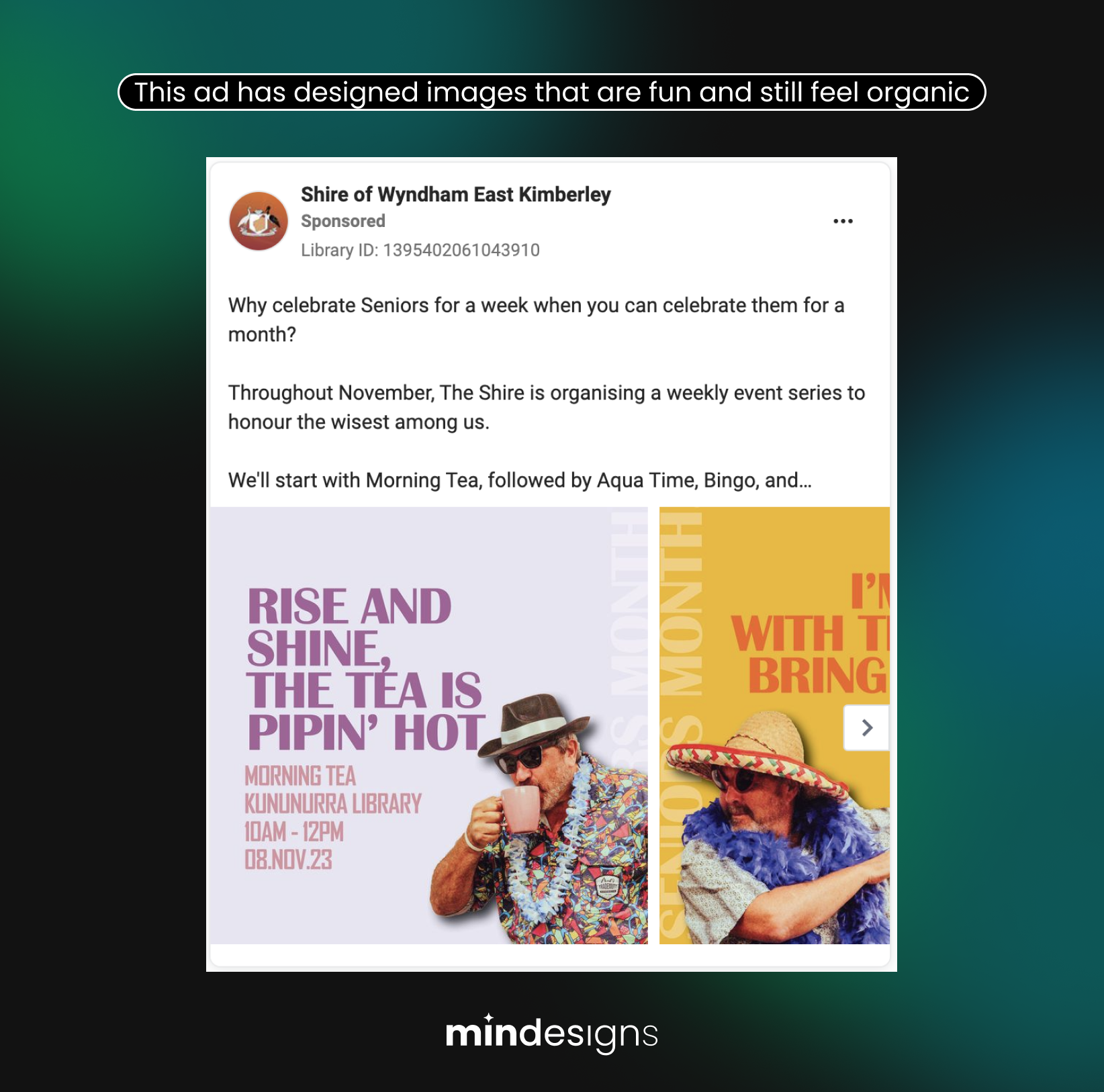
Whether you want to shock, entertain, or even feature customer testimonials, the more organic a visual asset feels on the platform where your ad lives, the better. This is really important to keep top of mind at all times (hence why we keep insisting on it).
A good creator is a good consumer. Why? If you first immerse and familiarise yourself with current trends on Facebook that your audience might be consuming, you’ll be better equipped to create ad images that feel more organic and capture their attention.
Go explore what Facebook groups or pages your audience might be following and take note of the images they see in posts. Once you have explored what they visually engage with, make your ad image and videos look and feel as close to that as possible.
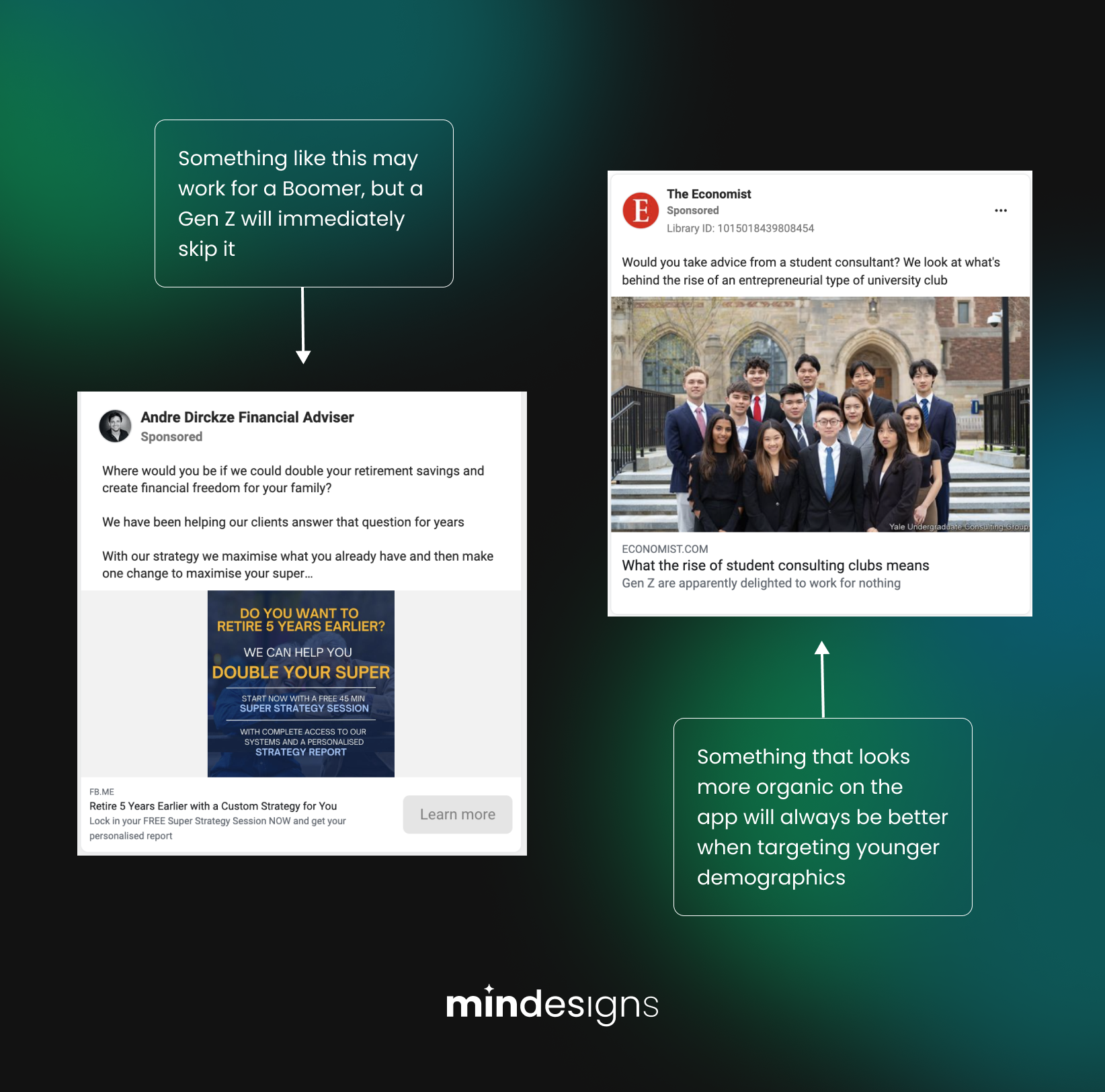
Modern audiences are getting more and more savvy about ads, and certain demographics (especially gen z) aren’t super keen on being sold to, so you really need to get their attention before they consciously tune out from your ad and decide to keep scrolling.
The younger your target audience is, the better you must get at this part of ad planning. What may fly under your uncle’s radar won’t necessarily work with your niece, for example.
If you’re working with videos instead of static images, this translates to the first 3 seconds being the equivalent of your copy’s hook. The first images you see need to be tractive and intriguing enough for anyone to want to keep watching.
Some important guidelines specific to videos include:
- Skip long intros
- Avoid logos in the first few seconds
- Make sure your video has captions (because many users browse apps on mute)
- Keep the editing dynamic (with things like frame, angle changes, and b-roll) because no one wants to see a boring talking head for too long.
- Follow the same structure of the ad copy we covered previously in you video script (i.e. hook, problem, connect, solve, CTA)
Some of the best Facebook ad examples we found
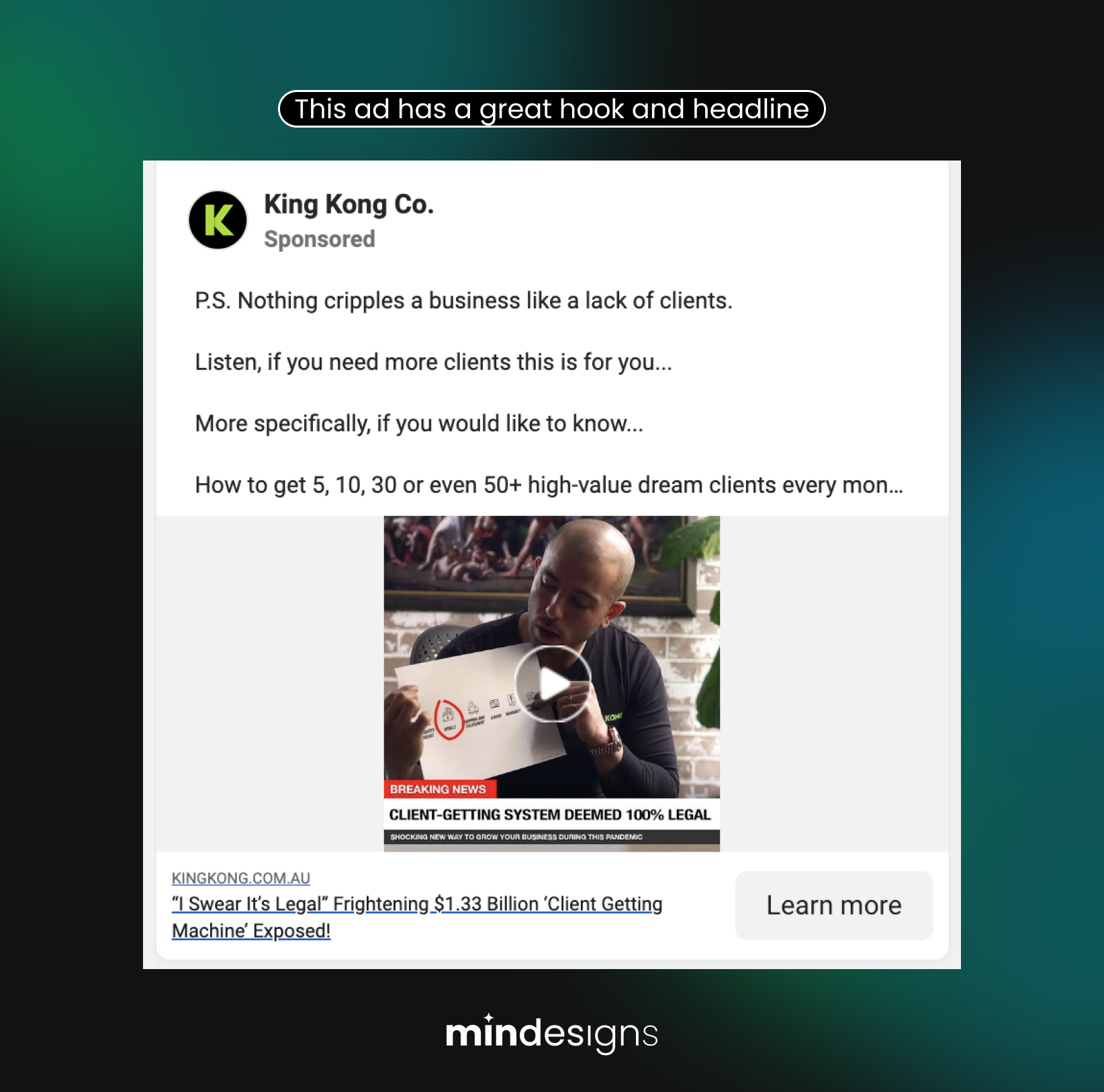
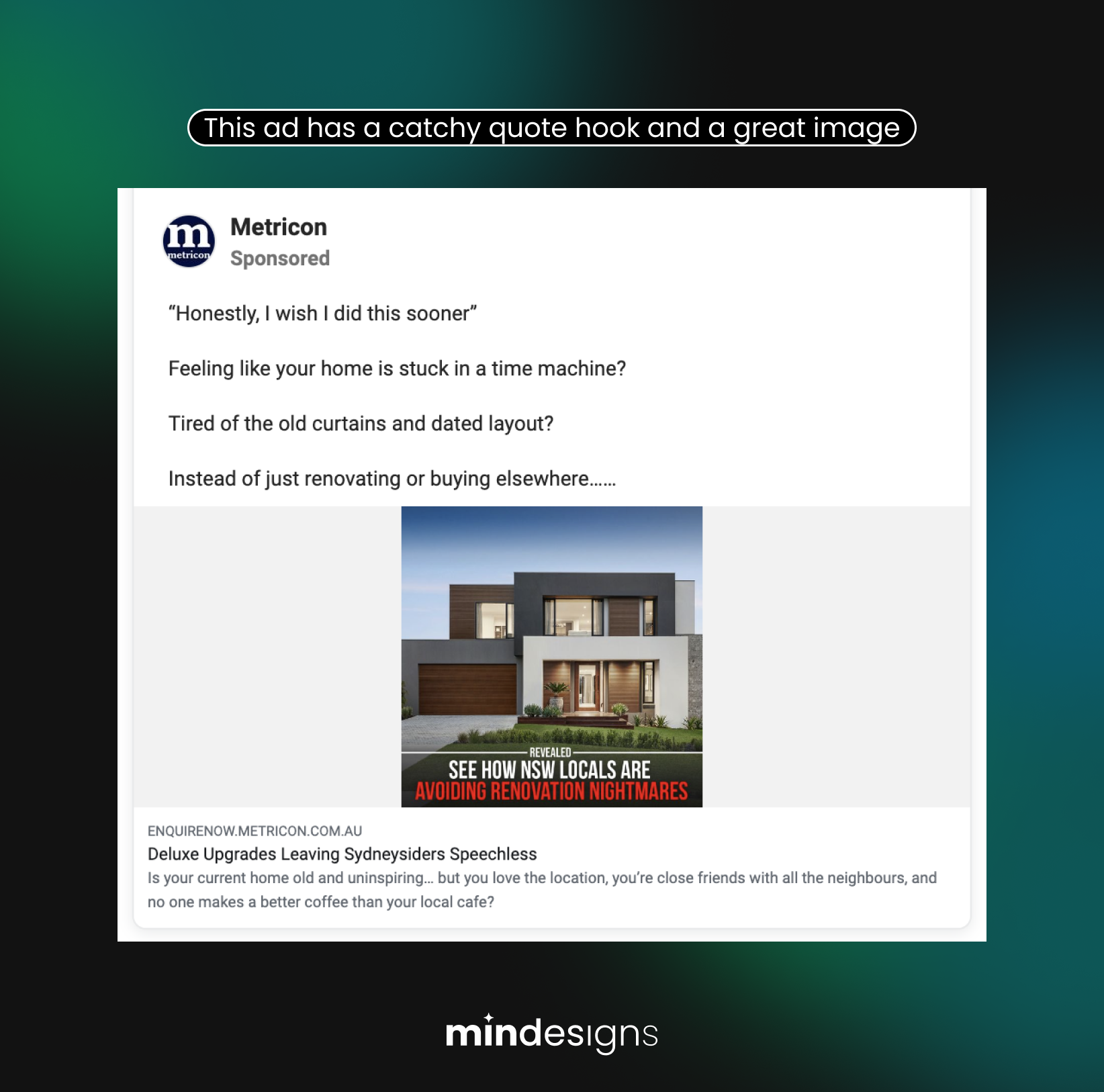
Now that we’ve covered the key factors for crafting and evaluating ads, here are a few top-notch Facebook ads we’ve discovered, along with our insightful comments to give you a clearer picture of why we appreciate them and what makes them effective.
If you need help with your Facebook ads, get in touch with us for a free consultation. Our team of experts is ready to turn your budget into real leads today!

