For Marketing Leaders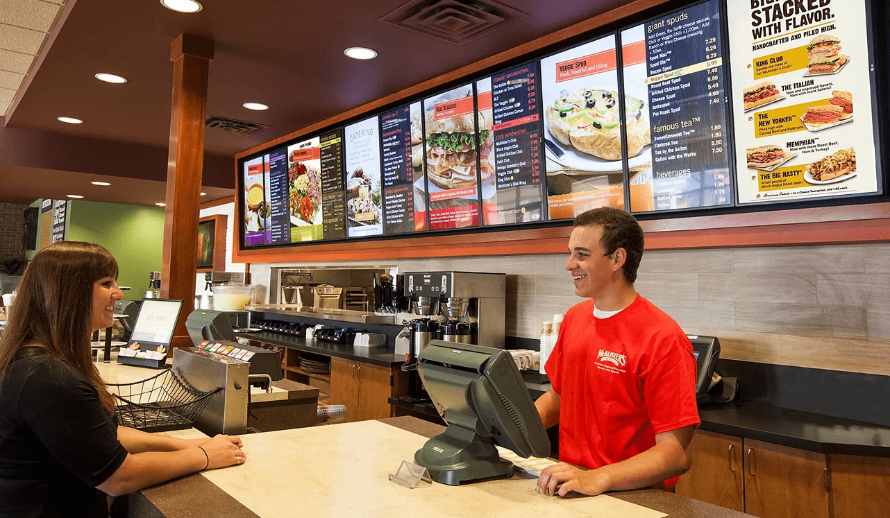
Digital menu boards are not our main line of work. We are a UX and design studio, and most of what we do is digital marketing and product interfaces. Menu boards land on our desk occasionally, usually through franchise and multi-site clients who already have us working on their brand or their site, and who need the in-store screens to behave like the rest of the system.
That turns out to be a useful angle. A menu board is an interface. Someone has a few seconds, a queue behind them, and a decision to make. The same things that make a checkout page work make a menu board work: hierarchy, contrast, and cutting the number of choices in view. Most menu board advice online comes from companies selling screens, so it covers hardware well and decision making badly.
“The first board we designed looked great on the monitor and was half unreadable on the wall. We had designed for the counter, and the queue formed six metres further back. Now the first thing we ask is where people actually stand.” – Sebastian Marin, Lead Designer at Mindesigns
Rule 1. Keep Your Digital Menu Board Design Simple
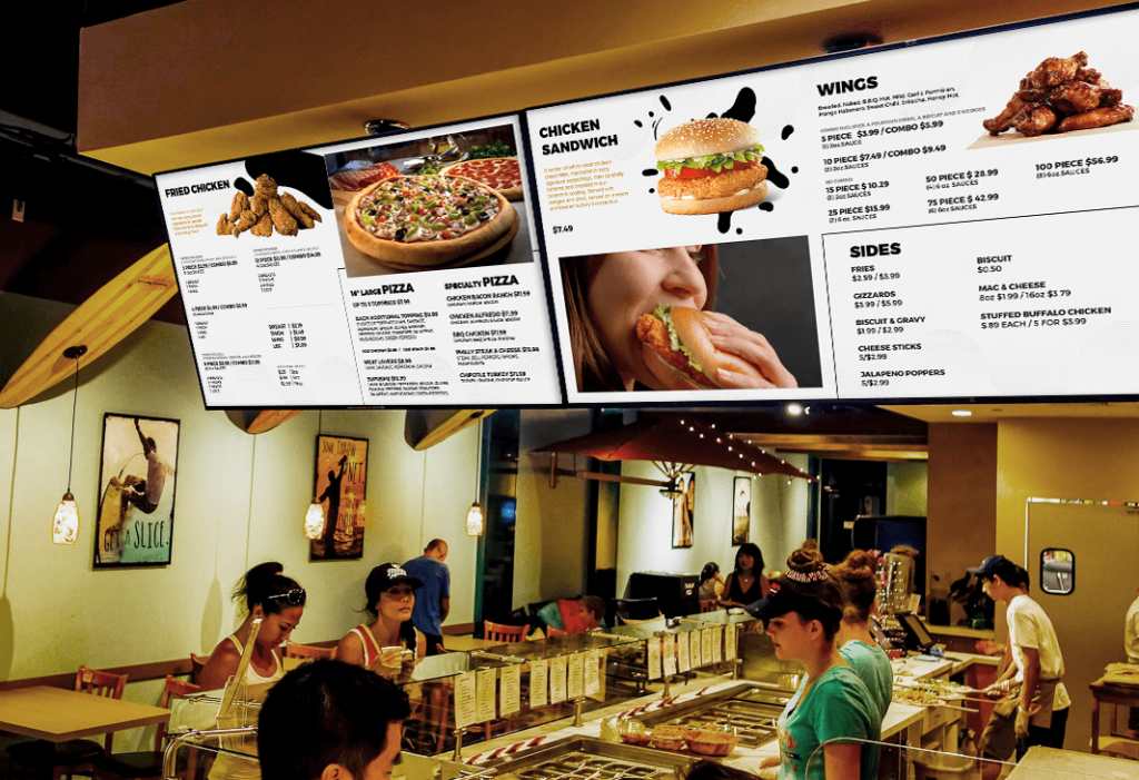
Clarity beats everything else on a menu board. A customer has a few seconds and a queue behind them, so the board has one job: make the choice obvious at a glance. Large, bold item names, prices that are easy to find, and hard contrast between text and background.
The instinct we push back on most is filling the space. An empty area on a screen feels like a waste to a venue owner, and it feels like breathing room to the person reading it. Every time we have cut a board back to what is selling and what it costs, ordering has got faster. If a line of text is not helping someone decide, it is competing with the lines that are. The same principle applies anywhere a customer is choosing under time pressure, which is why it matters so much in shopping centre advertising, where dozens of options are fighting for the same few seconds.
Rule 2. Use Images Sparingly and Make Them Count
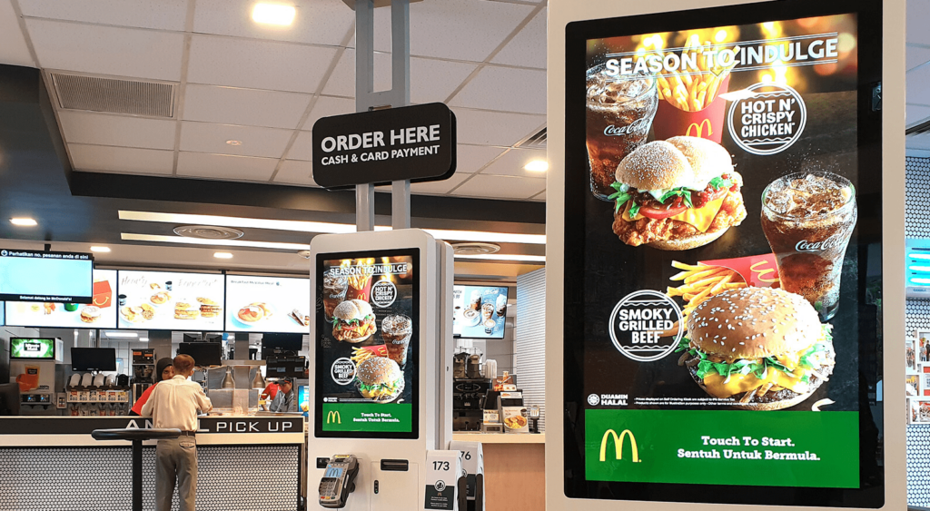
Good food photography works. It lifts how customers perceive the quality of your product and gives people a reason to try something they have not ordered before. Bad food photography does the opposite, and a screen makes it worse, because a low-resolution image at two metres wide is unforgiving.
Our rule is a small number of hero items rather than a photo against every line. Once there are images everywhere, the eye has nothing to land on and the board takes longer to read, not less. Pick the two or three dishes you actually want to sell, shoot them properly, and leave the rest as type.
Rule 3. Keep Your Digital Menu Board Design Dynamic
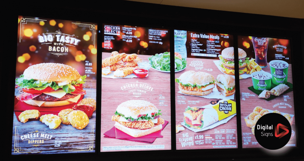
One of the main benefits of digital menu boards is the ability to change content easily and frequently. Use this to your advantage by featuring daily specials, promotions, or seasonal items.
It also lets you adjust to inventory and demand, and to run different menus at different times of day without reprinting anything. Motion is the part to be careful with. Subtle transitions between panels are fine, but anything moving continuously behind text makes prices harder to read. We cap it at one moving element per screen, and it has never cost us anything.
Rule 4. Maintain Brand Consistency
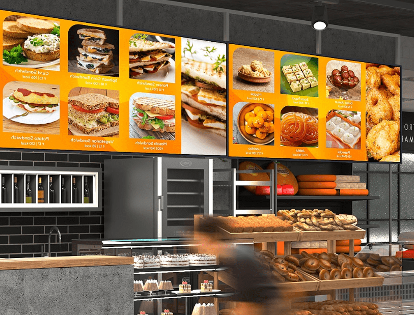
Your digital menu boards should be an extension of your overall brand. This includes using your brand’s colour scheme, fonts, and logo. Consistency helps reinforce your brand identity and enhances customer recognition and loyalty.
Every element on the screen should be cohesive and reflect the overall vibe of your establishment, it should feel like part of the overall look of your restaurant.
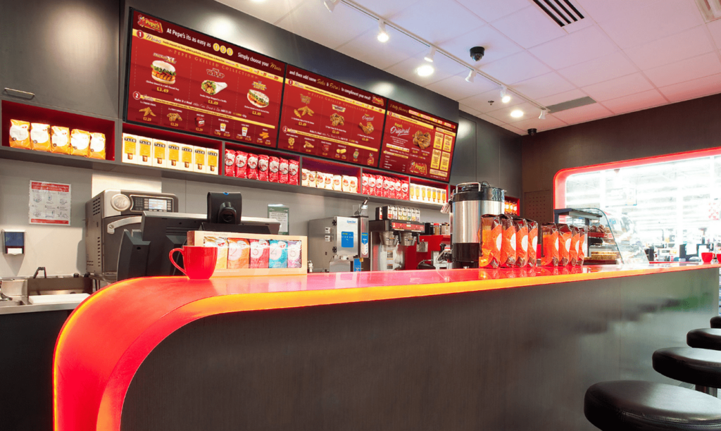
Your menu board is a brand asset, not a sign
If your screens, your website and your packaging do not look like the same business, that is a brand system problem rather than a menu problem. It is usually the reason a board gets redesigned twice in a year. We build brand and identity systems and UI and UX design for multi-site and franchise clients, and the in-store screens are one of the last places it shows up.
Rule 5. Order the Menu Around the Decision
Most boards are laid out in the order the kitchen thinks about food. Customers do not read that way. They scan for a category first, then look for something familiar inside it, and only then read a price.
So the category headings have to be the strongest thing on the screen after the item names, and the sequence should follow how people actually order in that venue: mains before sides, coffee before pastries in a café, the thing most people came for at the top. Put your highest margin items where the eye lands first, which is the top-left of a landscape board and the upper third of a portrait one.
Readability from a distance matters just as much, and it is specific enough to deserve numbers rather than advice. Those are in the specs section below.
Those five rules cover the design. The next section covers the part that gets decided before anyone opens a design file, and it is where most of the expensive mistakes happen.
Digital Menu Board Specs: Sizes, Fonts and Layout
Most menu board problems are decided before anyone opens a design file. We learned this the slow way. Our first few boards were signed off on a 27 inch monitor, looked excellent, and were half unreadable once they were on the wall. Get the specs below right and the design work gets much easier.
Screen resolution and orientation
Design to 1920 x 1080 for a standard landscape screen, or 1080 x 1920 if the screen is mounted in portrait. If the venue runs 4K displays, design at 3840 x 2160 rather than up scaling. Text edges are the first thing to go soft, and a menu board is almost entirely text.
Portrait suits narrow spaces and single category boards. Landscape suits multi column menus and any venue where the queue forms side on to the screen. A three screen landscape run is the most common quick service setup: categories reading left to right, no scrolling, no rotation.
Safe margins
Keep all text and prices at least 5% in from every edge. Screen bezels, wall mounts and over scan on older media players all eat into the edges. In our experience the first casualty is always a price sitting flush to the bottom of the screen, and nobody notices until the board is already mounted.
Minimum text size
The practical rule for signage is roughly 2.5 cm of capital letter height for every 3 metres of viewing distance. A customer standing 6 metres back needs item names around 5 cm tall on the physical screen, which on a 43 inch landscape display works out to roughly 90 to 110 px on a 1920 x 1080 canvas.
Before we design anything now, we ask the venue where the queue actually forms. It is almost never where the owner assumes. On one fit out the real reading position turned out to be nearly double the distance we had designed for, which meant every item name had to grow.
Prices should never be smaller than the item name they belong to. If something has to shrink, shrink the description.
Contrast
WCAG sets 4.5:1 as the minimum contrast ratio for body text and 3:1 for large text. Menu boards get read at distance, at an angle, and often in bright light, so we aim for 7:1 or better. Light text on a dark background almost always outperforms the reverse on an emissive screen.
Brightness
Around 350 to 500 nits is enough for a controlled indoor space. If the screen faces a window or a glass shopfront, you want 700 nits or more and a matte or anti glare panel. Consumer TVs are the usual false economy. They are not built to run twelve hours a day and they are not bright enough anywhere near daylight.
How many items per screen
Seven to nine. Past that, people stop reading and start scanning for the thing they already planned to order, which defeats the point of the board. Split into categories across multiple screens rather than compressing everything onto one.
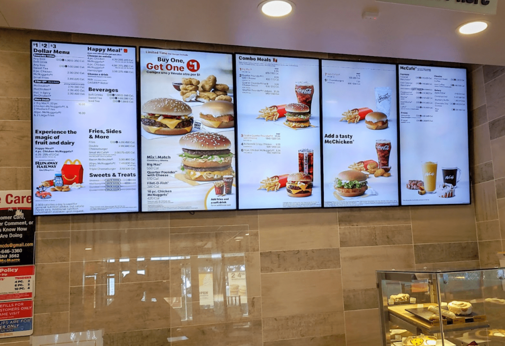
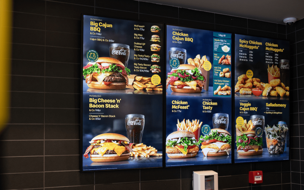
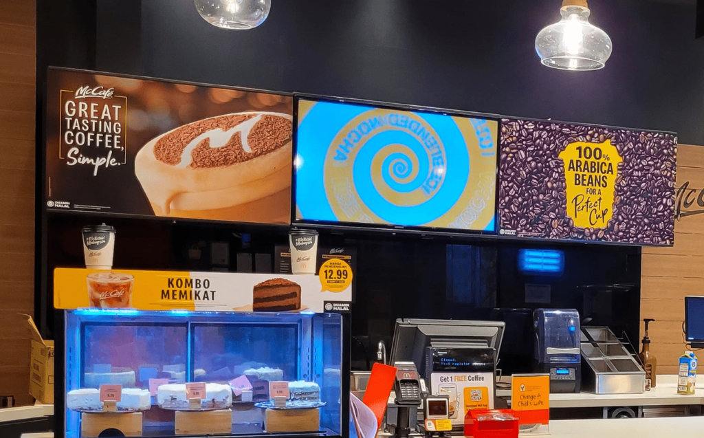
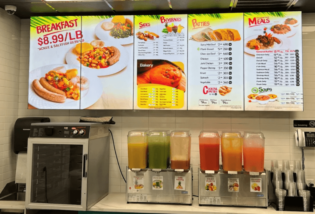
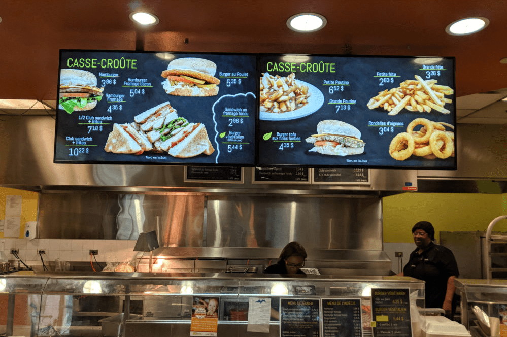
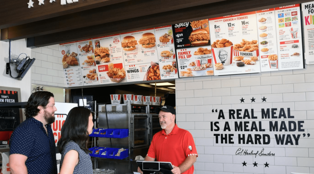
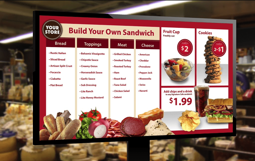
Digital Menu Board Examples
Digital Menu Board Design FAQs
These are the questions we get asked on almost every menu board project.
What size should a digital menu board be?
Design to the screen’s native resolution. That is 1920 x 1080 for landscape, 1080 x 1920 for portrait, or 3840 x 2160 for 4K panels. Keep all content 5% in from the edges so nothing is lost to bezels or over scan.
Portrait or landscape, which is better?
Portrait works for narrow walls and single category boards. Landscape works for full menus and side on queues. If you are running three screens in a row, landscape is almost always the right call.
What font size should I use on a digital menu board?
Allow roughly 2.5 cm of capital height per 3 metres of viewing distance. Measure to where the queue actually forms, not to the counter. This is the single most common mistake we see, and it is the one that makes a board look amateur from across the room.
How many items should be on one screen?
Seven to nine. More than that and customers stop reading. Use extra screens or rotating panels for larger menus rather than shrinking the type.
Can I design a menu board in Canva?
You can, and for a single board it is often fine. The limits show up at scale. There are no shared components, so a price change means editing every board by hand, and keeping brand assets consistent across a group of venues becomes a manual job. We have taken over more than one multi site menu system that started this way.
What software runs the screens?
A digital signage platform handles scheduling, remote updates and multi site rollouts. For a single venue, a media player looping a video file will do. For more than one site, or for switching between a breakfast and lunch menu, a proper platform pays for itself quickly.
How often should I update the board?
Change specials and seasonal items as often as they change. Leave the core layout alone. Customers build a mental map of where things sit, and moving the structure every month costs you the ordering speed you built the board to gain.
Should I use animation on a menu board?
Sparingly. Subtle transitions between panels are fine. Continuous motion behind text makes prices harder to read and pulls attention away from the decision you want people to make. We now cap animation at one moving element per screen.
Reviewed by Sebastian Marin, lead designer at Mindesigns.