For Marketing Leaders

These best website wireframe examples will guide you to improve your website’s performance, sales and conversions. We cover basic UX design, marketing principles and more…
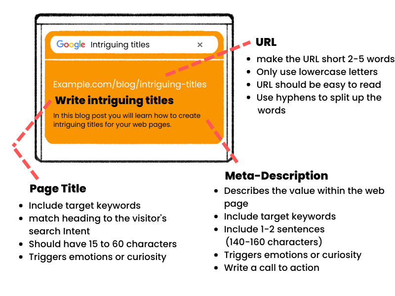
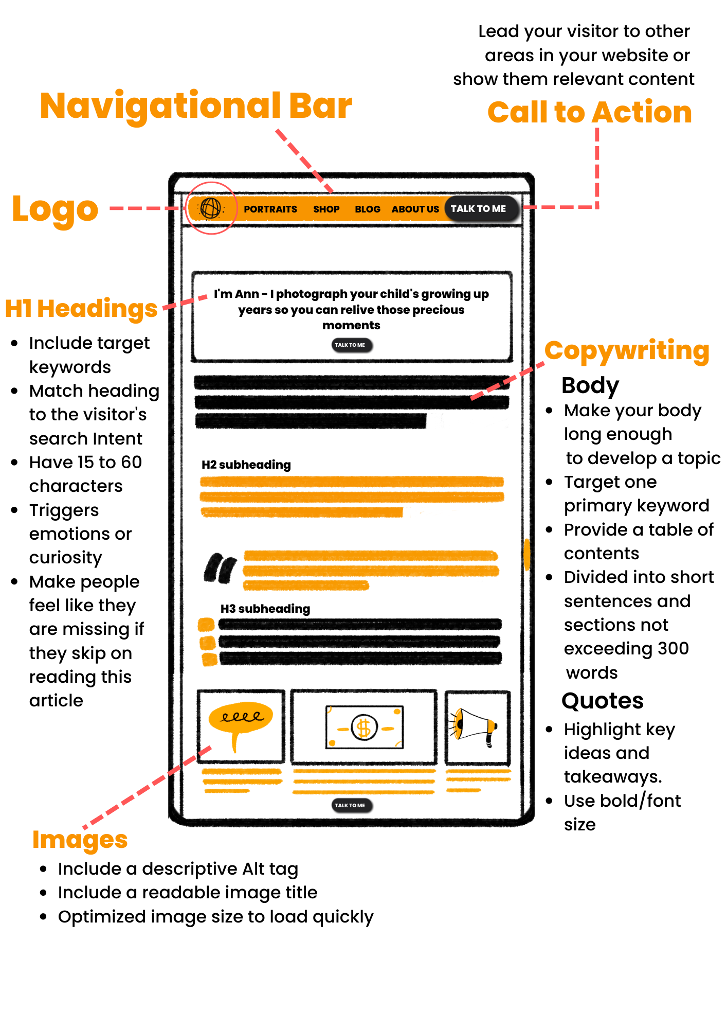
A wireframe is the blueprint of your website. It’s the first task you need take before the design and development phase. Moreover it sets the foundations of building a successful website.
The wireframe is a plan that help you get a better idea of what your website will look like. It helps decide where your website elements will go, the copywriting content and call to action (CTA). Each page has its own wireframe and purpose which will be discussed in this article.
To design a successful wireframe, you must consider not only the design components but also the integration of each of them with an SEO marketing strategy.
Undoubtedly the wireframe requires a mix of design and marketing skills. Above all having great writing skills and an understanding of the market you are in.
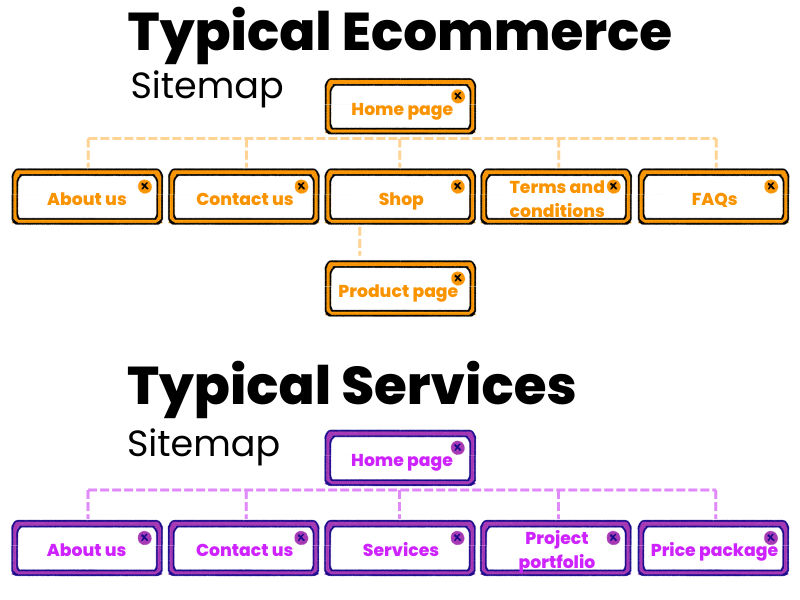
A sitemap is a list of web pages that is typically organised in hierarchical order. The intent of a sitemap is to get a visual perspective of web pages that will be included in the website.
The sitemap is the first task we take because we need to know which pages we need for our website. After we list the pages we need we can start building the wireframe for each page.
The pages you chose will vary based on the service/product you provide. Typically a website will have around 4-7 main pages.
Note that individual product and article pages count as one page. This is because they are consider a page template that is frequently used over and over again.
Start your wireframe by creating a sitemap of your website and use the examples below as a guide. Its ok if your sitemap is exactly the same as the below.
Also note that It is very common to have websites with an identical sitemap. So don’t over think it, and chose the pages you need.
Before we start putting pen to paper, we need to do some brain storming. Firstly let’s think about what the website will be used for?
If your answer is “I just need a website where my customers can contact me” its not enough. Literally 60% of our clients give us that answer when we ask that question.
If you are building a website, might as well make the most of it.
Let’s start by thinking of what sort of actions you would like your customers to take. Here are a few common examples –
Contact us, request a quote, book an appointment, buy a product, explore trending products, subscribe to a newsletter, take a free trial, buy a course, buy a subscription.
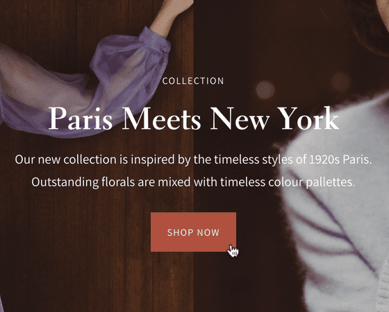
These are typically called Call To Action (CTA) elements which are super important. Without CTAs your customers will not know what to do on your website.
CTAs are usually located in website slides. For example you might show some text and a background image related to your service with the CTA button “Shop Now”.
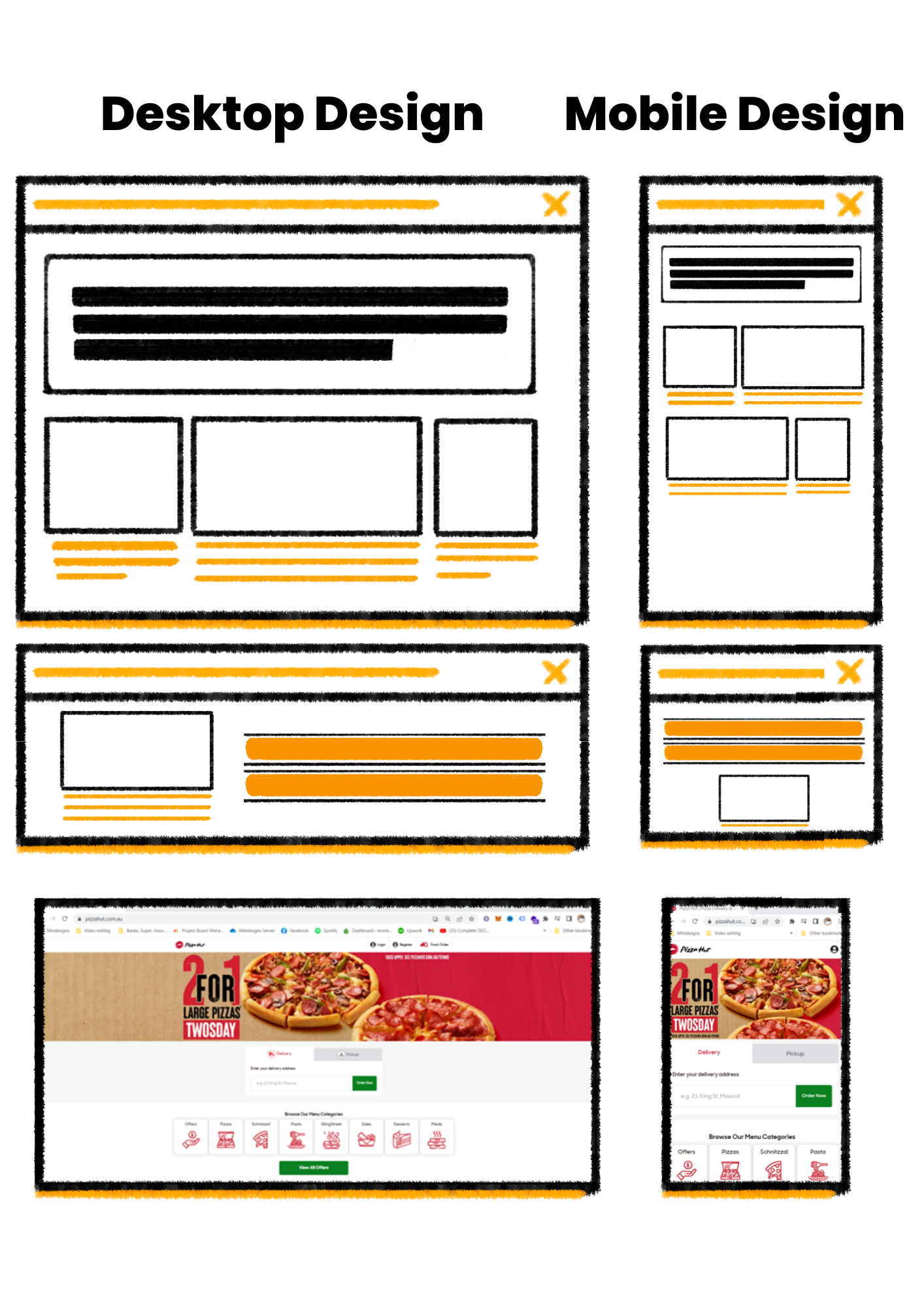
It is recommended you consider what your wireframe will look like on mobile devices. This will make the design phase easier to execute for different types of displays.
Sometimes people skip on this part which makes it harder down the track to develop the site on a mobile device.
Moreover a mobile friendly website will improve your SEO and general visitor experience.
When you get to designing your wireframe make sure you include both a desktop and mobile size canvas. This will help you organise how your website will look on desktop and mobile devices.
A website that has a great mobile design interface usually has a simple design with robust elements.
TIP – Visit websites you admire and play with the size of the browser on your desktop. Decrease and increase the browser vertically to imitate how the website looks on different devices. This will save you time as you don’t need to go on a mobile or a tablet device to see how the website looks like.
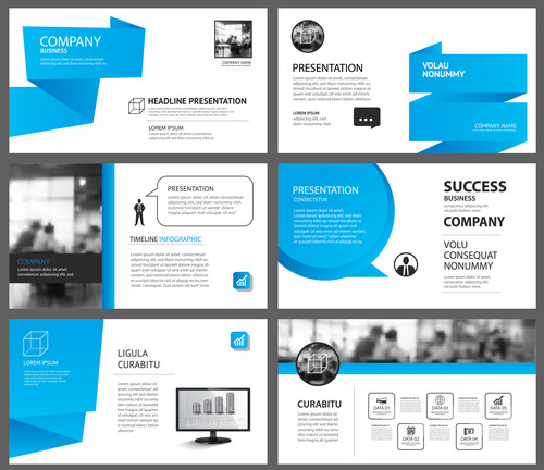
In general, there are many website slides to choose from. The key to choosing the best website slides is to consider what is important for your website visitors.
For example, if you are in the cleaning business, your audience may look for social proof and reviews of your services. Therefore, testimonials might be a good slide to include on your home page in one of the first positions.
Consider an ecommerce business. People buying online typically want information such as delivery time, shipping information and Guarantees etc… this means that a general informational slide might be important to include in the home page.
Note that there is no perfect slide order, each customer has different preferences and therefore one page design cannot satisfy all.
In practice the focus should be defining the slides that are most important to the general site visitor.
Pick and chose your website slides, you don’t need to organise them yet. Just chose the ones you think are the most relevant to your customers.
There are plenty of libraries available online to set up your website wireframe. We use Figma and their wireframe kit, makes our work super easy.
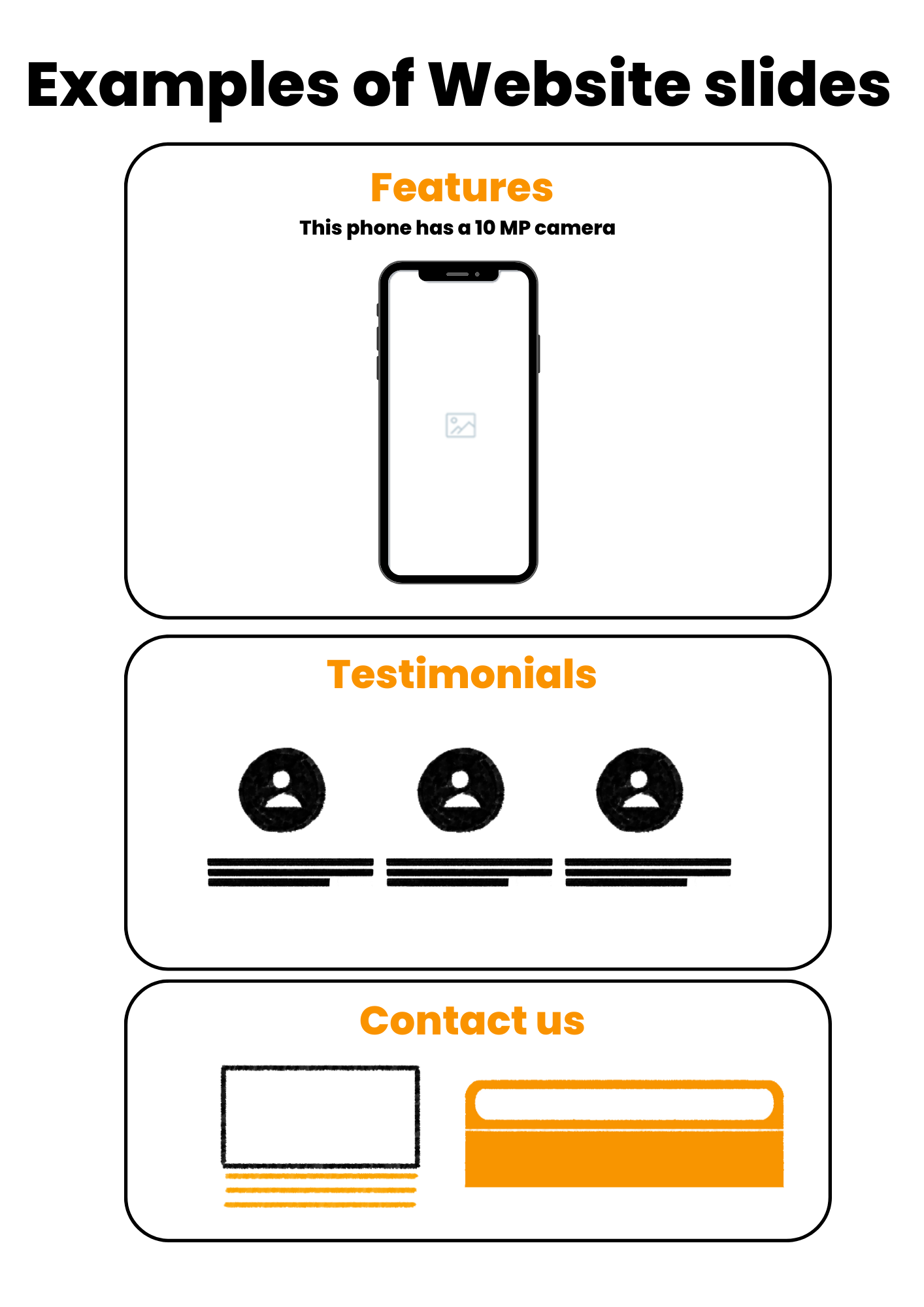
Here are some common examples of different types of website slides –
Value proposition – what is your product or service offer?
Website Content – show what the website has to offer like a blog or a resource.
How it works – A step by step guide explaining your service or product.
Features – features of your product or service.
Testimonials – Testimonials of customers
Call to action – slides that are intended to lead a customer to subscribe or buy.
Pricing Tables – shows the pricing range of your product or service.
Blog articles – show a few articles you have in your blog.
Contact us – a field for customer to complete in order to contact you
Ecommerce slide show – shows the products you have to offer as a reel or slider.
Team – shows the employees in the business.
Footer – At the bottom of the page, usually used as a navigational tool for your website and social accounts.
Associates and partners – Show who are your partners and other businesses you have a relationship with.
Portfolio – shows the work you have previously done which give social proof to your visitors.
Market size and matrix – provides some data about your industry.
The most important website slides need to go in the home page. Other pages are less likely to be visited. So if you want to communicate something to your visitor, the home page is the place to do it.
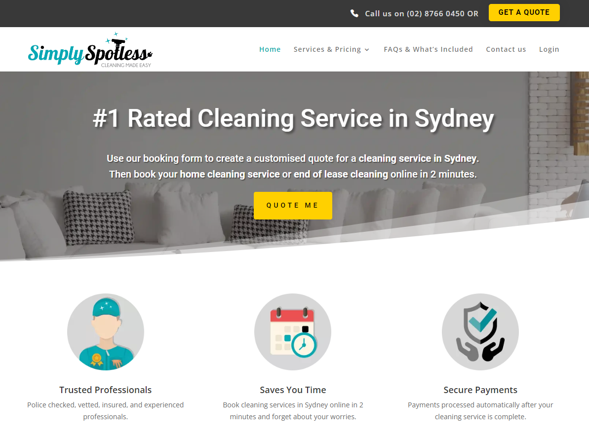
The first slide of your home page should cover what is your service or product about?
Meaning that if you are a cleaning business in Sydney your first slide should include copywriting such as “Cleaning Services in Sydney”.
The internal pages of your website are not as important as your home page. However, If a visitor navigates to these pages it means they are showing more interest in your business. So, it’s important to satisfy what they are looking for.
If visitors are navigating to your about us page it means they want to find out more about your business. Show them your team and what you stand for. Its important to be authentic and use real images of the people you employ.
Additionally, you can add LinkedIn links for social proof and a business mission statement, you can also add other elements such as business partners, major clients and culture.
Some businesses even use a short intro video which is another option to consider.
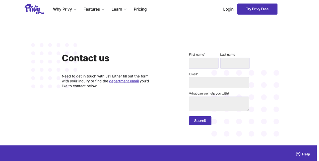
Contact us page should only be one slide or two. If visitors travel to this page, they want to contact you so make it as easy as possible.
After organising the website wireframe for all your pages, you can start writing text which is also known as copywriting. There are many ways to write copy, but there are some key points that should be considered before putting pen to paper.
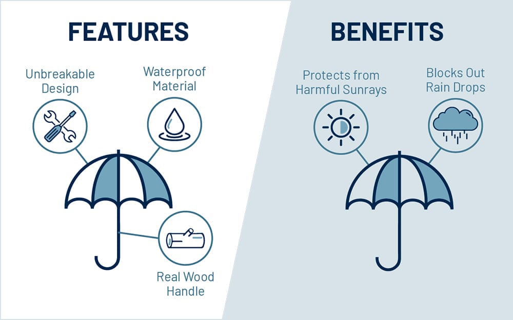
1 – Emphasize benefits over features
One of the most common mistakes companies make with their web copy is spending too much time talking about how great they are.
While it’s understandable to want to highlight the achievements and benefits of your organization, it’s typically not what visitors want to see.
We’ve said it before, but let me repeat – people don’t care about your company, they care about how your company can solve their problems.
2 – Write as if you are talking and be authentic
When content creators write like they talk, they naturally use everyday words that people use in actual conversations. Using the language of your readers is a great way to build connections and trust. This happens because you appear more human to your reader than a big corporation or insurance business.
3 – Less is better
Don’t lose your reader in a sea of text they can’t handle. Get to the point quickly and be clear about your intent. To give some perspective, the optimal number of words for your home page based on surveying thousands of successful websites is 300-600.
Other internal pages like services and about us pages typically have less words than the home page (not including article pages which usually have between 1000 – 2000 words).
TIP – Filling up your web pages with a lot of text is not going to help you from an SEO perspective (Google search). That is an old school SEO approach which does not work anymore.
4 – Use the voice of the customer
This aspect of copywriting focuses on your client’s needs, wants, expectations and problems. The idea is to write copy that speaks to the conversation that is taking place in your customer’s head.
Your copywriting is a big part of increasing your conversion rates so be smart about it.
Here is a super simple example..
The other day I was looking for a cleaner for my Airbnb rental. Not many cleaners do Airbnb and usually you have to call to ask them as most of them don’t have a website.
During my search I finally came across a website that clearly said Airbnb services on the first slide of the home page.
“Professional Airbnb to suit your needs” as simple as that. I called them, and they seem very friendly over the phone, so I became their customer.
The text on their website spoke to my needs. I was looking specifically for an Airbnb cleaner and they made it clear they provide this service.
If they didn’t have that text on the first slide of their website I probably would have never called them.
TIP – Do some market research about your customers needs. It can be as simple as having a conversation with them to understand their needs, wants and problems relating to the service or product you provide.
5 – Think about your customer’s intent
Most people visit your website with an intent. An intend to buy, to get more information or conduct market research.
What ever your visitor’s intent might be, your copywriting should be designed to satisfy that intent. The more relevant you are to the reader, the more likely they will buy from you or visit your website again.
Copywriting is very subjective. You can’t be perfect to everyone because not everyone has the same priorities concerning their needs and problems.
It is therefore beneficial to get other people’s opinion on what you write. Especially if the advice is coming from your customers.
The best thing you can do is to ask your customers what they think of your copywriting. Ask them questions like –
Did my website mention what you are looking for?
Was there a sentence that resonated with you?
Was there a sentence that did not sit well with you?
What do you think is missing in the text?
TIP – Asking one person is not enough, get feedback about your copywriting from at least 5 people.
share this article with someone that can use it 🙂 I hope you liked it.