For Marketing Leaders
This is an exciting article I am sure will come in handy. It will not only give you a good structure for a landing page design, but it also includes my personal secrets to designing a high-converting landing page.
There are years of my experience put into this article. I created it to save you from repeating my costly mistakes, so you won’t have to waste so much time and money to build the perfect landing page.
No interested audience, no landing page conversions
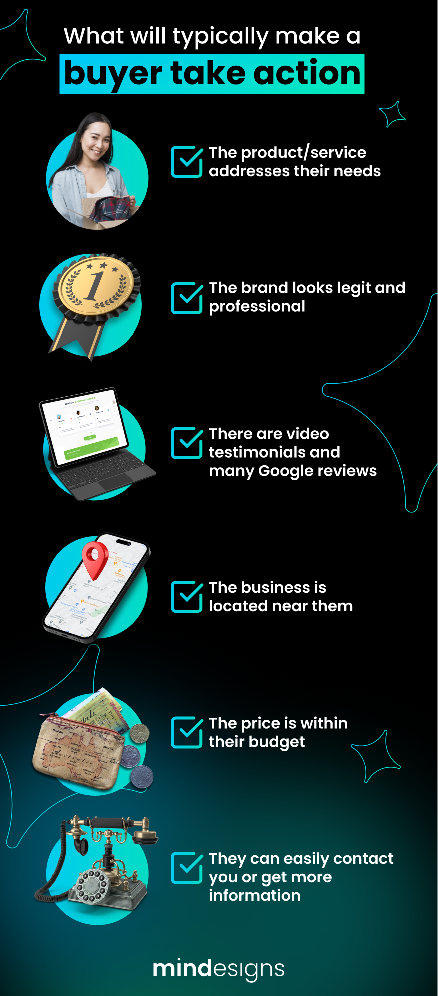
Let’s jump straight into it, with a bit of pre-work. The first step we need to take is to define our target audience. Knowing whom our landing page is intended for is vital. Why? Because if our landing page doesn’t appeal to our visitors, they will not buy from us.
Once we define our perfect buyer, we can tailor our content to address their needs. Our images, copy, and video need to be smartly designed. This is how you can achieve this:
- If you are using images, make sure the people in the images look like your ideal customer.
- Use colours that match the persona or the brand.
- Include language and slang your customers use in your copy.
- Explain how you solve your customer’s problems, help them face their fear, and satisfy their needs.
- Be specific instead of broad.
Equipped with this knowledge we can start creating the 4-7 web sections that make up our landing page. I say 4-7 because you technically don’t need more than that. People’s attention is getting shorter every day, so you only have a few chances to persuade your buyer.
In this article, we will cover a powerful 5-section structure and how you should design each of these sections. I will also share my personal secret tips for creating excellent copy, images, and videos that will be hard for your audience to ignore.
Before we jump into the landing page section, I just wanted to say that there is no such thing as a one-size-fits-all. You can use this landing page structure in the given order, but it’s not a must. You’ll definitely want to keep section 1 (hero Section) first, but after that, the order of everything else is more flexible.
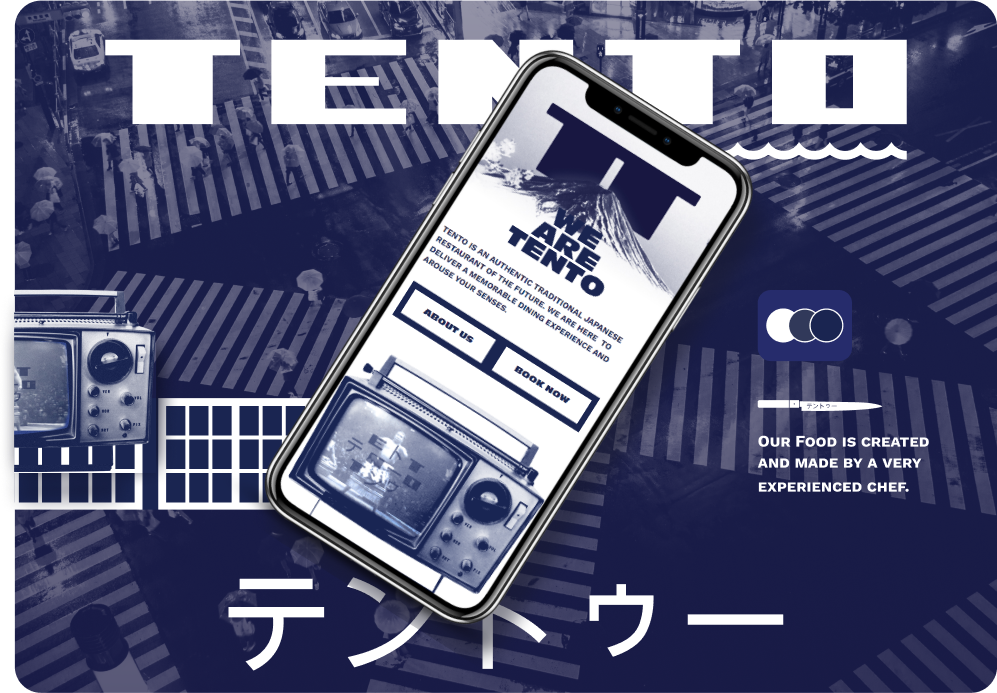
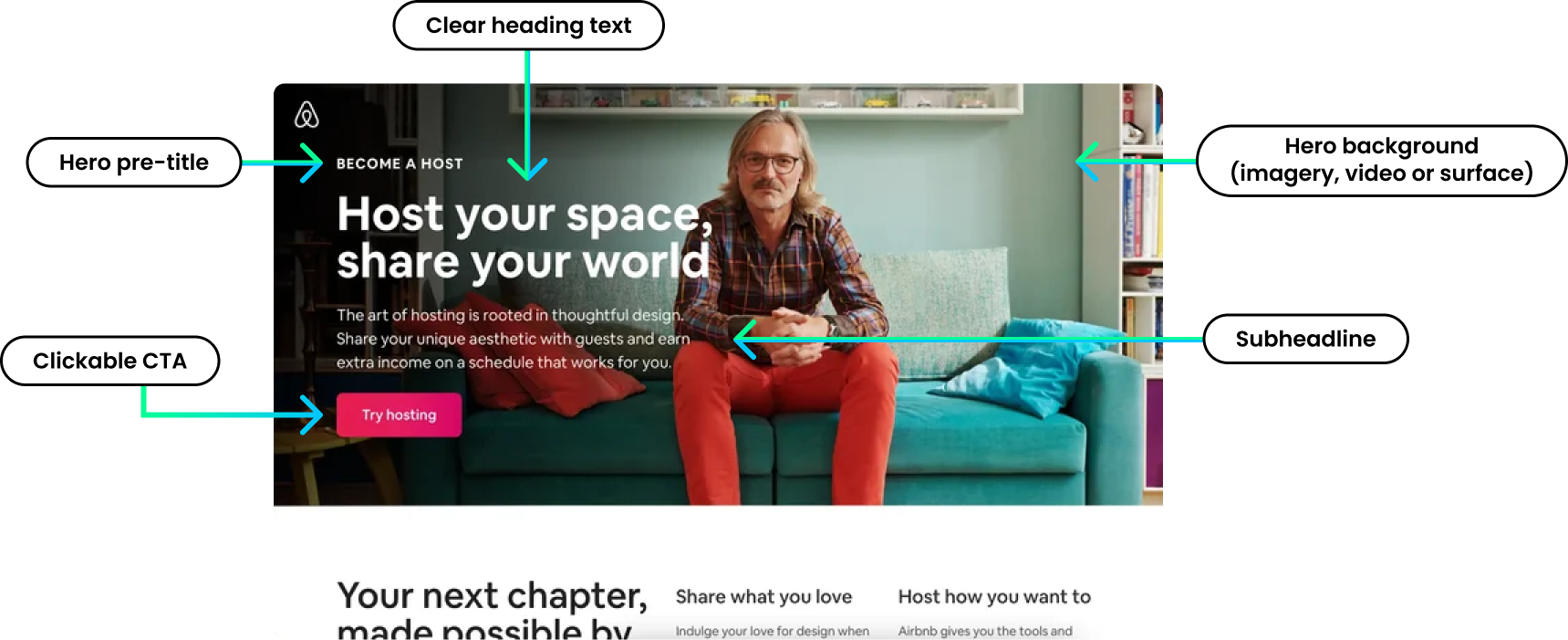
Landing Page Design Section 1 – The hero section
The hero section is the most important part of your landing page because it’s the first thing your visitors see. Website visitors only take a few seconds to determine if your business is right for them after landing on your page, so if your hero section is not powerful enough they will simply bounce off and leave.
The hero section must be clean looking and to the point. There are 3 elements that you need to touch on in this section:
What do you do, why should the visitor care, plus a call to action.
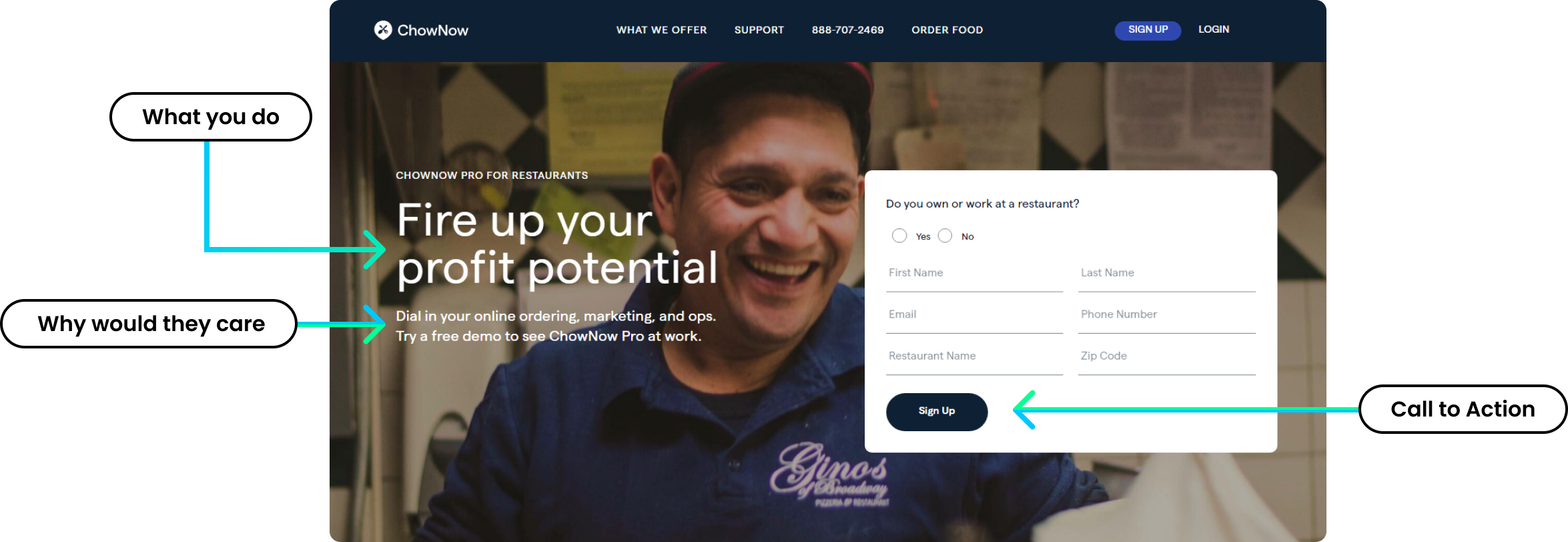
Now that you know the keys to a good hero section, you will start seeing them everywhere!
Some businesses may use a video to address the 3 elements that you need to include in your hero section, but those are harder to nail, so a great image and effective copy are usually enough to achieve the goal.
Keep your hero section as simple as possible. Don’t make your heading and subheading too wordy, and don’t use complex words. Avoid using stock images and instead include authentic (or clean design) images that relate to your business.
Finally, never forget to instruct your visitor to take the action you seek the most.
Landing Page Design Section 2 – Product solutions and benefits
In this section you want to address the visitor’s problems and how you solve them. This is a good place to try to relate to your audience by thinking about what product or service benefits they’re looking for. Here is an example –
Don’t let your expensive timber deck rot and decay. Our paint will keep your deck protected for 10 years, whether it is exposed or undercover.
In the above example we addressed the problem and how we solve it. We also made it clear that our solution is suitable for all decks both inside and outside. Pro tip: Try to make sure your language is kept simple and to the point.
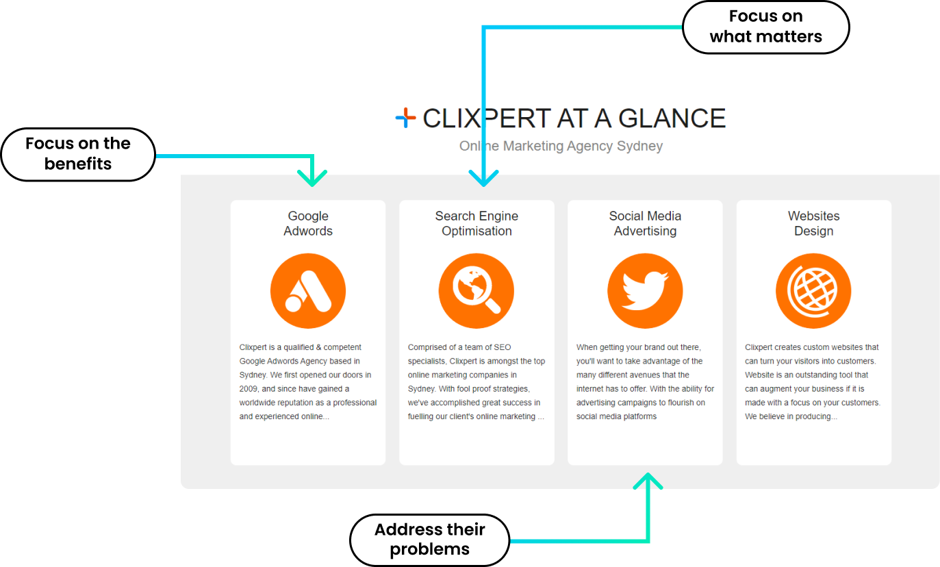
This section should include at least three benefits or solutions that you offer. The way you convey this information is up to you in terms of design, but make sure you focus remains on their main problems and the solutions you offer. After your visitors read this section, they need to think: “This is exactly what I was looking for!”
Warning! Do not focus on the features you offer. Try to explain your features like benefits as much as possible. For example, if you are offering 24/7 support, instead of saying it like that, you could instead say: “No bots and long waiting times, our quick response team is available 24/7 to solve your technical issues!”
Get creative and tell your visitors what they want to hear.
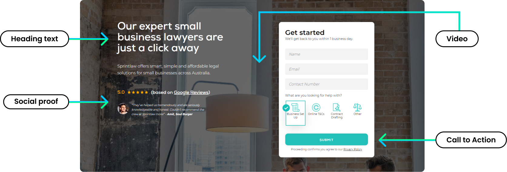
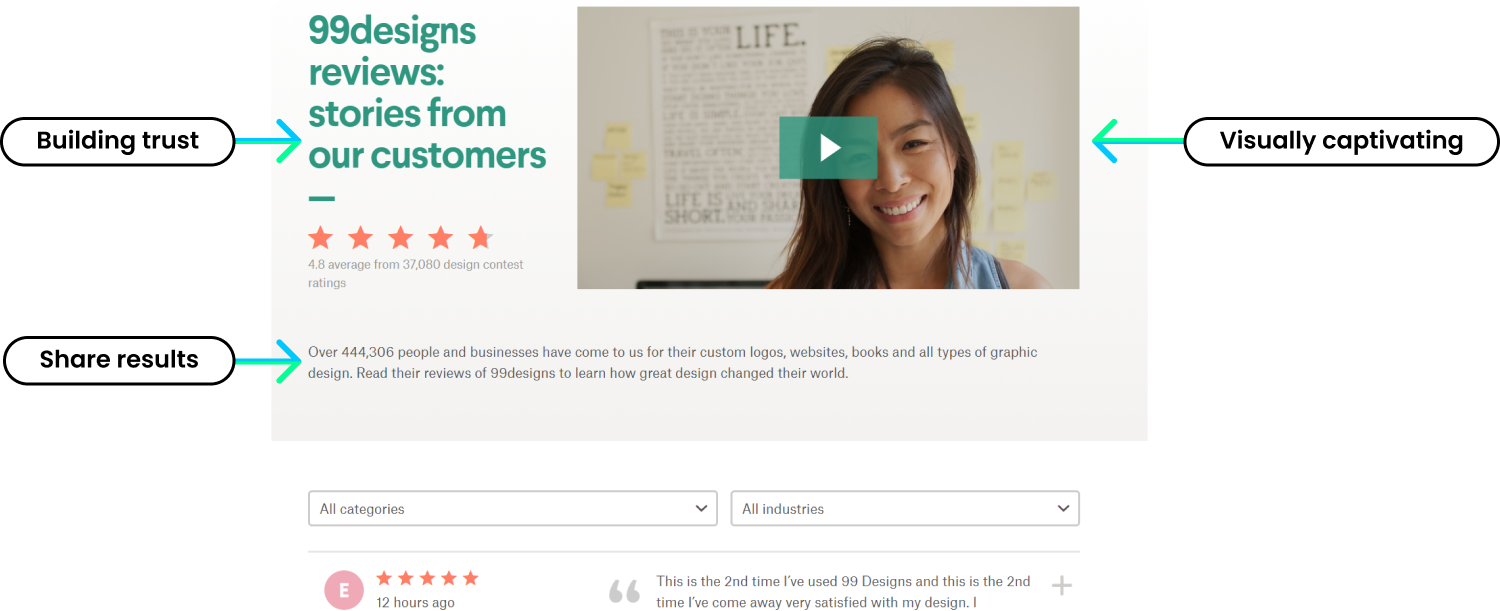
Landing Page Design Section 3 – Social proof elements and testimonials
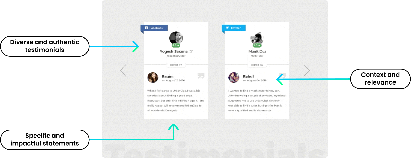
Social proof comes in many shapes and forms. It can be done by displaying Google reviews, sharing written testimonials, displaying awards or qualifications, among many other things. However, we’ve discovered that one of the most effective ways to display social proof is through video testimonials from actual clients. This is a very strong form of social proof because it allows your visitors the opportunity to connect with one of your clients and hear about their experience with your business.
One good testimonial can often do the trick, but if you want to tend to a wider audience, you could include a few more testimonials. The testimonials you choose should include people who are your ideal clients. For example, if your audience is Caucasian ladies in their 30s who are trying to lose weight, then your testimonial should come from a Caucasian lady in her 30s with a good weight loss success story.
Testimonial scripts should be carefully planned. Try to get your ideal client to walk through the journey from the problem they had, to how they discovered your services, the wonderful experience you offered, and finally, a recommendation. Testimonials should not be more than 1-2 minutes long and should feel like a story (preferably clean and professional).
Do not be shy to include other forms of social proof throughout the landing page. If you have any badges, such as awards and qualifications, put them in the hero section. If you have been featured in any magazines or news agencies, make sure you let your audience know.
Landing Page Design Section 4 – How it works (Process and specifications)
In this section, we get to explain our service or product to our visitors. It is an opportunity for us to set expectations and potentially resolve any doubts our visitors could have about taking the next step.
The more we educate our visitors, the easier it will be to convert them to customers when they contact you or browse your products.
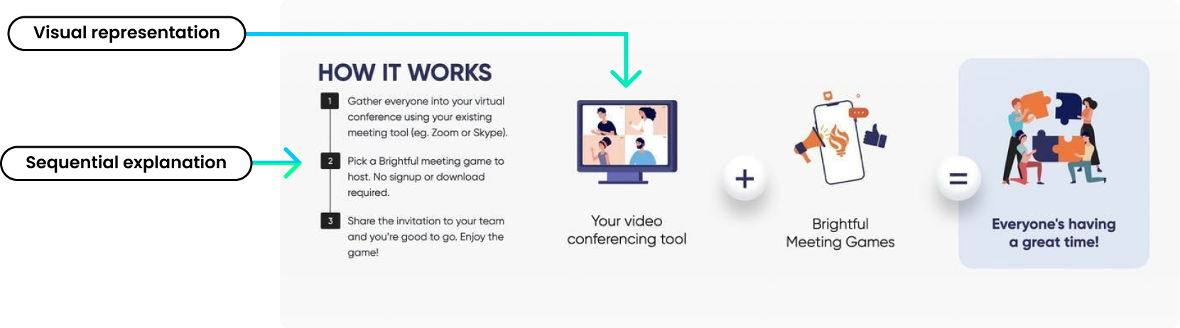
There are many ways to go about this section, but the key to getting it right is knowing your customers’ most burning questions. Think carefully about what your visitors want to know and what could be holding them back from picking up the phone or adding a product to their cart.
Some of these questions include:
- What is the process of getting a quote?
- How long does this process/delivery take?
- Do you provide a signed certificate for this service?
- Is this product of high quality? How is it produced?
- What are the costs associated with different service packages, and what do these packages include at each tier?
- What are the product/service guarantees and features?
- How do I use this product?
- How do I integrate this software?
- Are there resources to help me with installation/application/usage?
Some people may say that giving them all the answers up front is not a good approach. Maybe they want to keep the visitors questioning, so they are forced to call the business to get answers. This approach may work in some situations, but I would rather have more educated customers call me because they are likely to be more ready to buy than those who still have questions to ask.
The approach of giving them more information helps filter customers so you don’t waste your time, while also giving them a better user experience.
Do not confuse this section for an FAQ. The how it works section is more about educating them about the experience of your product or service rather than answering many popular questions.
Landing Page Design Section 5 – Frequently Asked Questions (FAQ)
The FAQ section in a landing page serves as a vital tool to address the most common questions and concerns of potential customers in a concise and personal manner. By anticipating and answering these queries upfront, the FAQ section not only helps to alleviate doubts, but it also showcases your brand’s transparency and commitment to customer satisfaction.
A well-crafted FAQ section can work wonders in guiding potential customers through their decision-making process and increasing conversions. Share relevant and valuable information in your responses, such as shipping details, return policies, and product specifications. Additionally, consider including links to more in-depth resources for those who seek further information.
Regularly update the FAQ section to address new queries that arise over time and consider checking your website analytics and user feedback to identify any gaps and areas for improvement.
Remember: A personal touch goes a long way. By humanising your responses and addressing customers’ concerns with empathy, you’ll foster a positive and trustworthy relationship with your audience.
High Converting Landing Page Design Tips
Tip 1 – Get feedback and be open to feedback. Sharing your page after launch with friends or co-workers is important because they will let you know if something doesn’t feel right. It’s hard to review your own work so make sure you let someone else take a fresh look at it.
Tip 2 – Experience your landing page. Go and test your page on different devices and ensure everything is working as expected. Make sure all the buttons function, and the design looks clean on desktops, mobiles, and tablets.
Tip 3 – Make it easy for them to contact you. I recently noticed a popular trend of businesses including a contact form in the hero section of their home page. This is genius, as it makes it easy to contact a business without looking for a phone number or email address.
Tip 4 – If you can, use a story to communicate your message. Stories are very powerful tools you can use to increase conversions. Telling your business’s story and the changes you are making in your customer life can enormously impact your visitor’s buying decisions. It helps you stand out and make your landing page truly unique.
Tip 5 – A/B test. Make sure you are always testing at least 2 variations of your landing page. I’ve always found this to be a good strategy, as one will always do better than the other, sometimes by double the conversion rate! Always be testing and improving.